Web & Software
Billard Café Crazy Ball
A pool café that has been running in Cologne’s Südstadt since 1998 — and got an appearance as calm as the place itself.
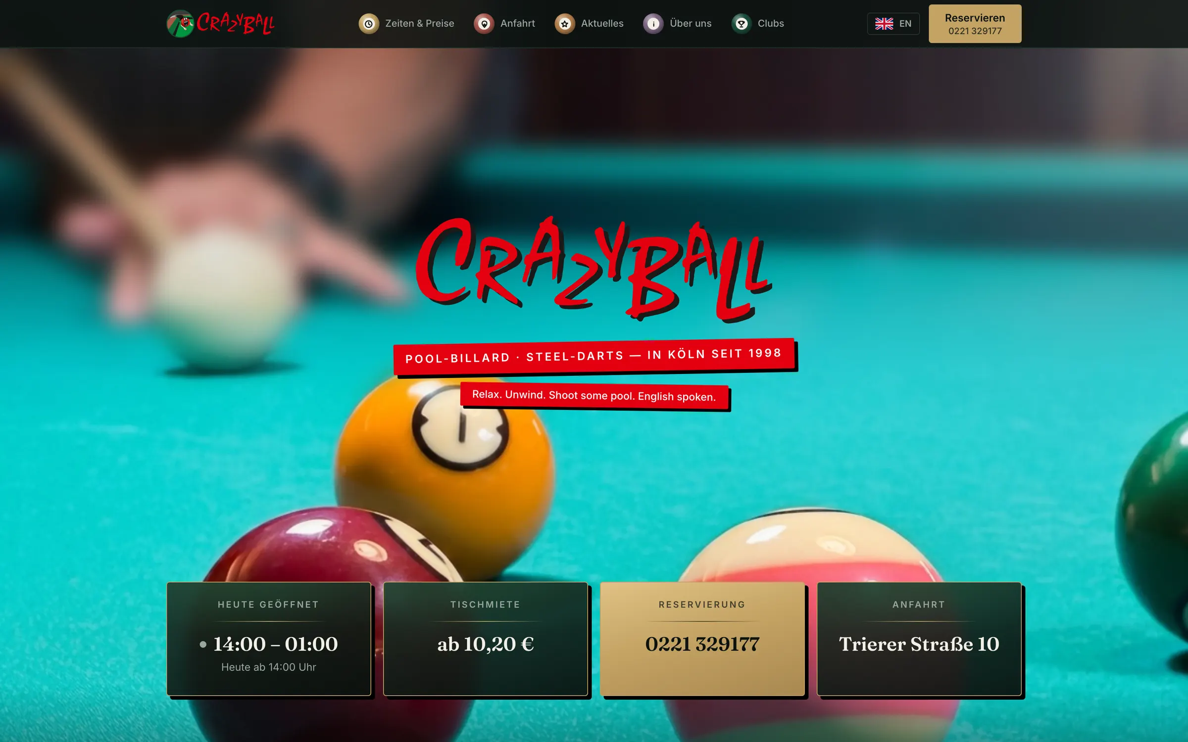
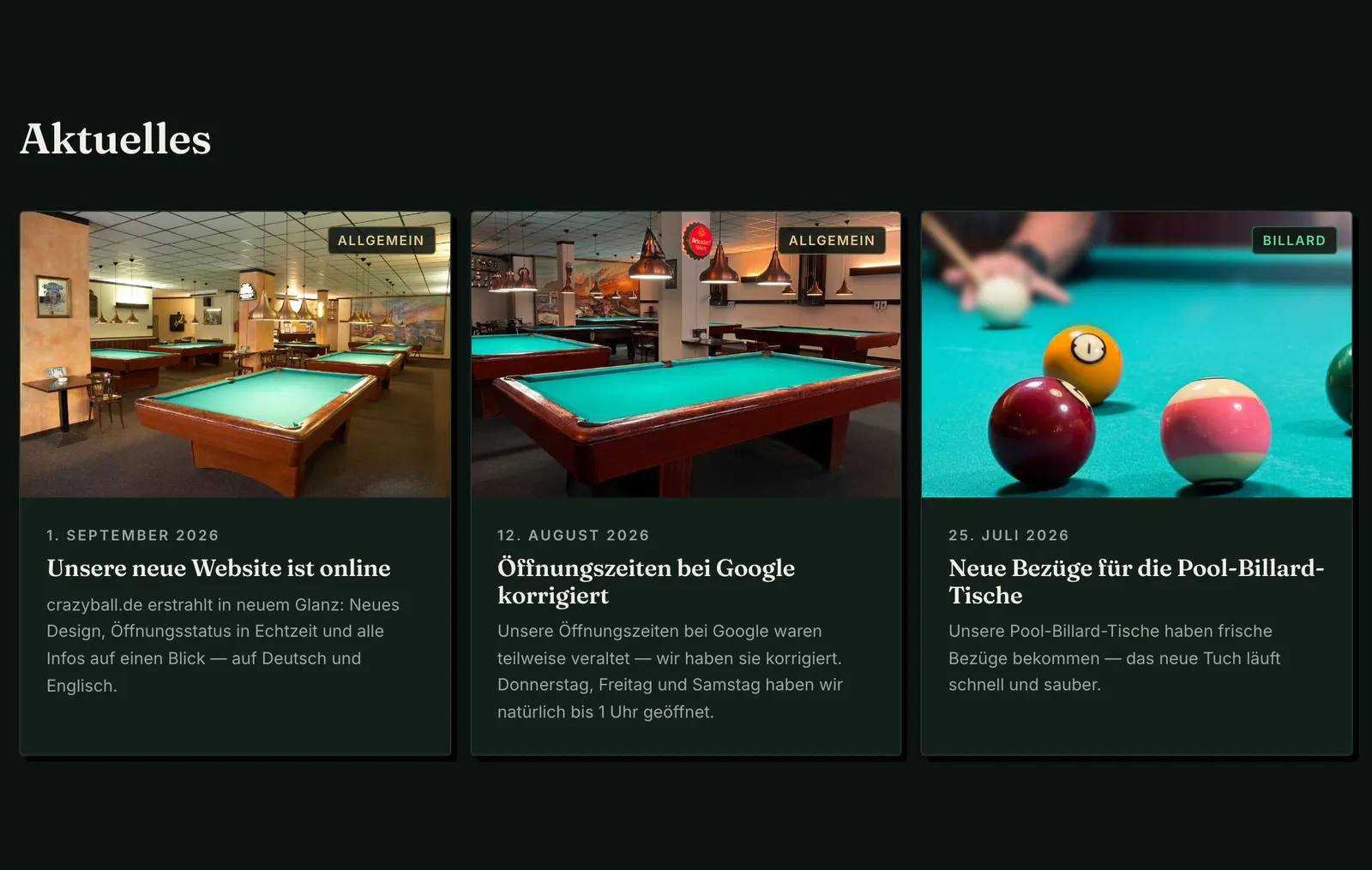
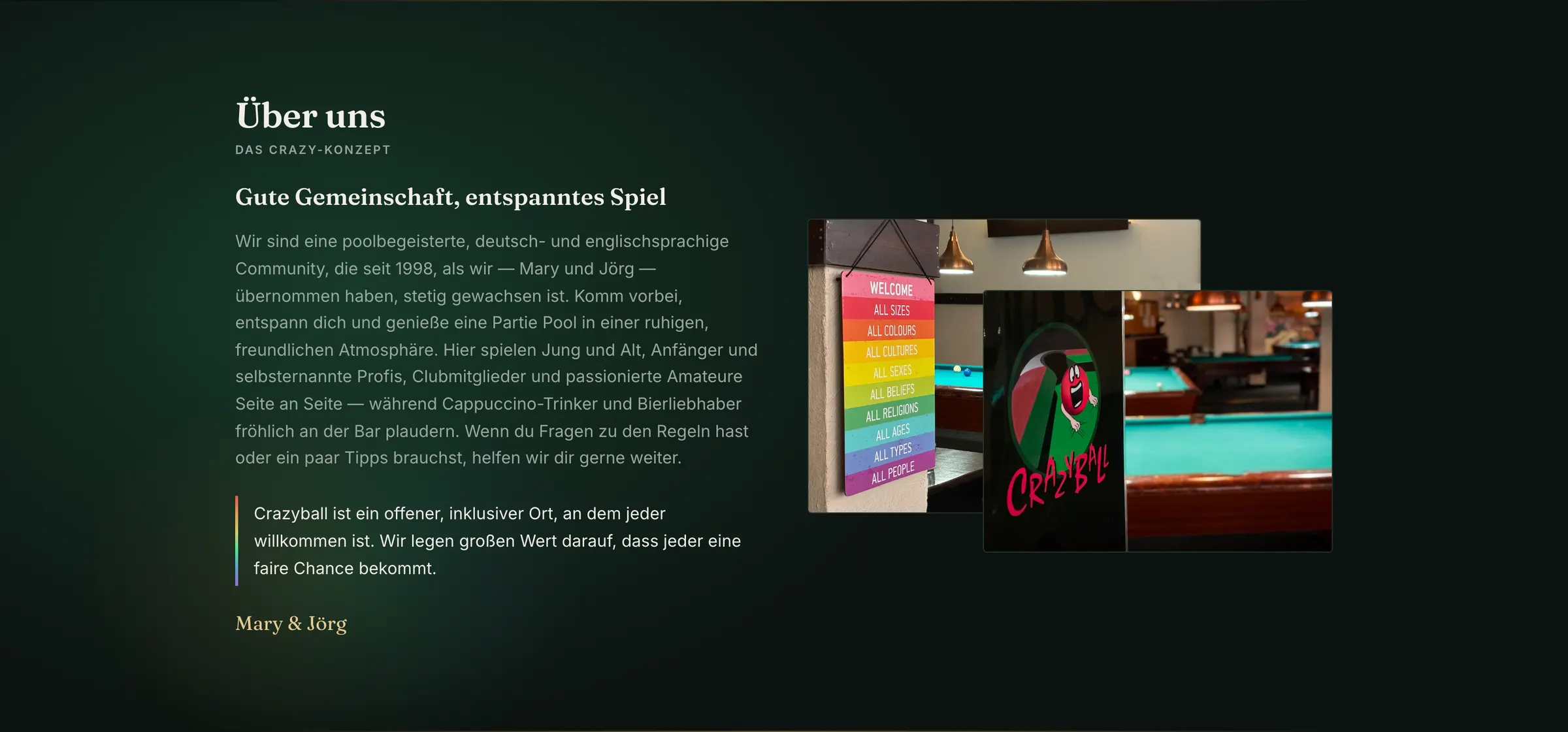
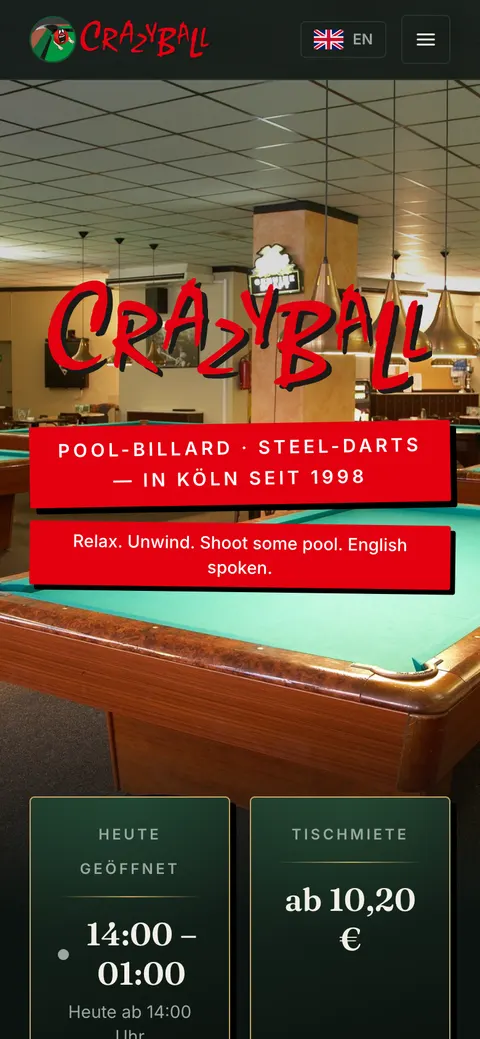
Crazyball sits on Trierer Straße in Cologne’s Altstadt-Süd, a few steps from Barbarossaplatz, run by Jörg and Mary. Pool billiards and steel darts, plus a bar. Not a sports centre, not an arcade — a place where you play in peace. It is also the clubhouse of PBC Köln-Süd and has won the Gastro Award in the “Hangout” category. That is not a passing crowd, that is a regular clientele.
Which is exactly what made the task delicate: the old appearance sold the place short, but a new site that turned out too loud would have missed the nature of the place entirely.
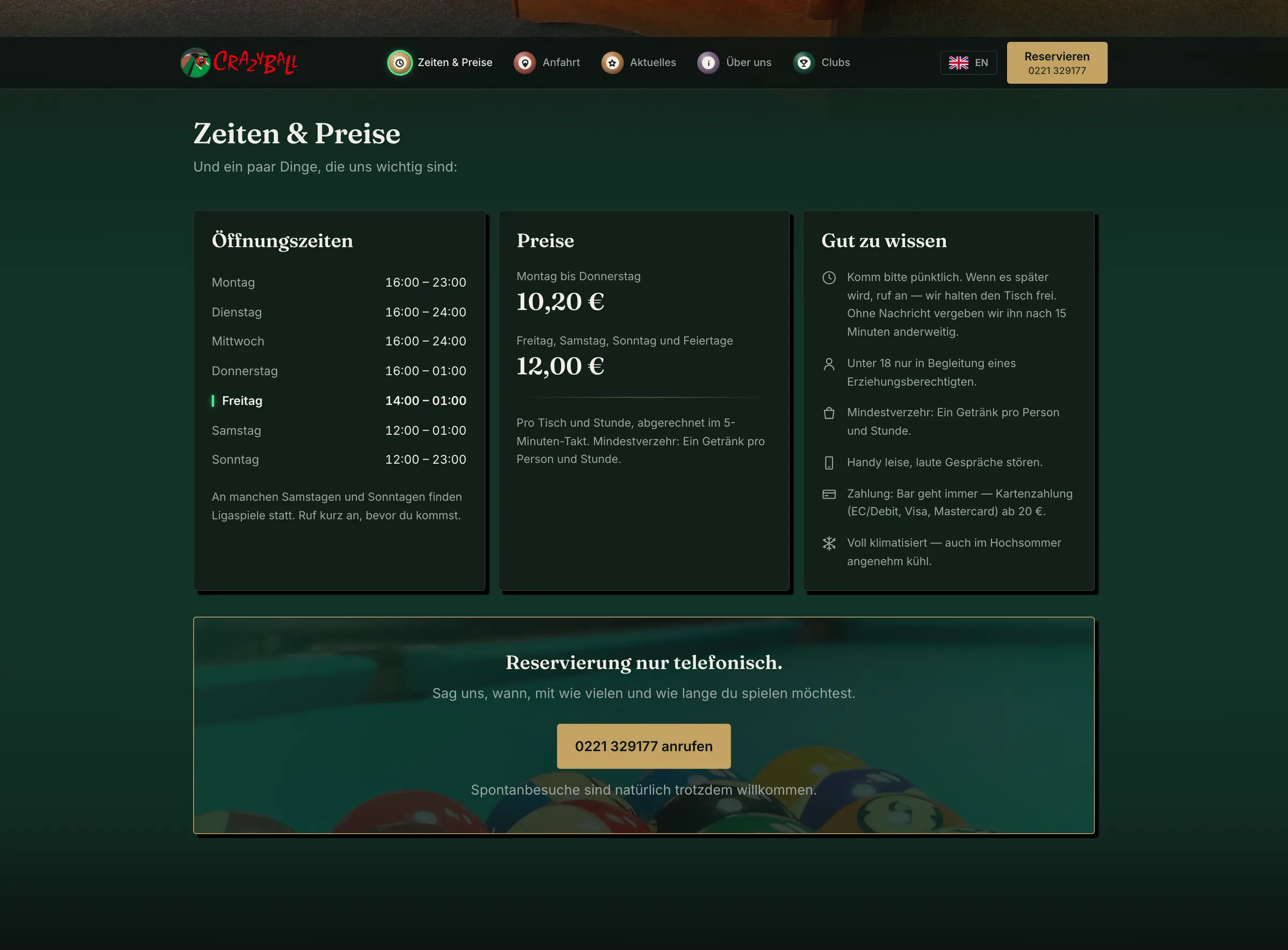
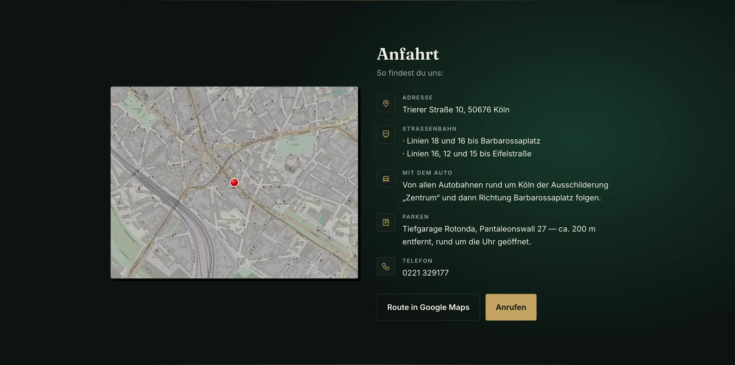
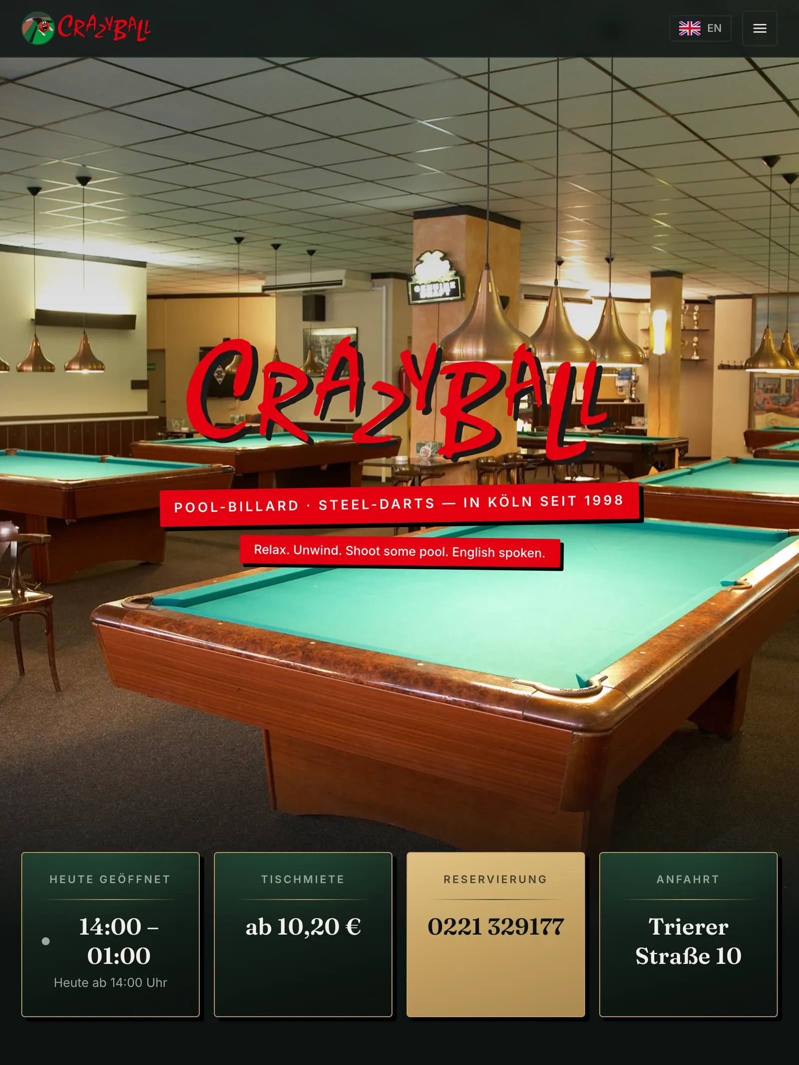
So the first step was not a draft but a question: why do people come to this site at all? The answer was unambiguous — opening hours, table prices, reservations, how to get there. Those four things are now on the first screen instead of hiding behind menu items. Anyone who wants to know whether it is still open today sees it immediately, status included.
Visually I started from the picture everyone has in their head of a good billiard hall: a dark room, warm cones of light over the tables, green cloth. That became a deep English green pulled slightly towards grey, with brass — deliberately not the garish cloth green from the sporting goods catalogue. Mary is Irish, but you will not find a shamrock or a flag anywhere. That origin lives entirely in the colour world.
Plus exactly one neon moment: the lettering at the head of the page, built like a real neon tube with a bright core and a soft glow, slightly uneven — like a tube that has been hanging there for a few years. Neon only works as long as it stays rare; there is none on the rest of the site.
“Everyone is welcome” was an explicit wish of the owners. It appears as a rainbow accent, but as a fine line, twice — a stance meant to feel self-evident rather than to be a statement.
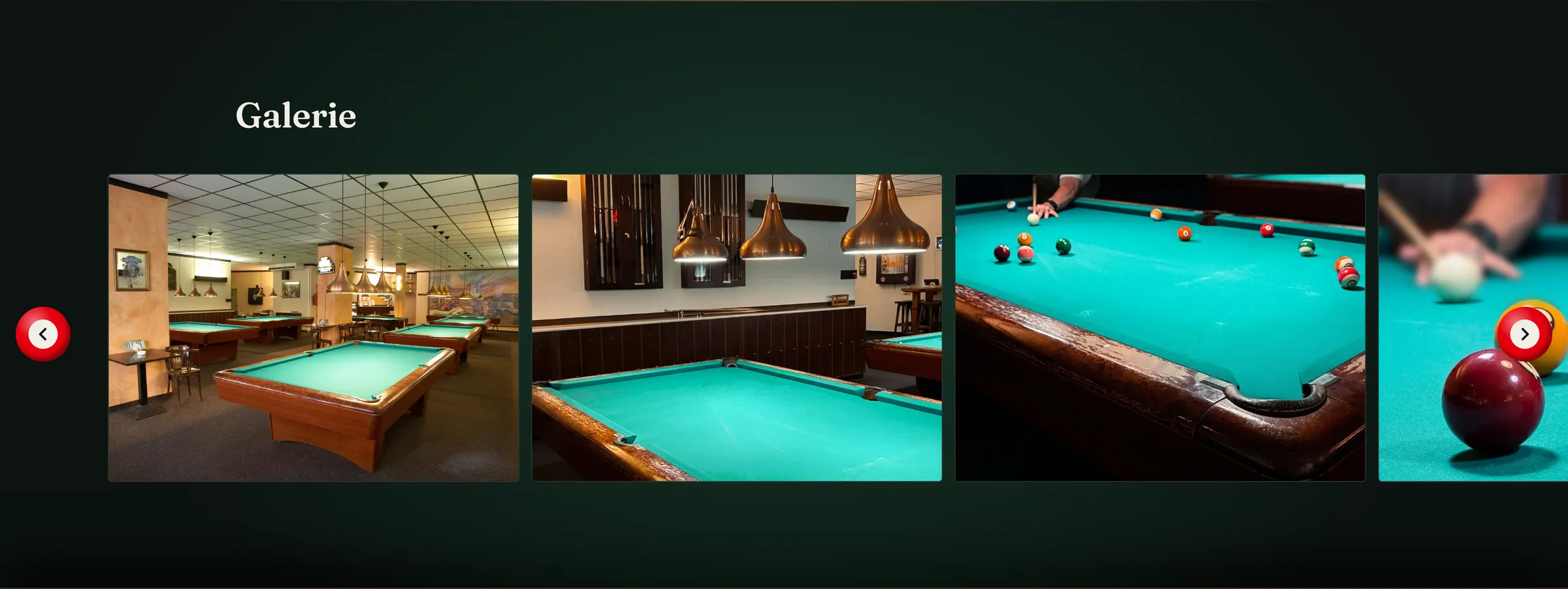
Built with Next.js and React, bilingual in German and English, because a good share of the guests come from abroad. I took and edited the photos of the hall myself. The logo is not mine.
Colours
- Black Emerald#132019Ground
- Heat Signature#E3000FNeon lettering
- Magic Lamp#C3A263Brass
Typeface
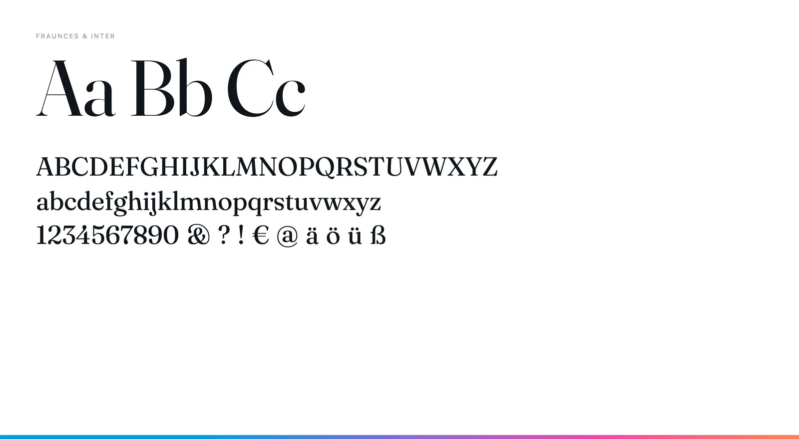
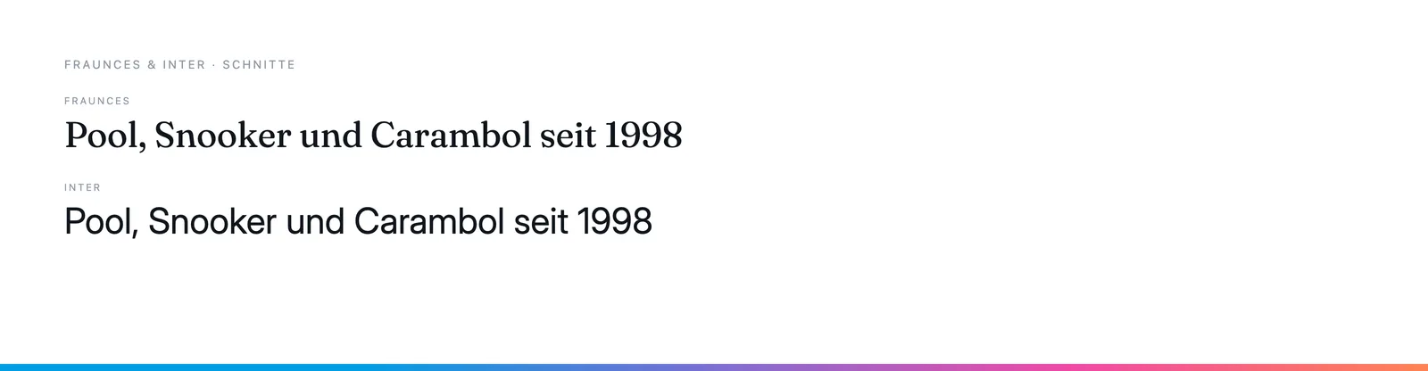
Fraunces for the headings, Inter for the running text. Fraunces has soft, almost turned shapes — it suits the wood and brass of the place without turning nostalgic.