Brand & Design
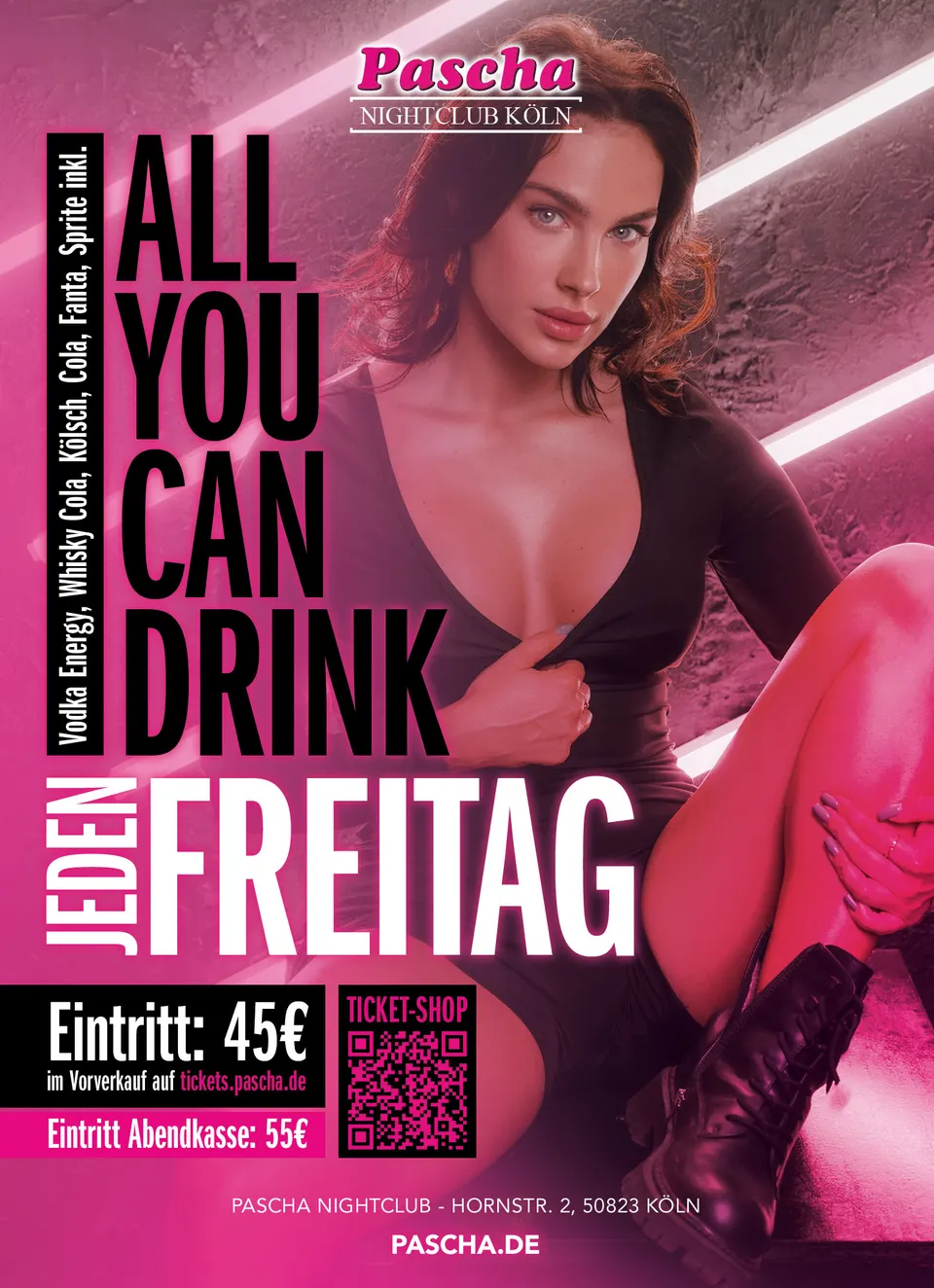
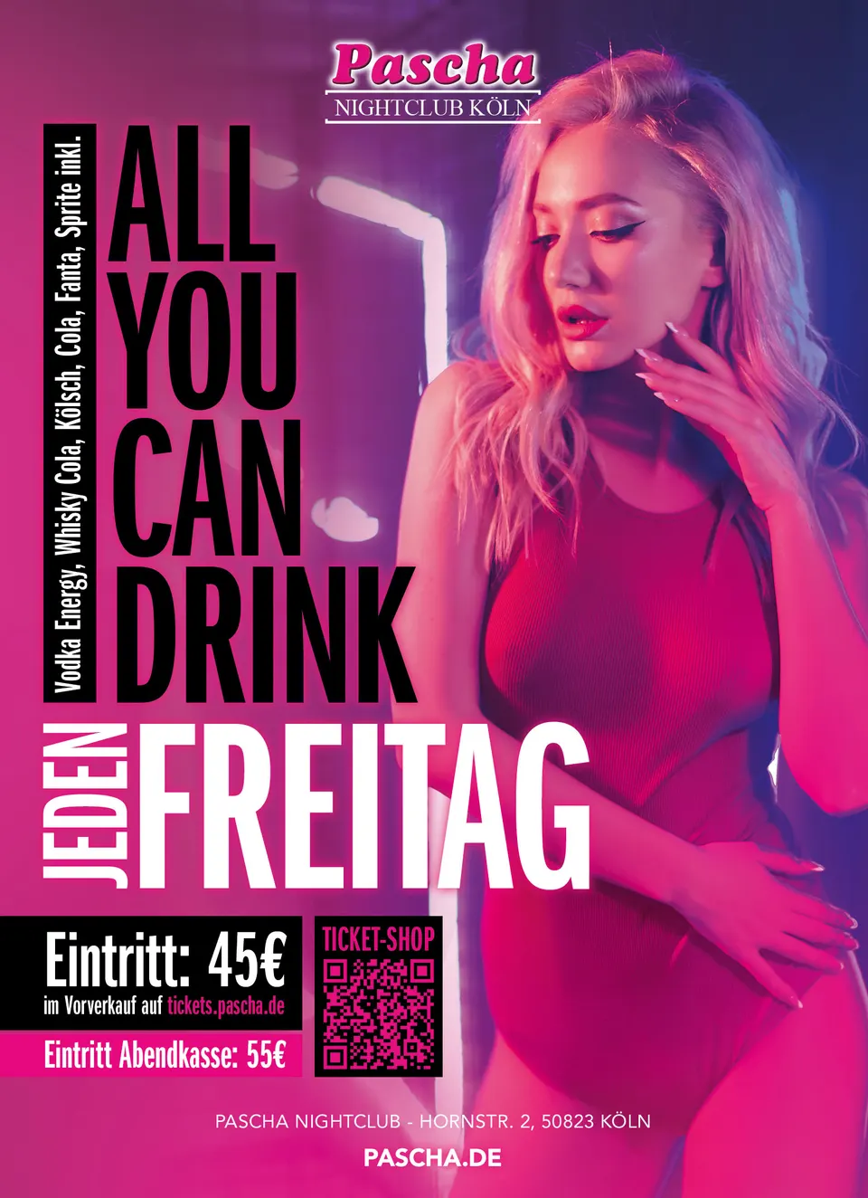
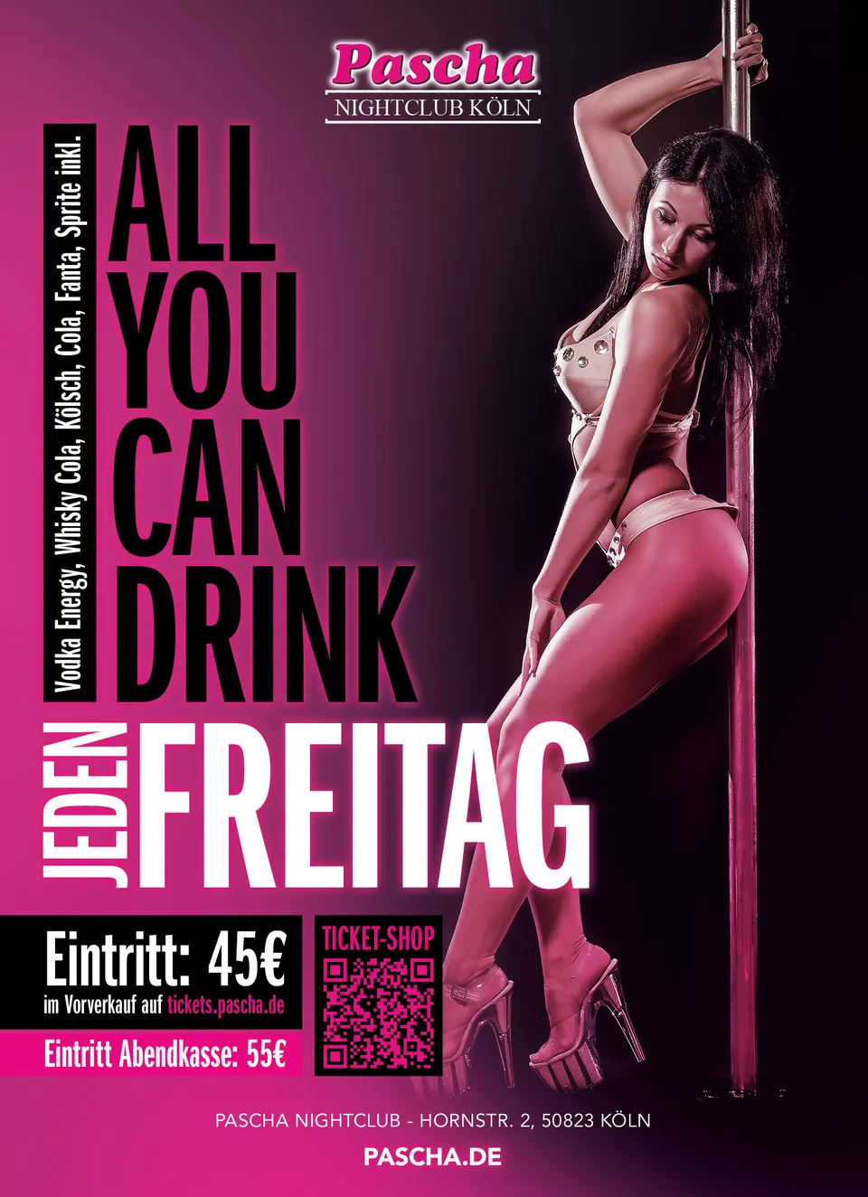
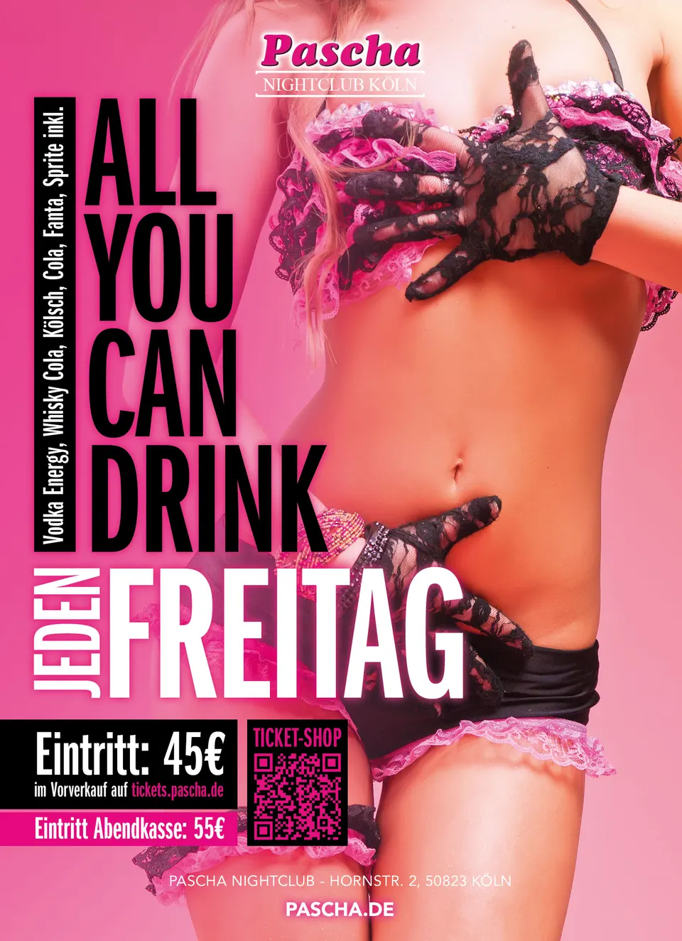
Flyer series for Pascha Nightclub
A series that needs a new motif every week — and still has to be recognisable at a glance.
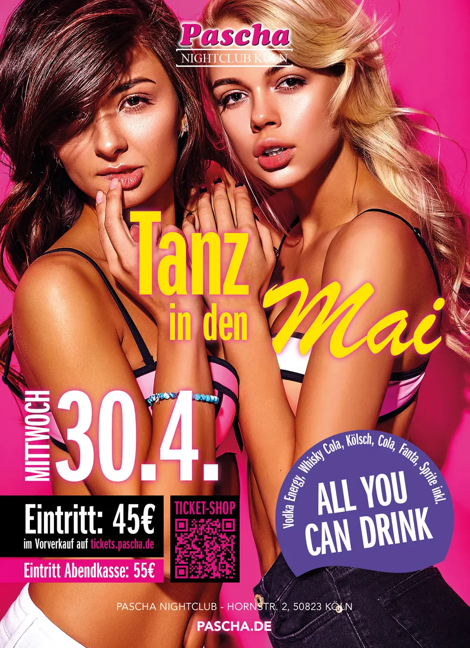
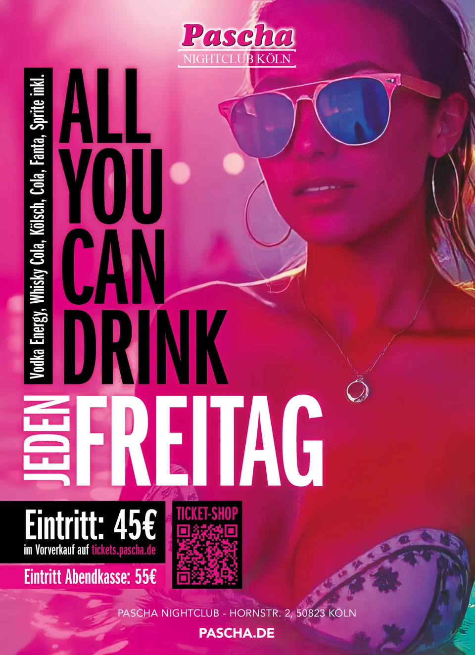
New display material is produced for the nightclub on a regular basis: the weekly “All You Can Drink”, plus occasions such as “Tanz in den Mai”.
The framework is fixed: logo top centre, the type block on the left in stacked capitals, the drinks list as a narrow column beside it, at the bottom the advance and door prices with the ticket QR code, and right at the bottom the address and domain. The only thing that changes is the motif.
That framework is not laziness, it is the whole point. A guest who sees the poster in passing has two seconds. If the price and date are somewhere different every week, they have to search all over again each time. If everything is always in the same place, all they read is what has changed.
Set in Photoshop, delivered print-ready.
Colours
- Red Purple#E41878Title
- Daisy Bush#543C90Gradient
- Belladonna#240C18Ground
Typeface
Typeset in Photoshop with no fixed typeface: every weekly motif brings its own headline, the framework underneath stays the same.