Brand & Design
Print material for Praxis Oepen Welter
In a medical practice, paper is not old-fashioned — it is the thing the patient takes home.
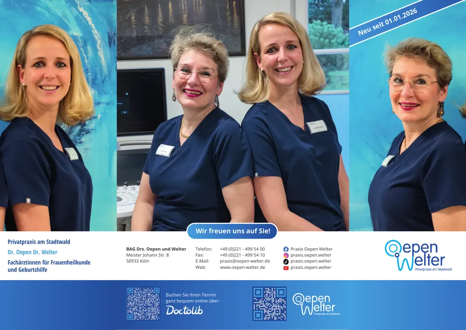
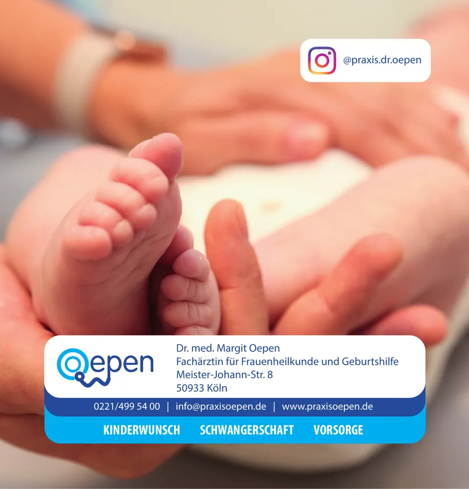
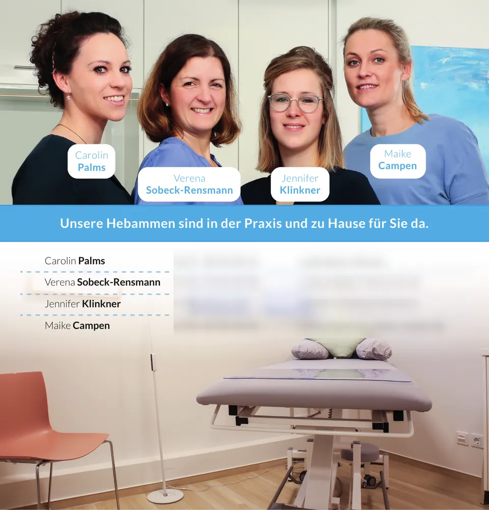
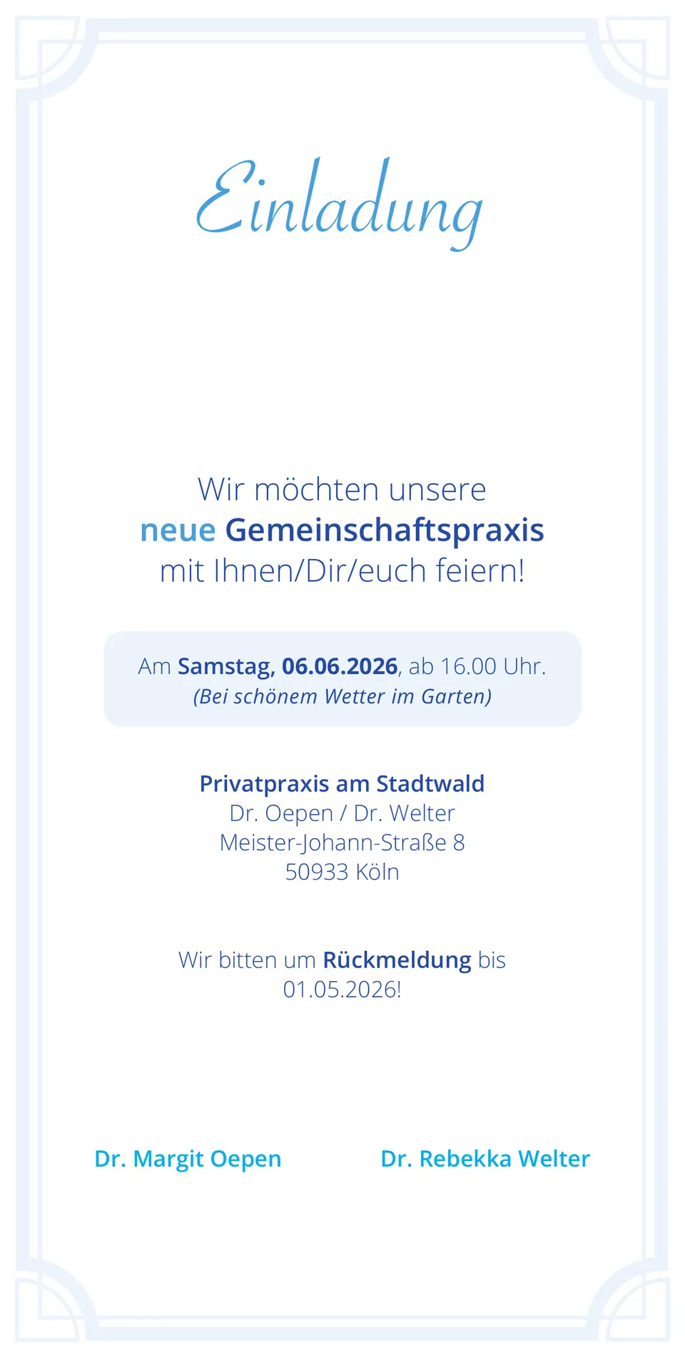
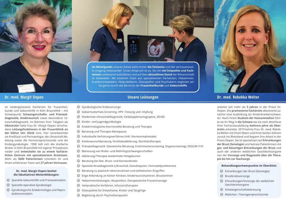
Over time a number of printed pieces have been produced for the practice: the practice flyer, invitation cards in DL format, the midwife card and a tiled wall for the practice rooms.
The midwife card is the piece I enjoyed most. An expectant mother is handed it and keeps it for months — it ends up on the fridge or in her maternity record. So it has to take some wear: information you look up again and again, in a format nobody throws away.
Everything was delivered print-ready with bleed. The design follows the website so that practice and paper belong together — whoever holds the card and later opens the site should recognise the same place.
Colours
- Huelveño Horizon#00A8E4Practice blue
- Vanderbilt Beach#D8CCB4Paper tone
- Creeping Death#0C1824Text
Typeface
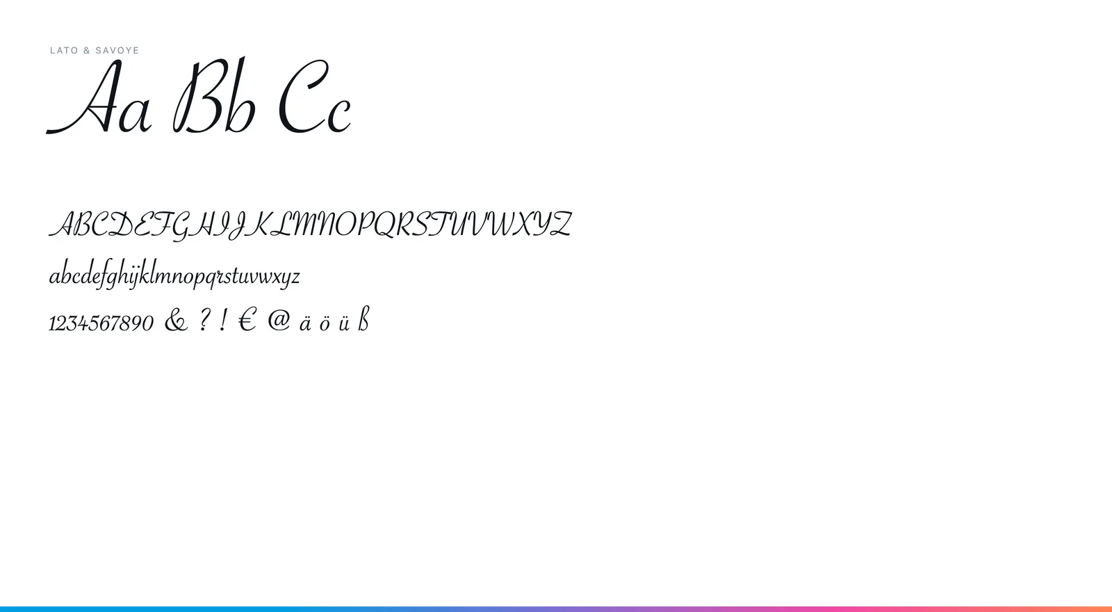
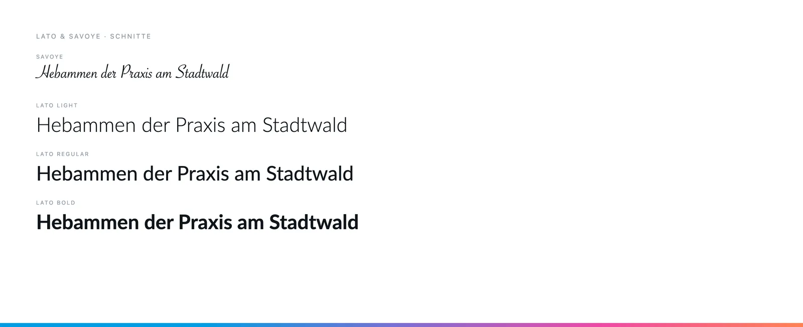
Lato in Hairline, Light, Regular and Bold — the same family as the website, so practice and paper belong together. The invitation cards add Savoye as a script face.