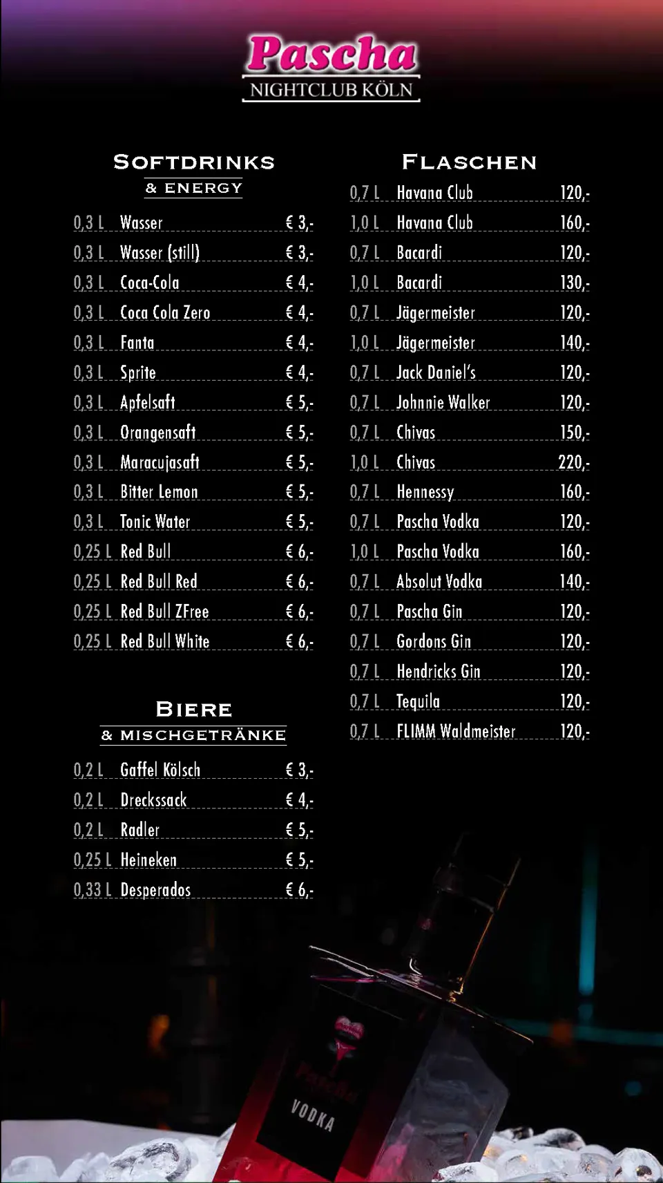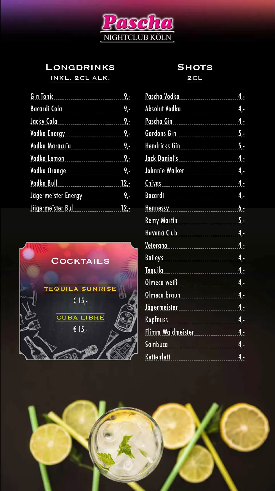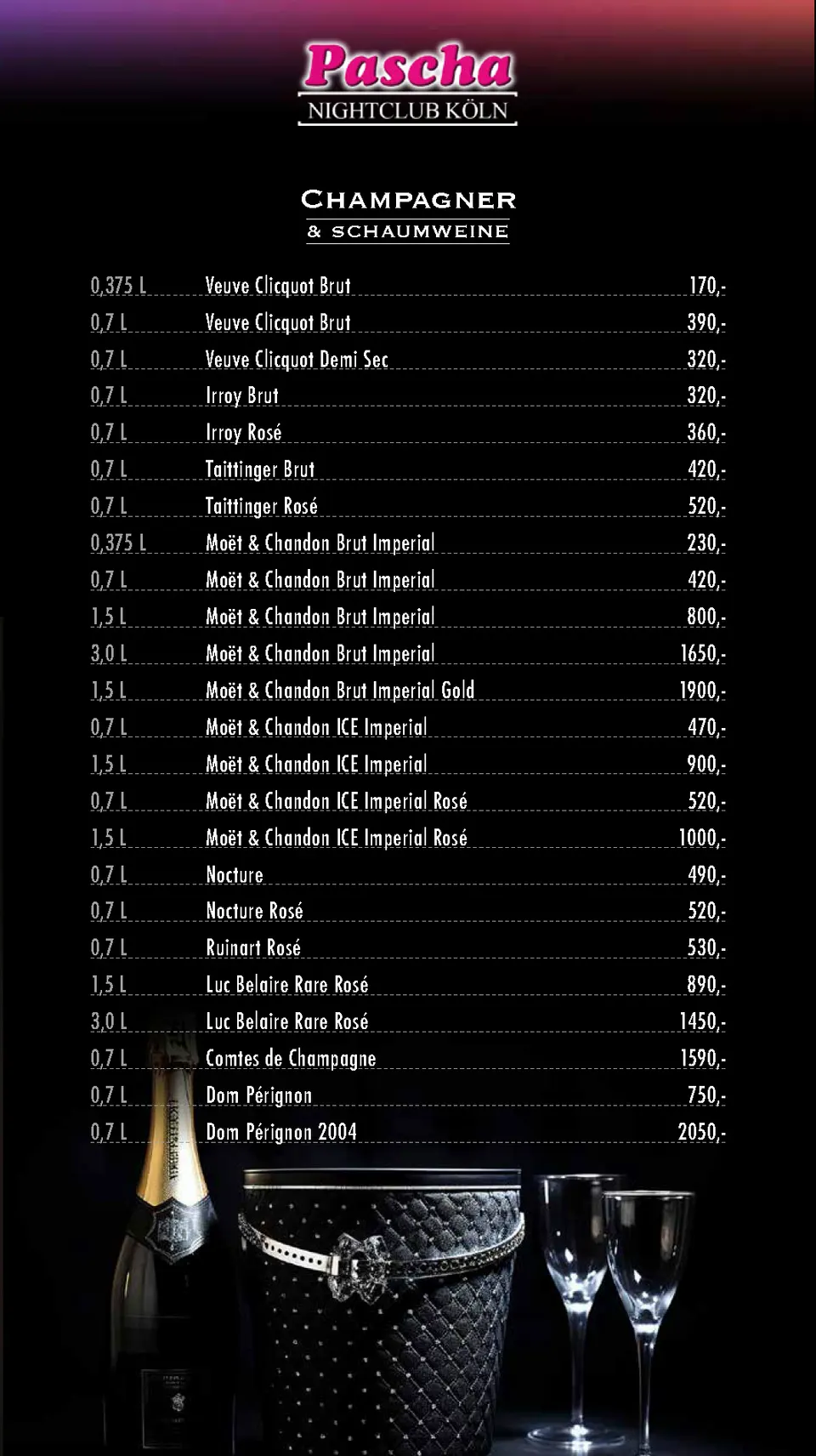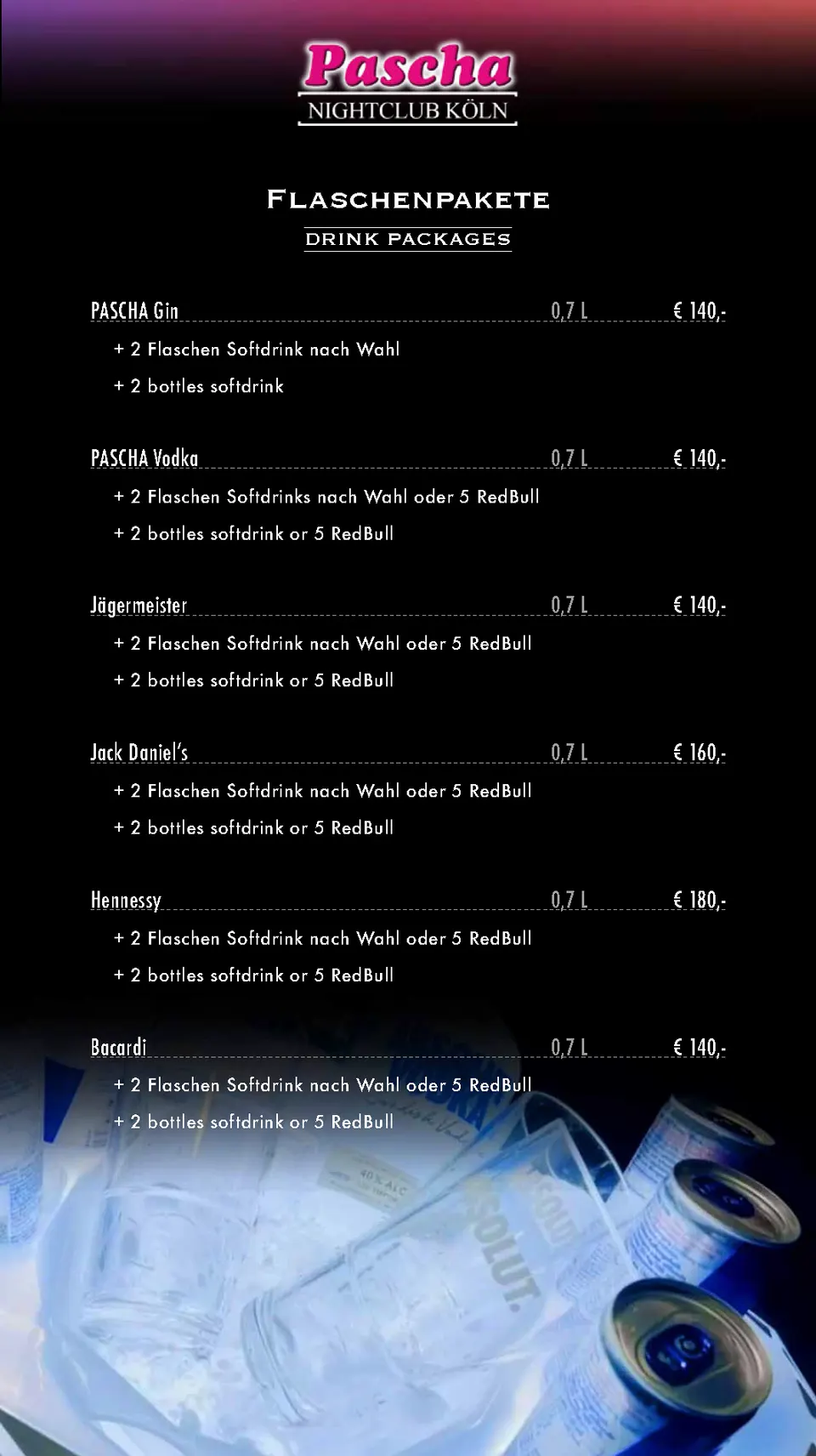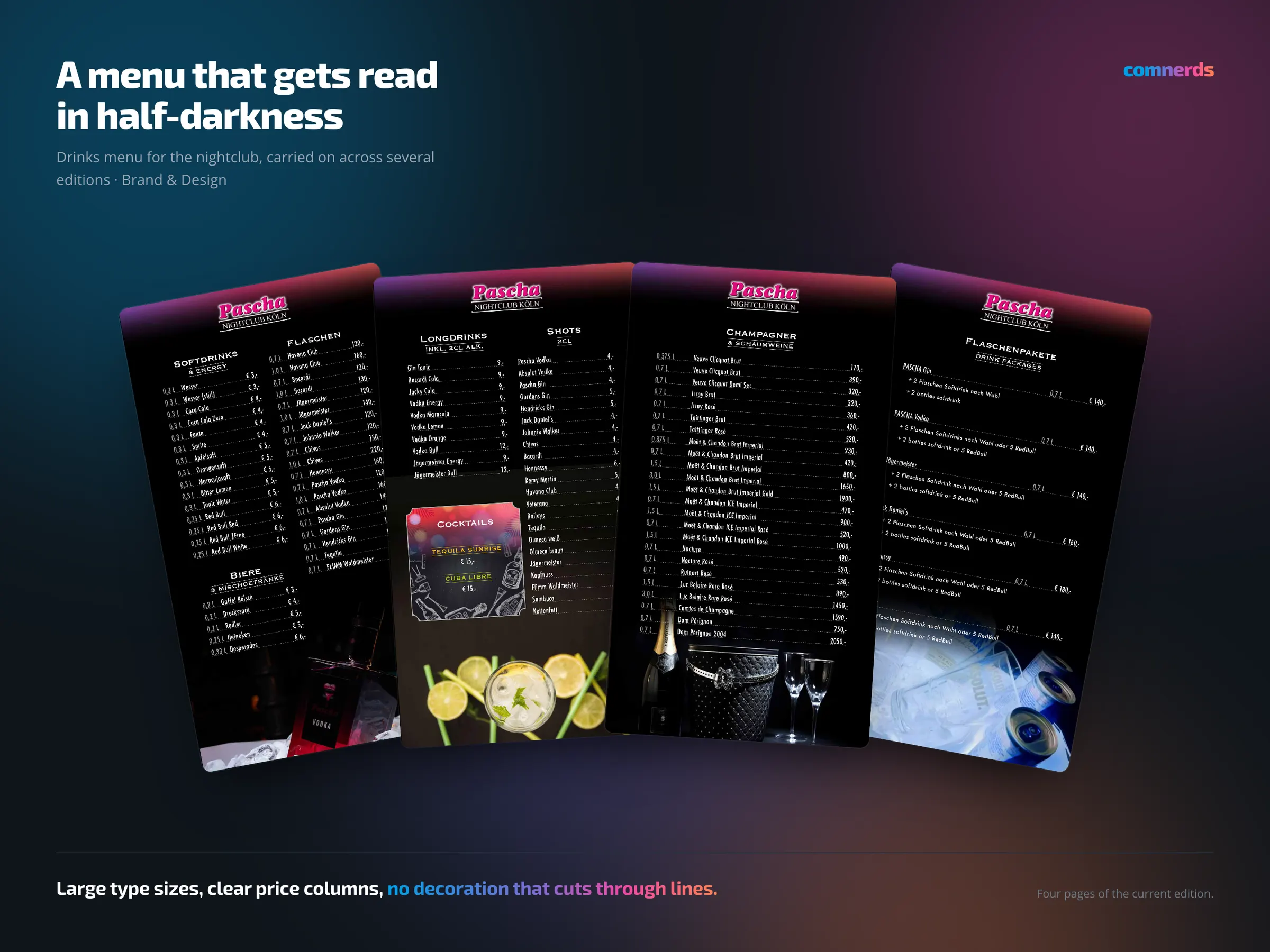
The drinks menu for the nightclub, typeset in InDesign and carried on across several editions.
The conditions decide everything here: it is read in dimmed light, often with a glass in the other hand, by guests who do not want to study it but to find something quickly. So: large type sizes, clear price columns, hard grouping by type of drink and no decorative elements that cut through lines. The Vis-a-Vis cocktail, the house speciality, gets a place of its own.
A menu is one of those printed pieces that is handled most often and consciously noticed least. That is exactly how you can tell whether it works.
Colours
- Black#000000Ground
- Magentarama#C82870Logo and rules
- Silver#C0C0C0Price columns
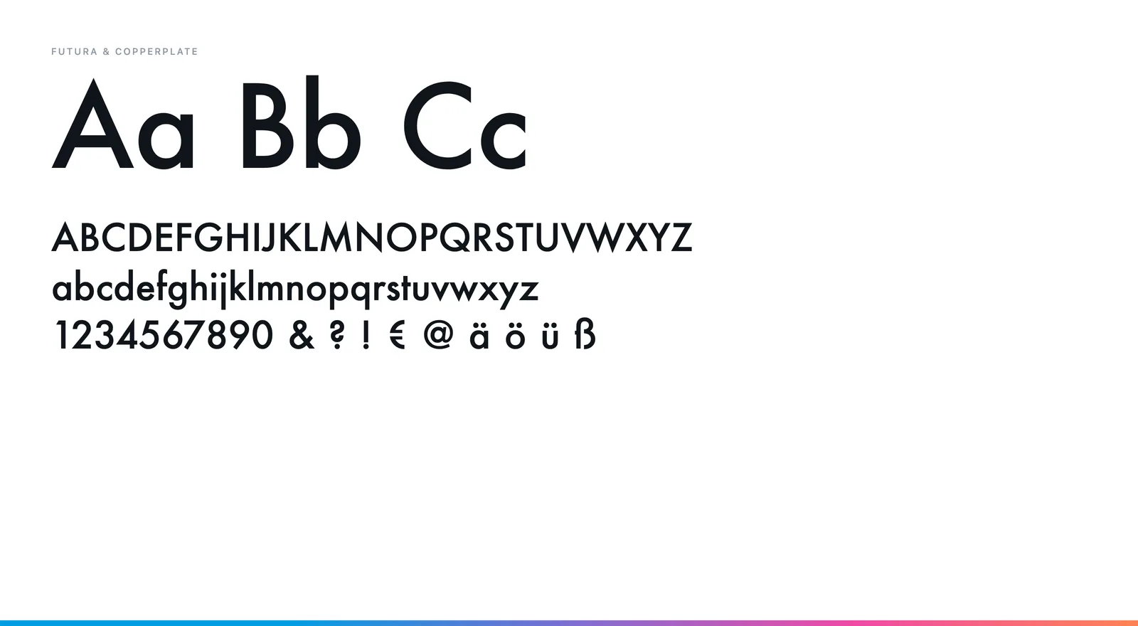
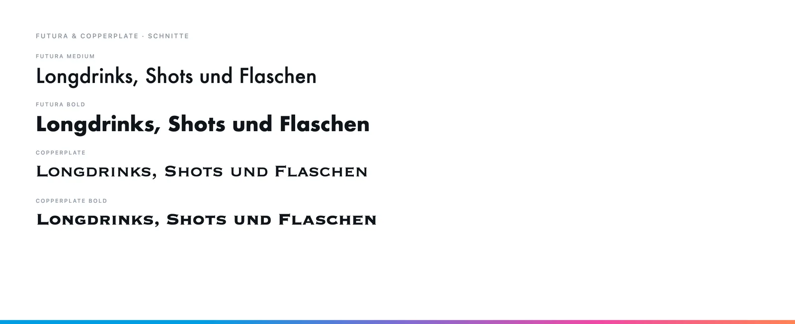
Typeface
Futura in Medium and Condensed Medium for the entries, Copperplate for the section headings. Futura Condensed saves room in the price columns without looking cramped.