Brand & Design
Sue's Kitchen cookbook
A cookbook through four seasons — the same book in three production routes.
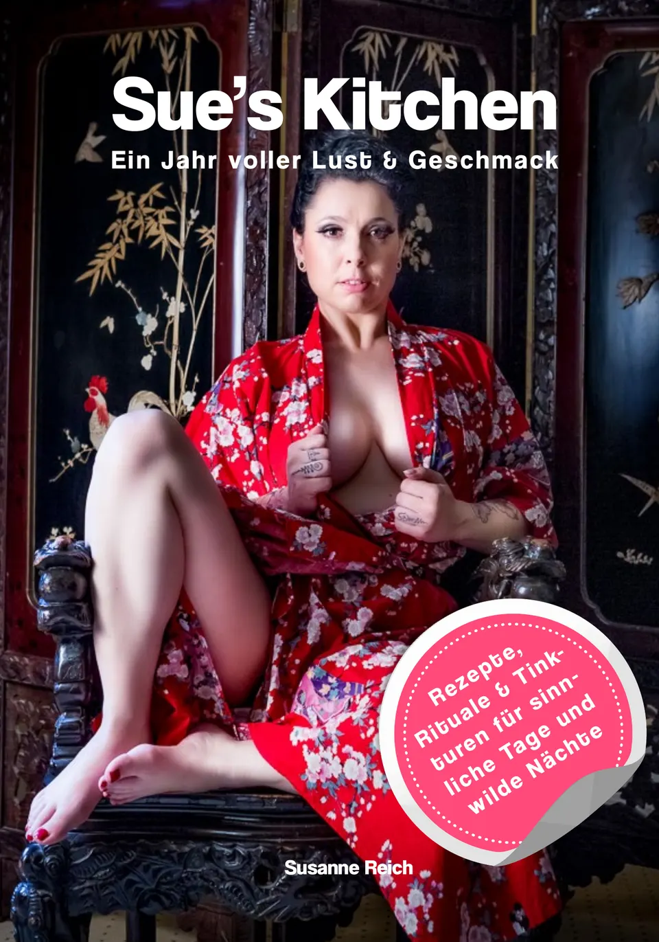
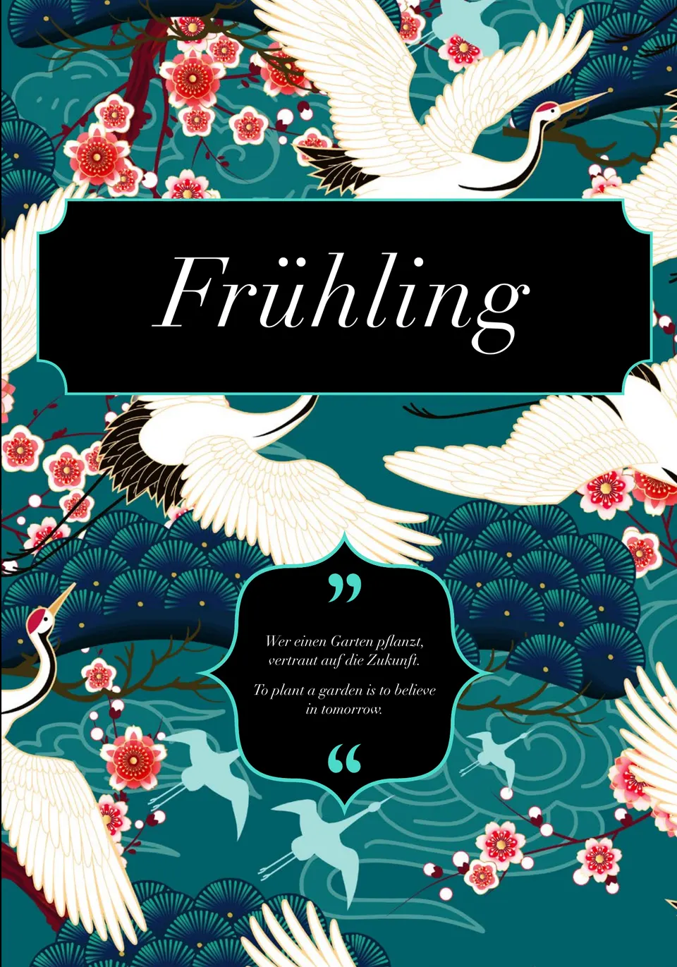
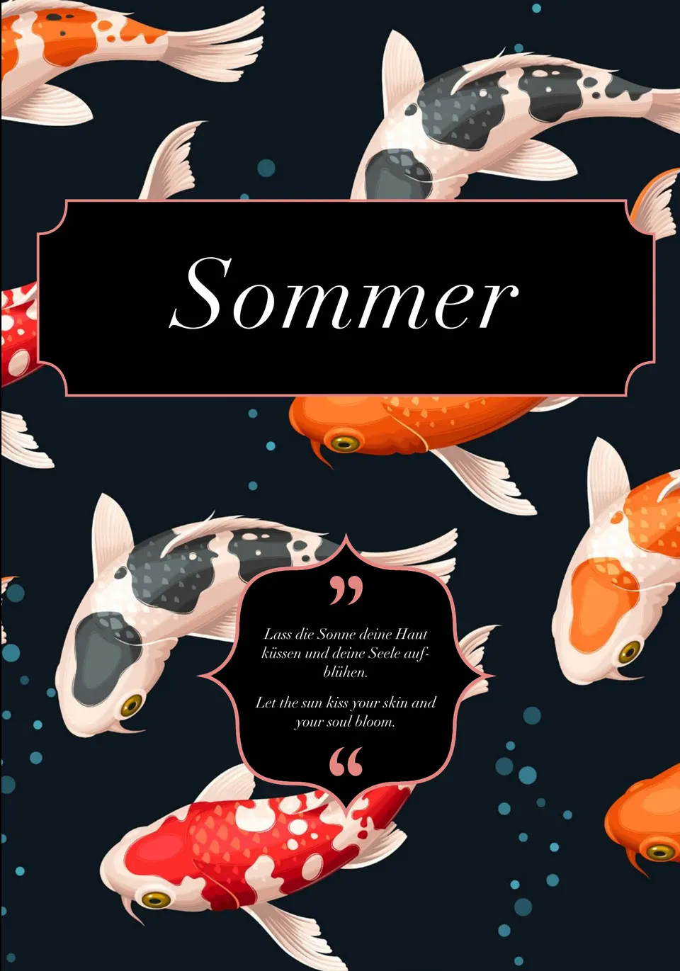
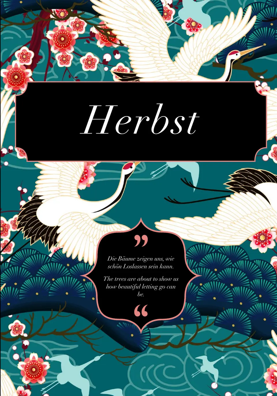
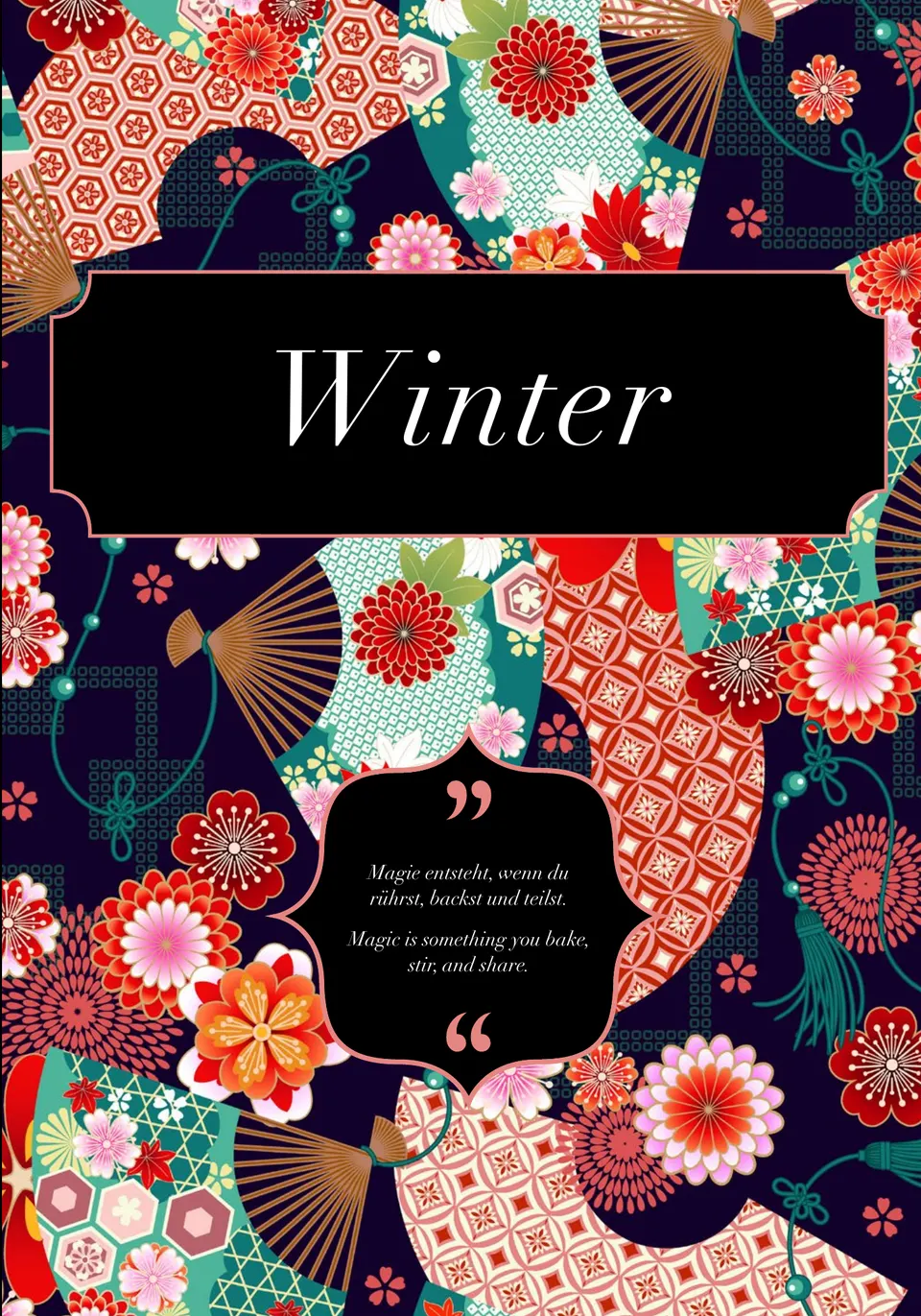
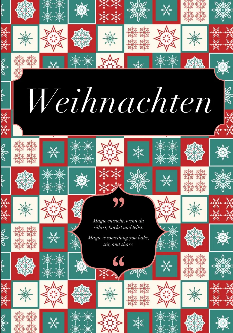
“Sue's Kitchen — Ein Jahr voller Lust & Geschmack” is a cookbook that follows the year: spring, summer, autumn and winter, plus Christmas and a chapter called After-Care. Every season gets its own opening page, its own colour world and a menu card showing what is coming in that part.
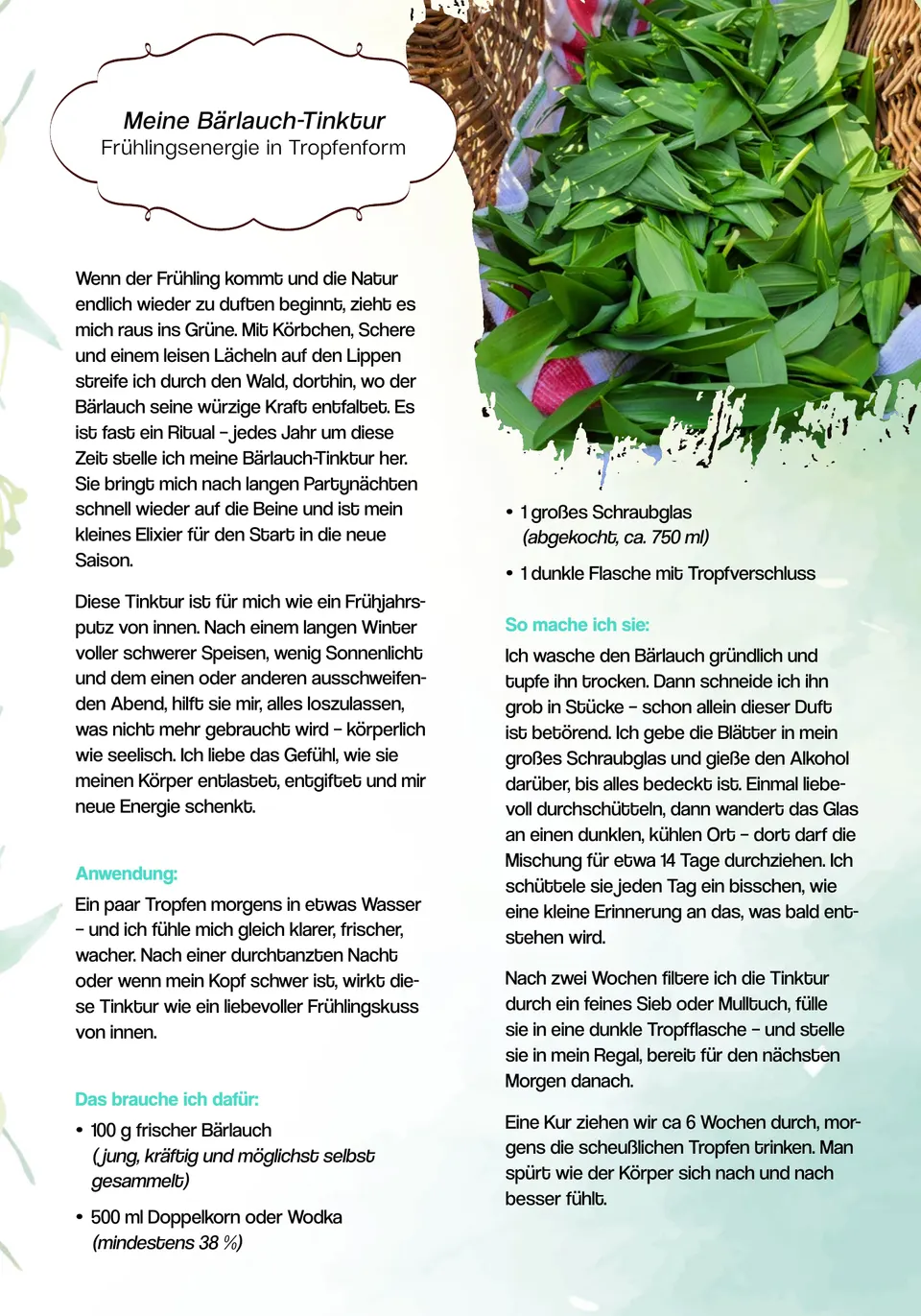
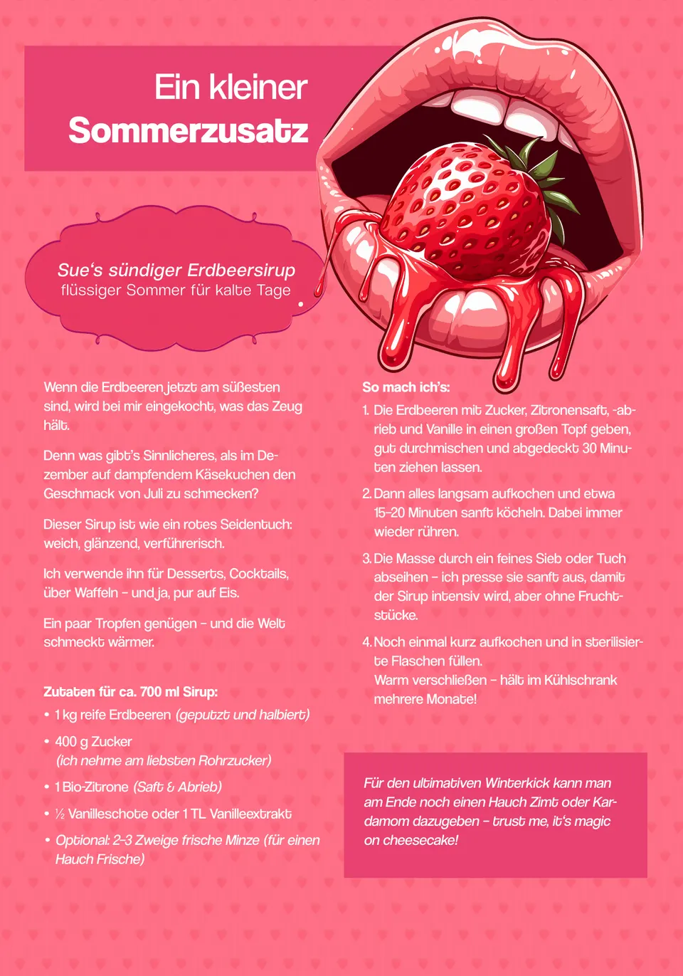
The work sits less in the individual recipe than in the rhythm. A recipe consists of a backstory, an ingredient list, a method and often an effect as well — four kinds of text that fall differently on every page, depending on how long the list is and how many photographs belong to it. To keep that from falling apart, a fixed grid runs underneath everything: recipe titles always in the same shape, ingredients always on the left, method always on the right, photographs always bled off the edge.
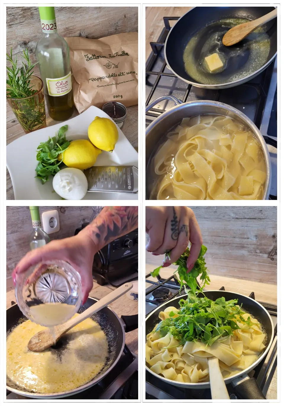
The photographs come from the author herself, from her own kitchen, not from a picture agency. That means different lighting, different formats, different quality. Part of the work was picture editing — selecting, cropping, matching, and where a photograph does not carry, working with illustration and flat colour instead of blowing it up.
The book exists in three versions: paperback, hardcover and a PDF edition for the Etsy shop. Three versions means three type areas, three bleed logics and three colour profiles. A hardcover does not forgive a tight gutter that a PDF never sees.
Typeset in InDesign, delivered print-ready. Distribution runs through Amazon KDP and the Etsy shop, which I also built.
Colours
- Wild Watermelon#FC6C84Summer
- Sandhill Crane#006060Winter
- Backlight#FCF0E4Paper tone
Typeface
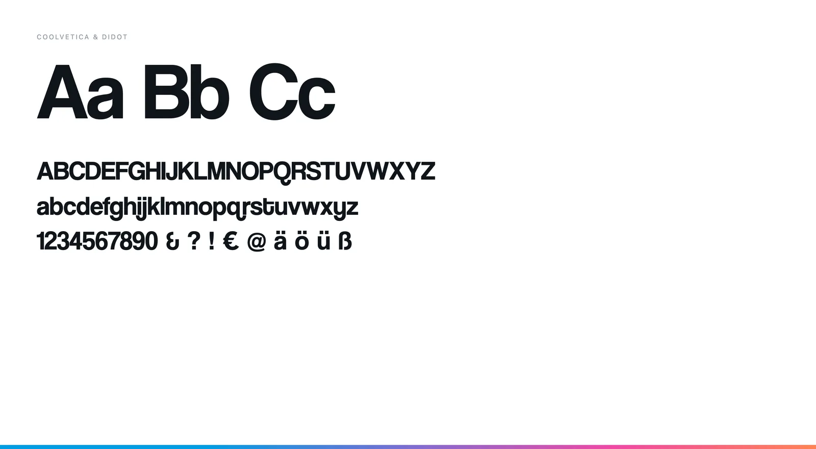
Coolvetica for recipe titles and opening pages, Didot italic for the linking texts. The seasons differ in colour, not in type — the grid stays the same across 80 pages.