Brand & Design
Information brochure on separation and divorce counselling
A brochure for people who have just lost track of everything.
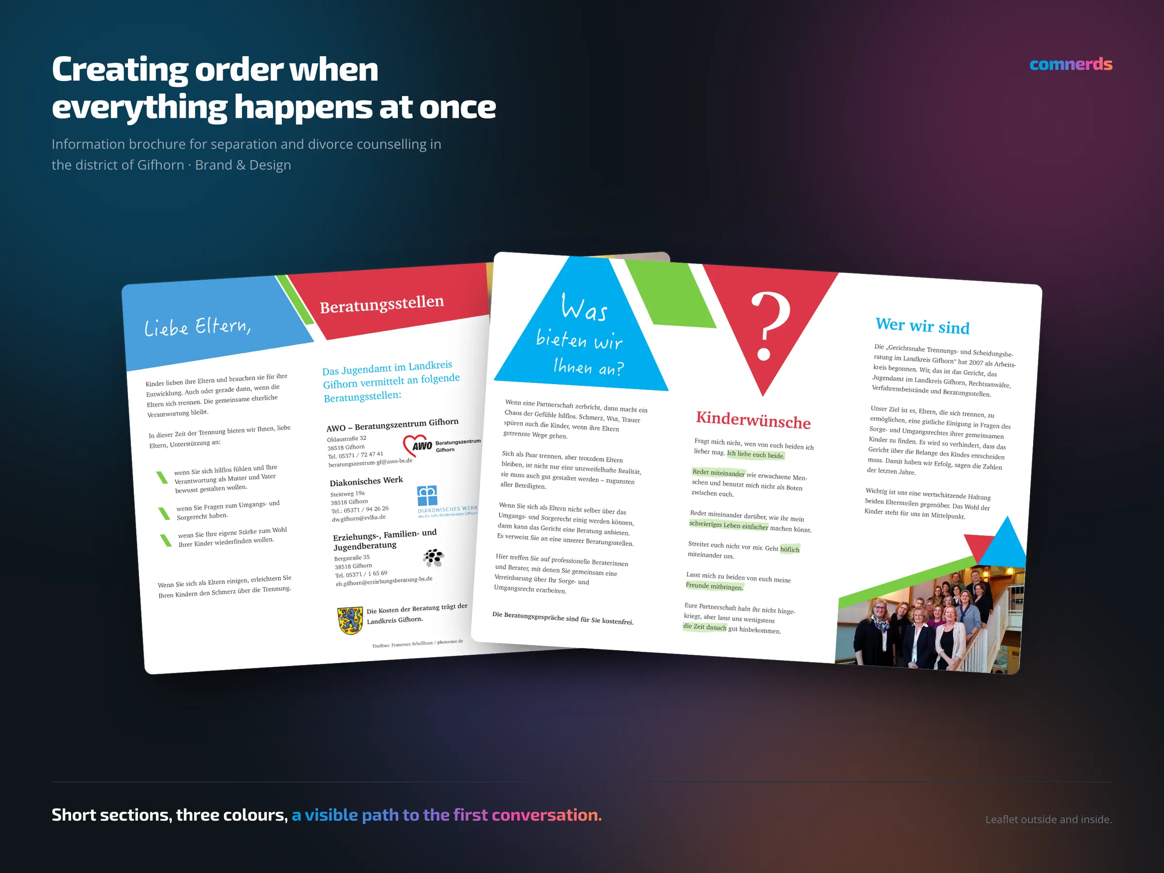
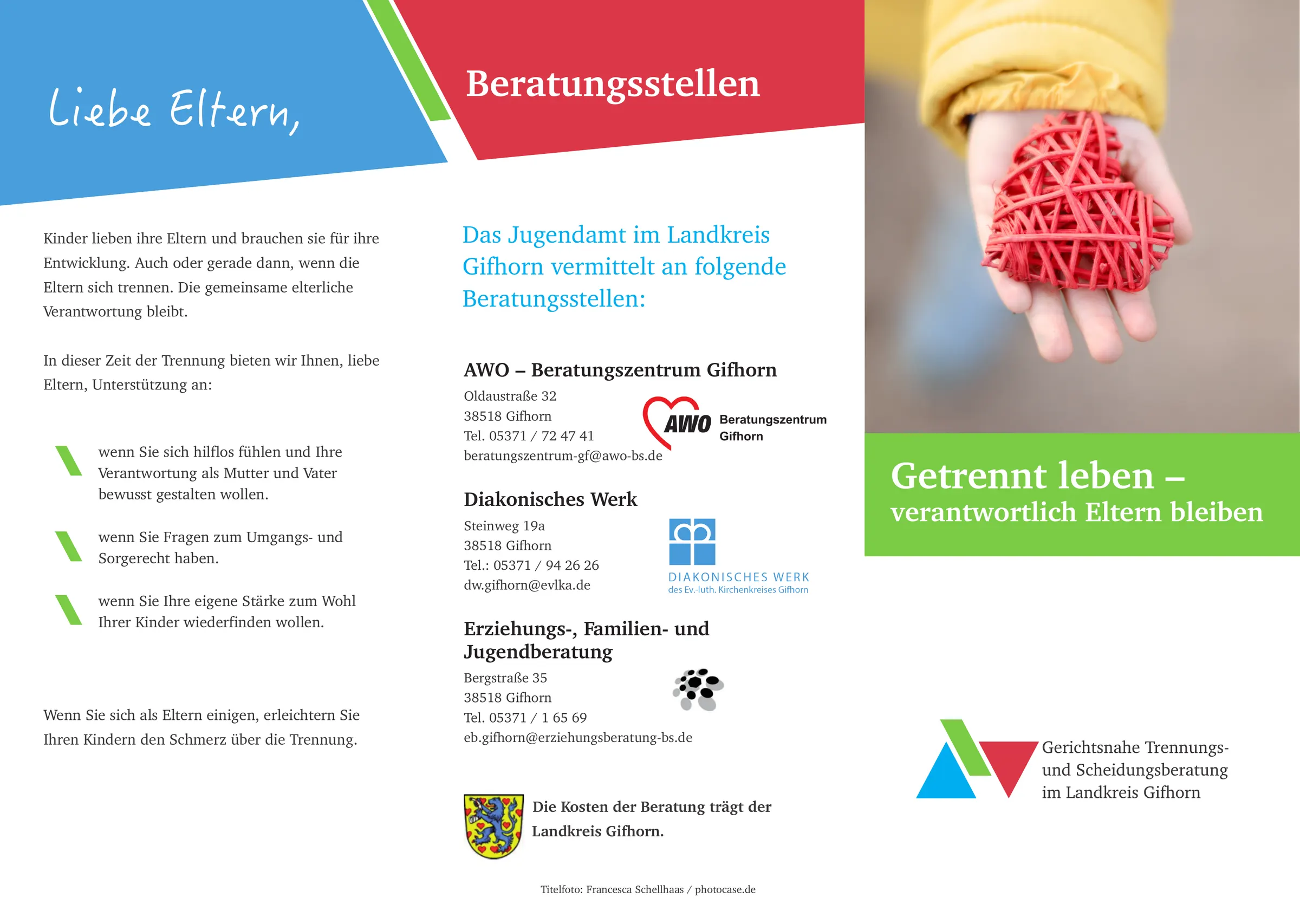
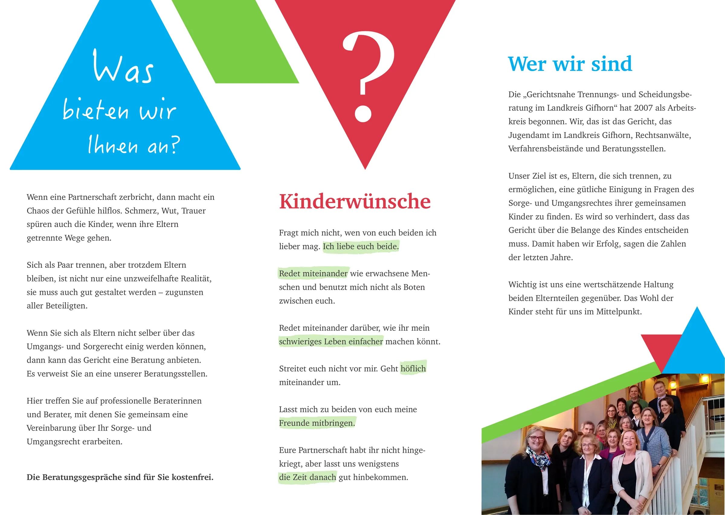
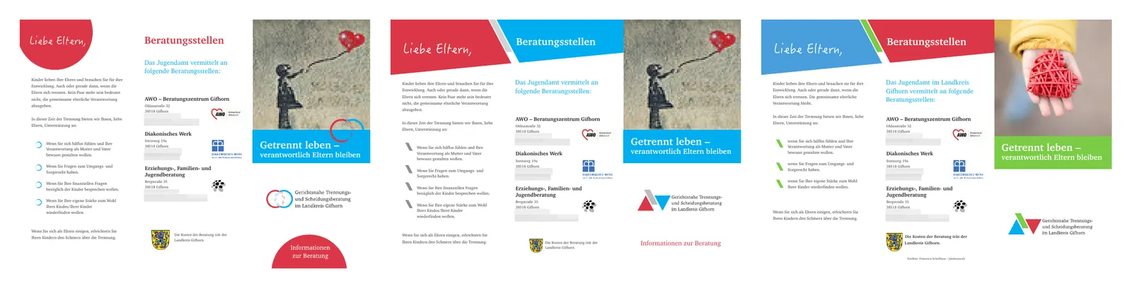
Information brochure for the court-related separation and divorce counselling in the district of Gifhorn — a leaflet the youth welfare office hands to parents and that refers them to three counselling centres. Anyone who opens it is in a situation where many things are happening at once — legally, financially, with children, emotionally.
The design therefore has one single task: to create order. Short sections, clearly separated topics, three colours for three areas, a visible path to the first conversation. The salutation “Dear parents” in a handwriting face so the brochure does not look like an official notice — the rest in a calm serif. Nothing that suggests you have to read the whole brochure before you are allowed to call.
Before the final artwork there were four drafts with different cover motifs; the drafting board shows three of them.
Colours
- Democrat#00ADEFBlue — parents
- Poppy Red#DC3747Red — counselling centres
- Jasmine Green#7ACC45Green — title and mark
Typeface
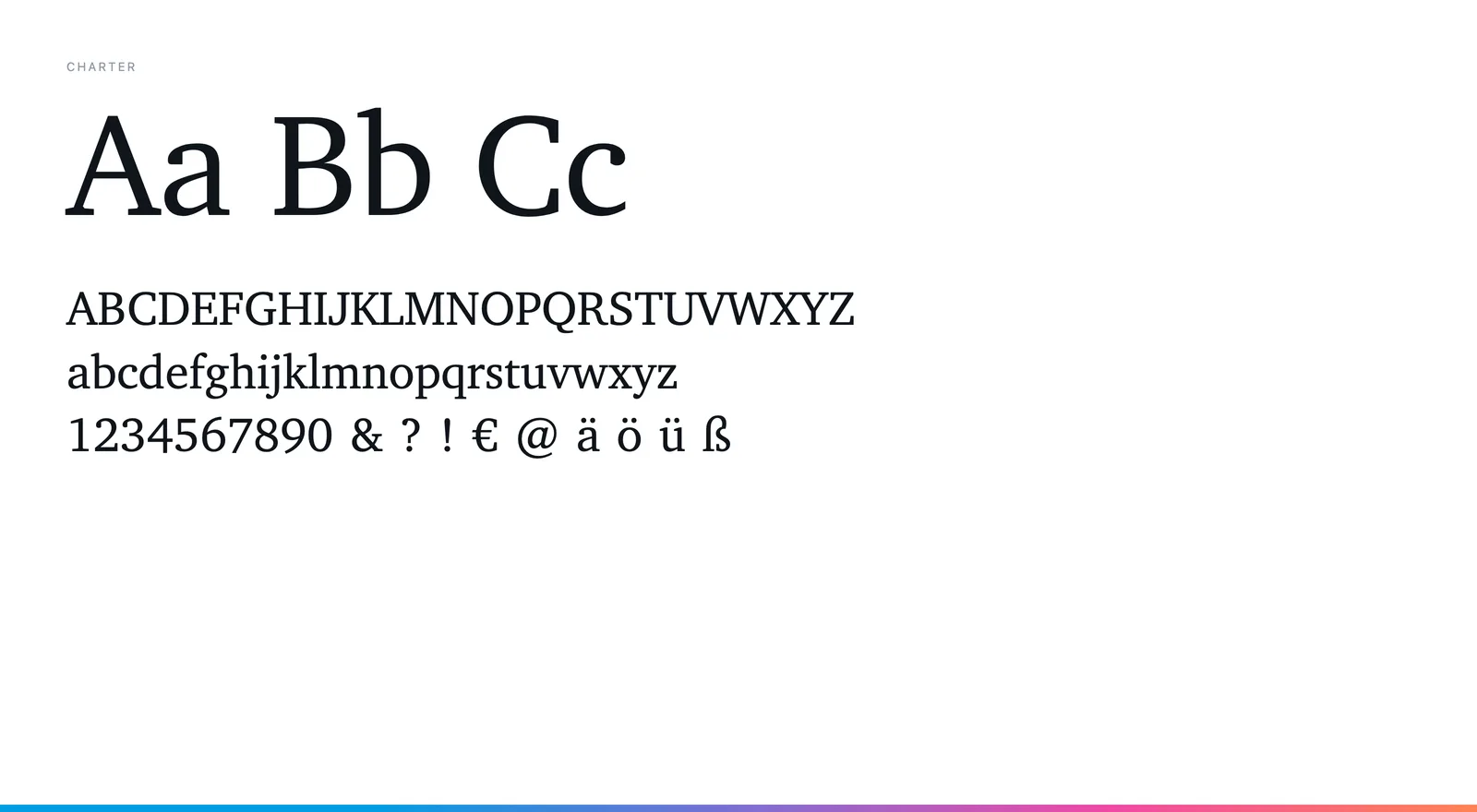
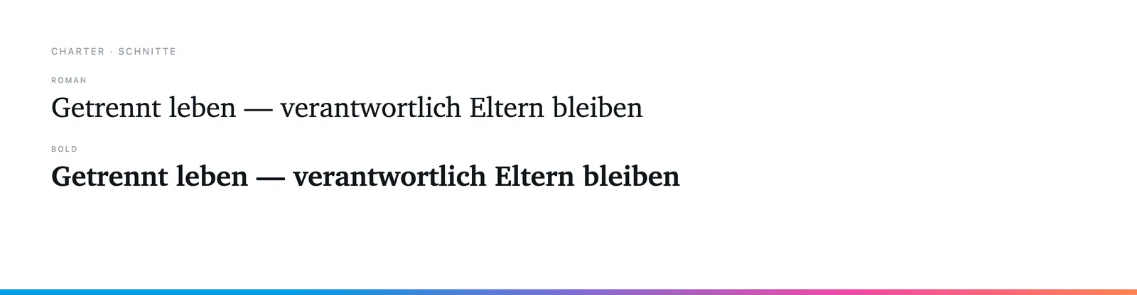
Charter in Roman and Bold — a serif that runs calmly on paper and does not dramatise the readers' situation. The salutations in HanziPen, a handwriting face, as a human counterpoint.