Brand & Design
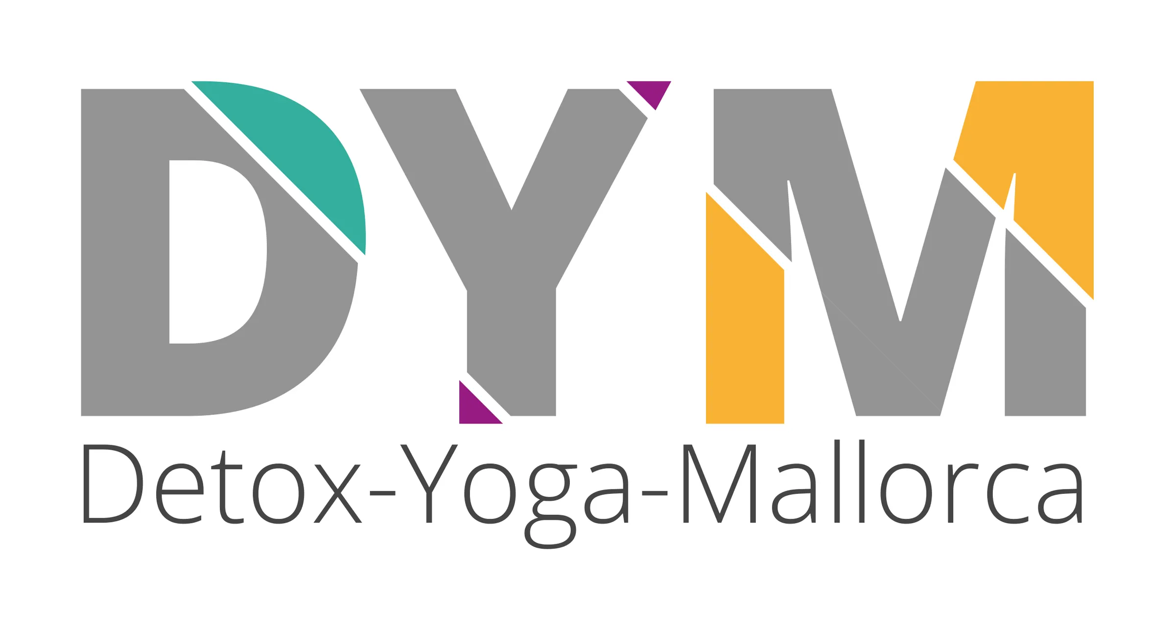
Detox Yoga Mallorca logo
Three letters, three colours — and a cut through each of them.
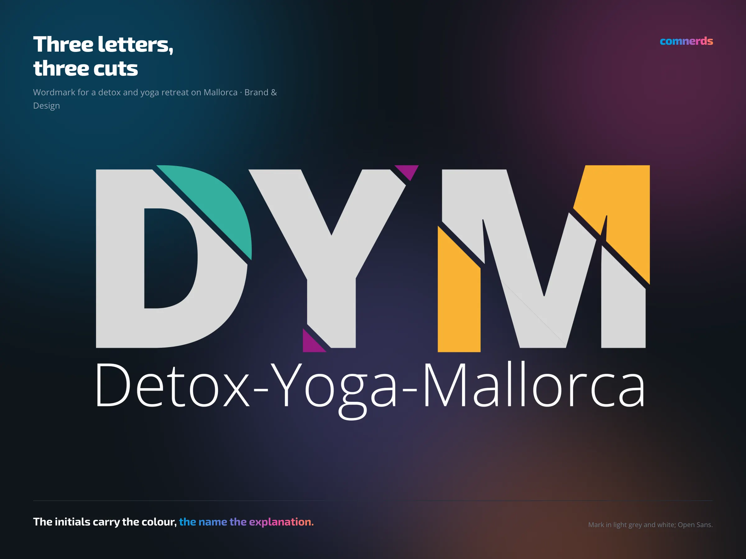
A wordmark for a retreat on Mallorca that combined detox programmes with yoga. The letters D, Y and M stand side by side, grey and heavy, and a diagonal cut through each of them opens up a coloured triangle: turquoise, violet, yellow. Below runs the name written out in full.
The thinking behind it is simple: an abbreviation on its own tells nobody anything, and three spelled-out words are too long for a mark. So the abbreviation gets the colour and the name does the explaining — anyone who sees the brand twice no longer needs the second line.
The retreat no longer exists. There was a website once; it can no longer be reached. What remains is the mark.
Colours
- Grey Shingle#949494Grey — letters
- Waterfall#34AE9ETurquoise — D
- Royal Purpleness#951B81Violet — Y
- Soft Boiled#F9B233Yellow — M
- Greenish Black#454445Name
Typeface
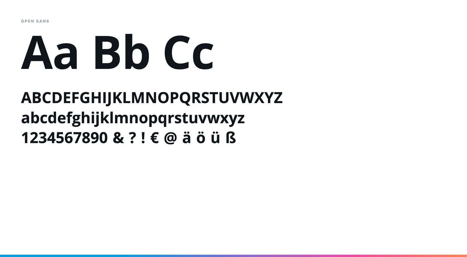
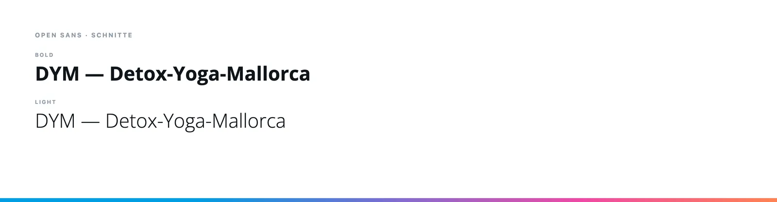
Open Sans — Bold for the initials, Light for the spelled-out name. The cuts sit in the heavy letters; the light line beneath explains without competing with them.