← Back to all work
Brand & Design
Frauenarzt Ngango logo
Two colours for two sides of the same speciality.
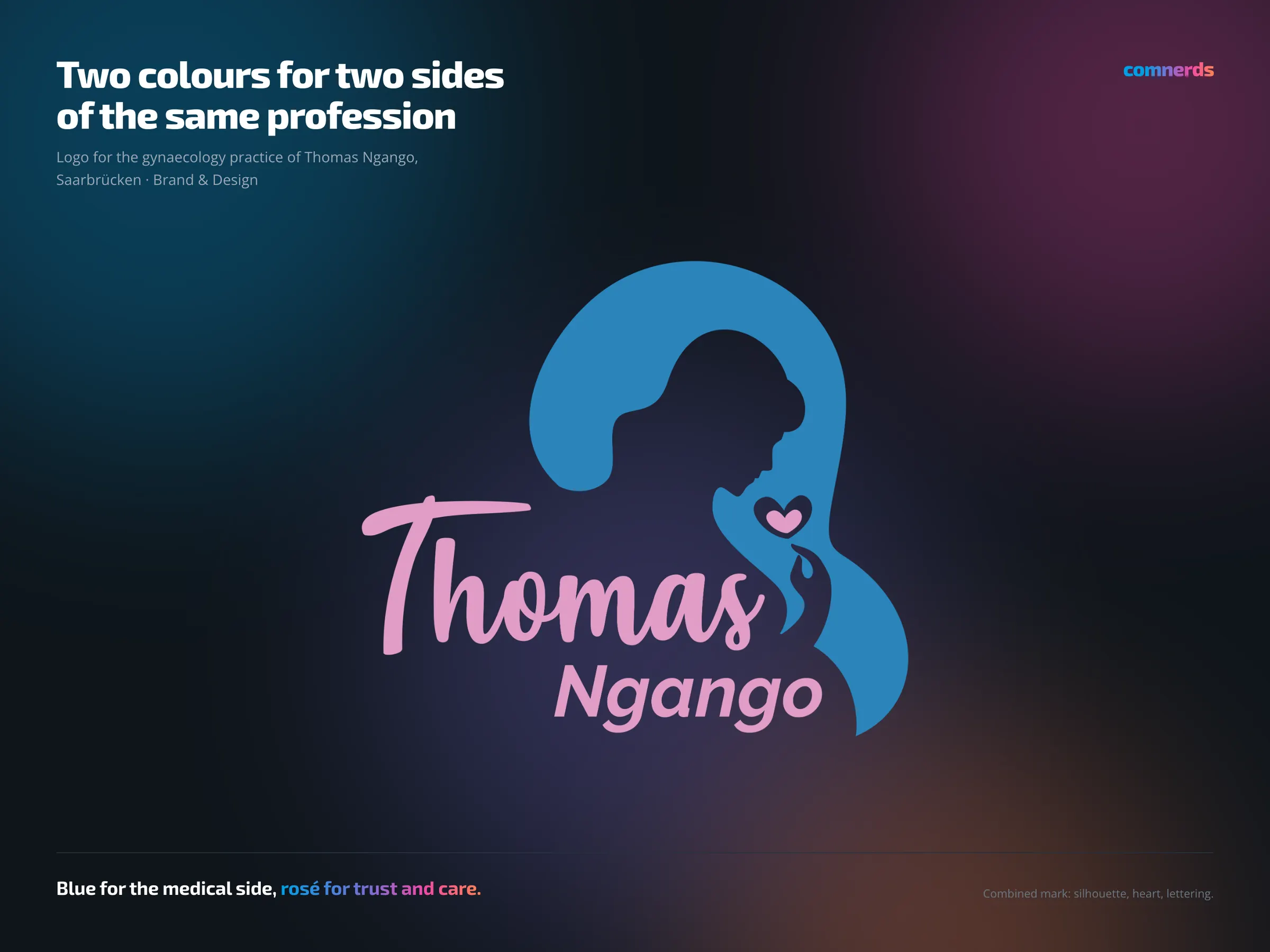
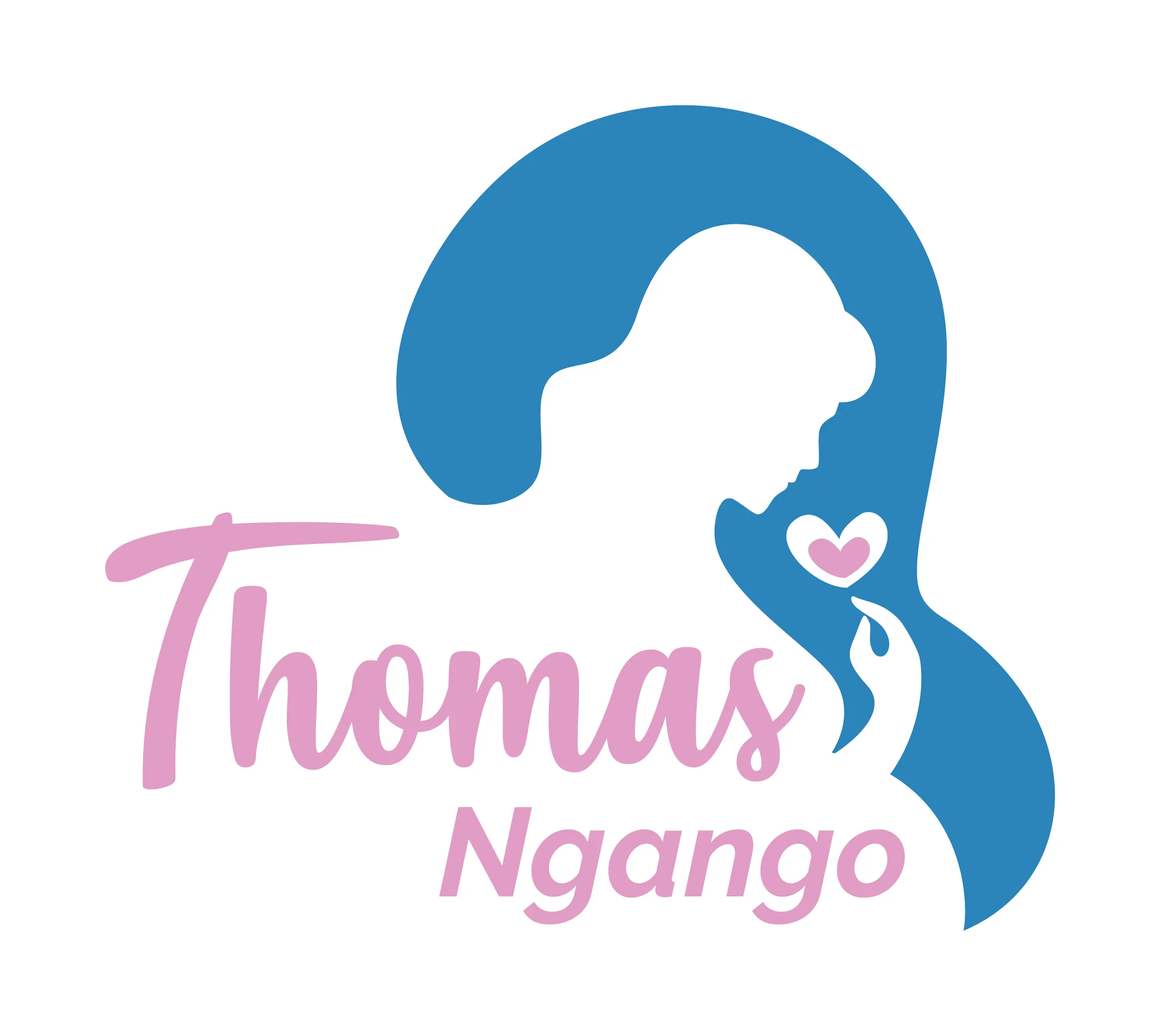
Combined word and picture mark for the gynaecology practice in Saarbrücken: the silhouette of a woman in blue, a small heart in rosé at her hand, and the name below — the first name in a script face, the surname in a plain italic.
The logo works with two tones: a cool blue for the medical, diagnostic, reliable side — and a warm rosé as counterweight, for the part of the work that is about trust and care.
The colour world of the logo later became the basis of the website, which appears here as a project of its own.
Colours
- Mediterranean Blue#2A84BBBlue — silhouette
- Lilac Chiffon#E09DC5Rosé — heart and name
Typeface
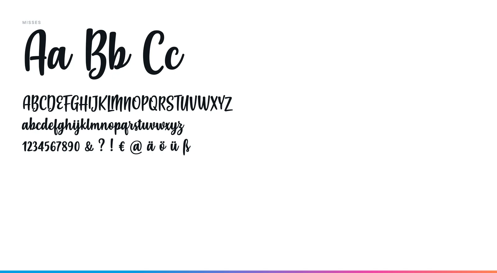
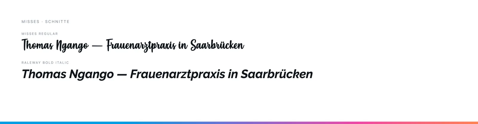
Misses for the first name — a brush script with a loose stroke —, Raleway Bold Italic for the surname. The script carries the warmth, the sans the legibility.