Brand & Design
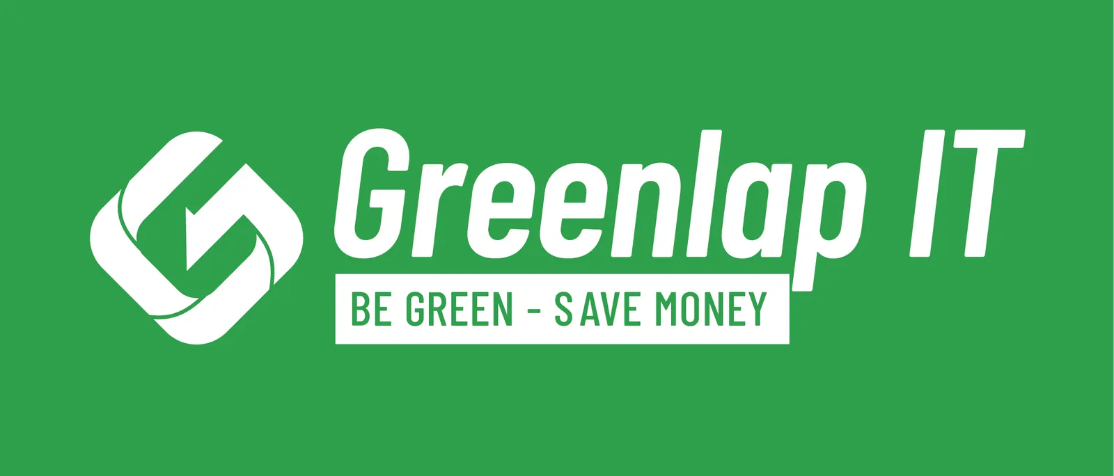
Greenlap IT logo
Refurbished hardware only sells if the mark does not look second-hand.
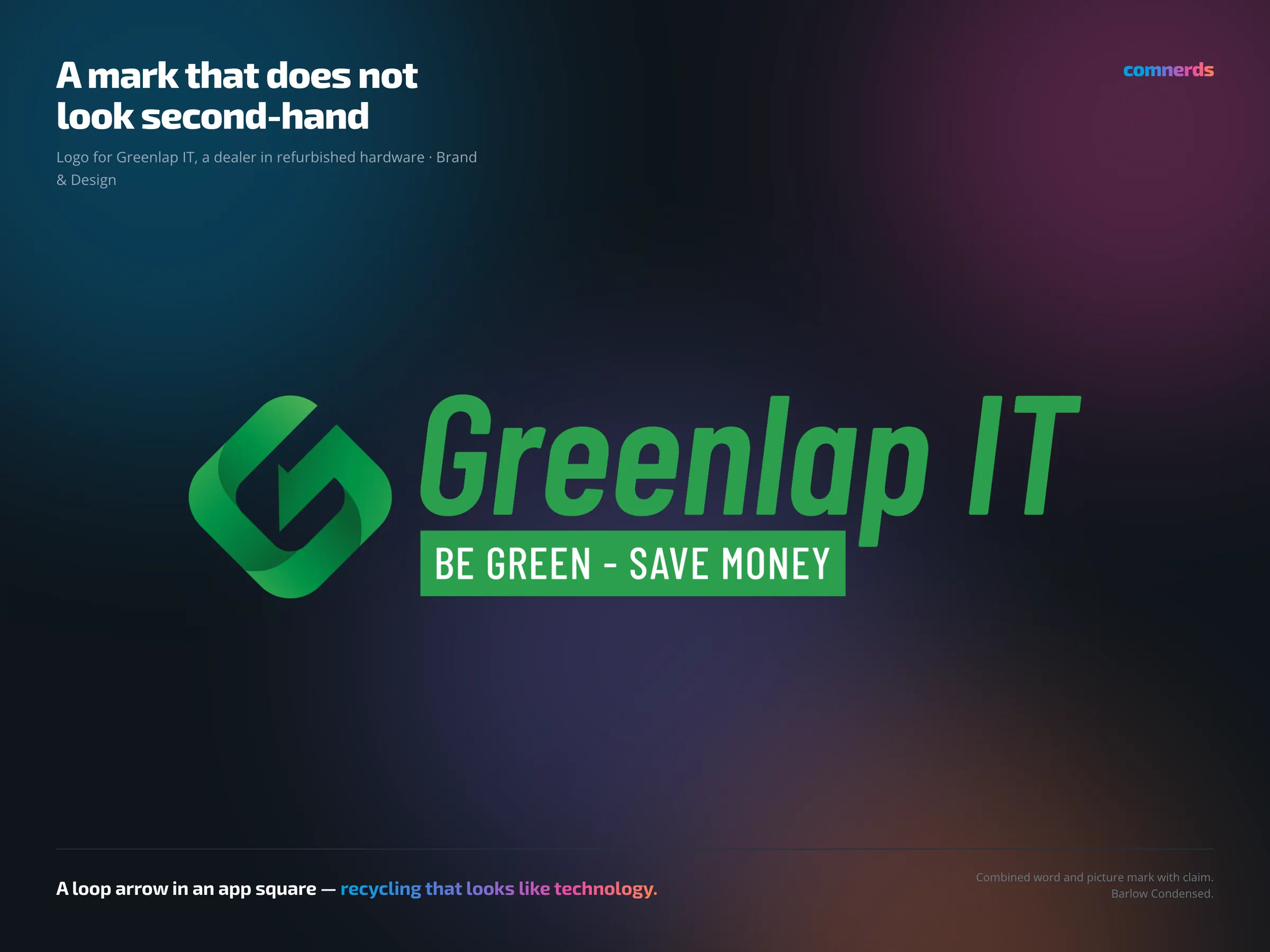
Greenlap IT deals in refurbished IT — devices that get a second life. The promise is ecological, but the reason people buy is entirely practical: good technology at half the price. A mark that leans only on green and recycling sells just half of that.
The signet therefore works with an arrow that runs back into itself — the cycle idea — but set inside a rounded square of the kind you know from an app icon. The green gradient gives it depth without tipping into nature study. The lettering stands beside it in italics, which brings pace, and underneath sits the claim “Be green – save money” in a green box so that it does not disappear as a footnote.
Delivered in several export sets: as PNG in eight widths for everyday use, as PDF for print and as SVG for screens — each positive on white and negative on green. What came of it is shown by the print material: flyers, rating sheet, business cards, sticker, packing tape and stamp.
Colours
- Get up and Go#2B9F4DWordmark and claim
- Ficus Elastica#0A6031Gradient, dark end
- Drop Green#62BA59Gradient, light end
Typeface
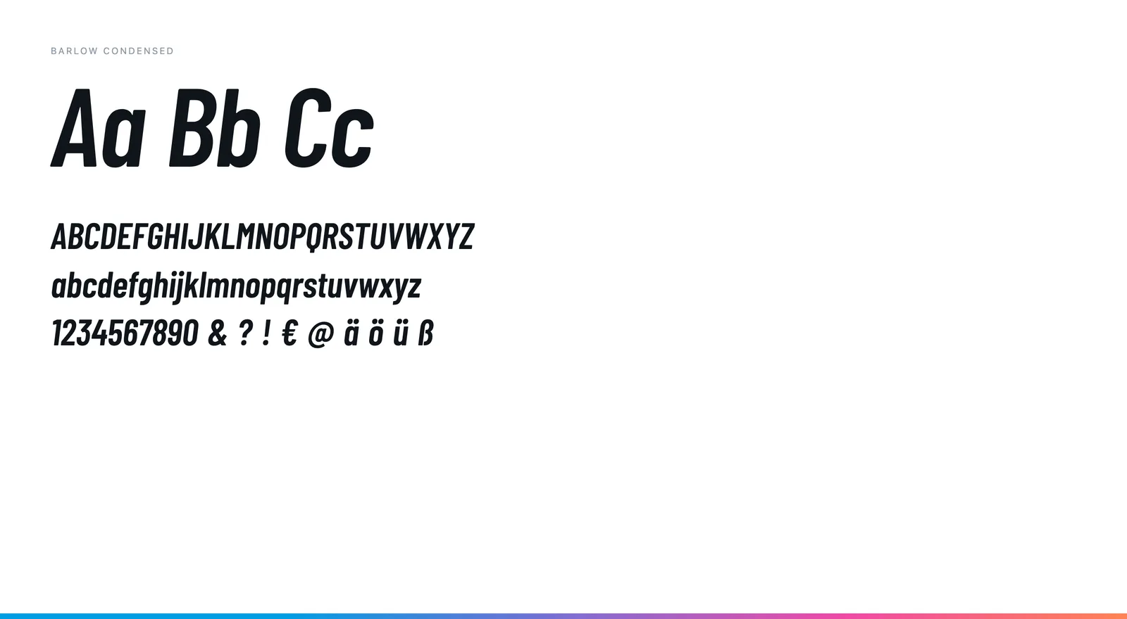
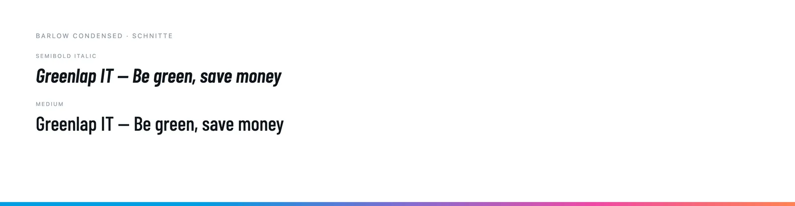
Barlow Condensed — SemiBold Italic for the wordmark, Medium in capitals for the claim. A narrow grotesque with a technical edge; the italic brings the pace a dealer needs.