← Back to all work
Brand & Design
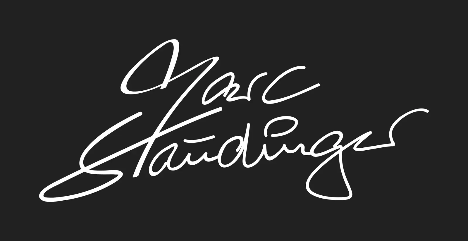
Marc Staudinger logo
Not a logo in the usual sense, but his signature.
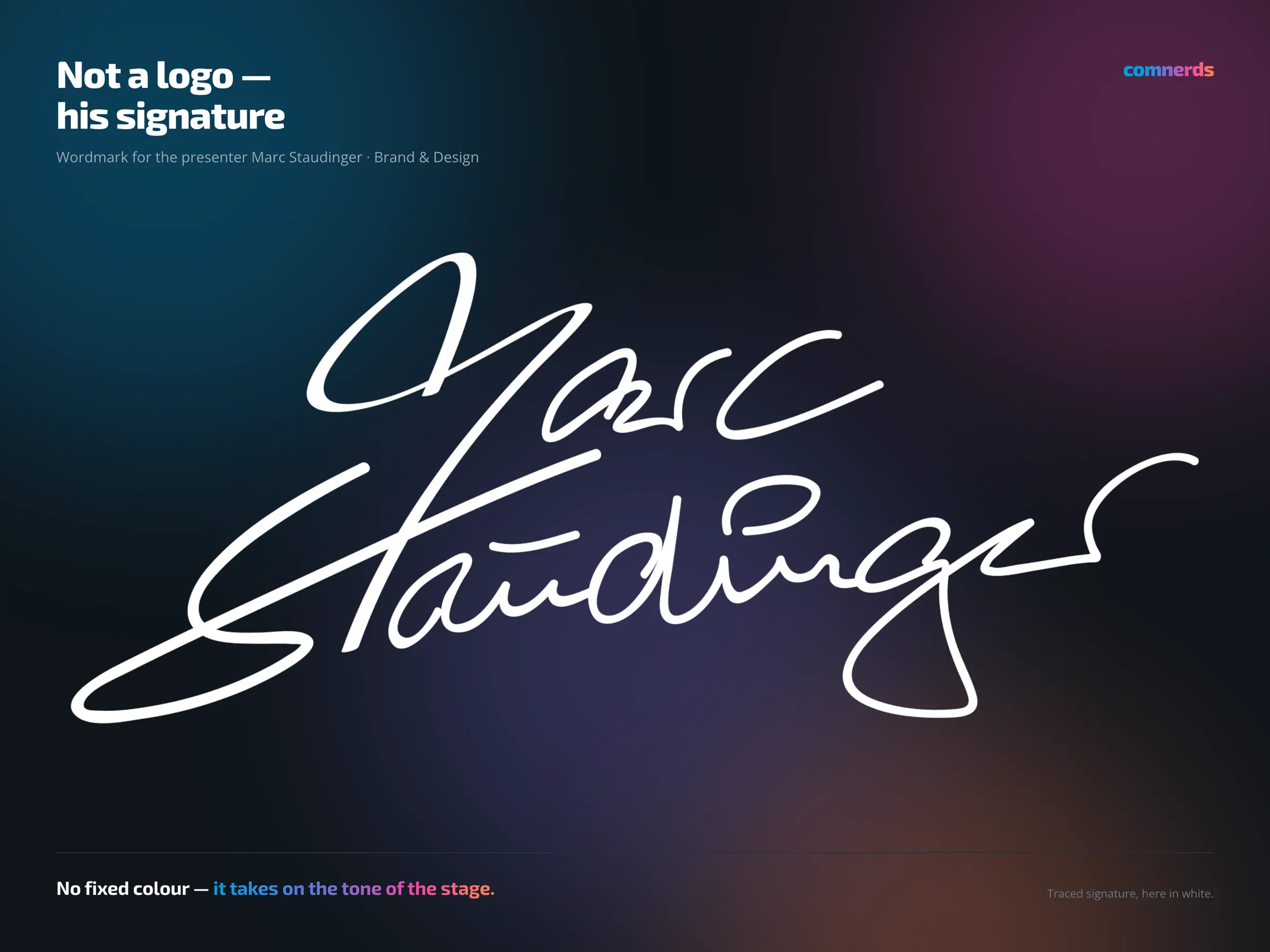
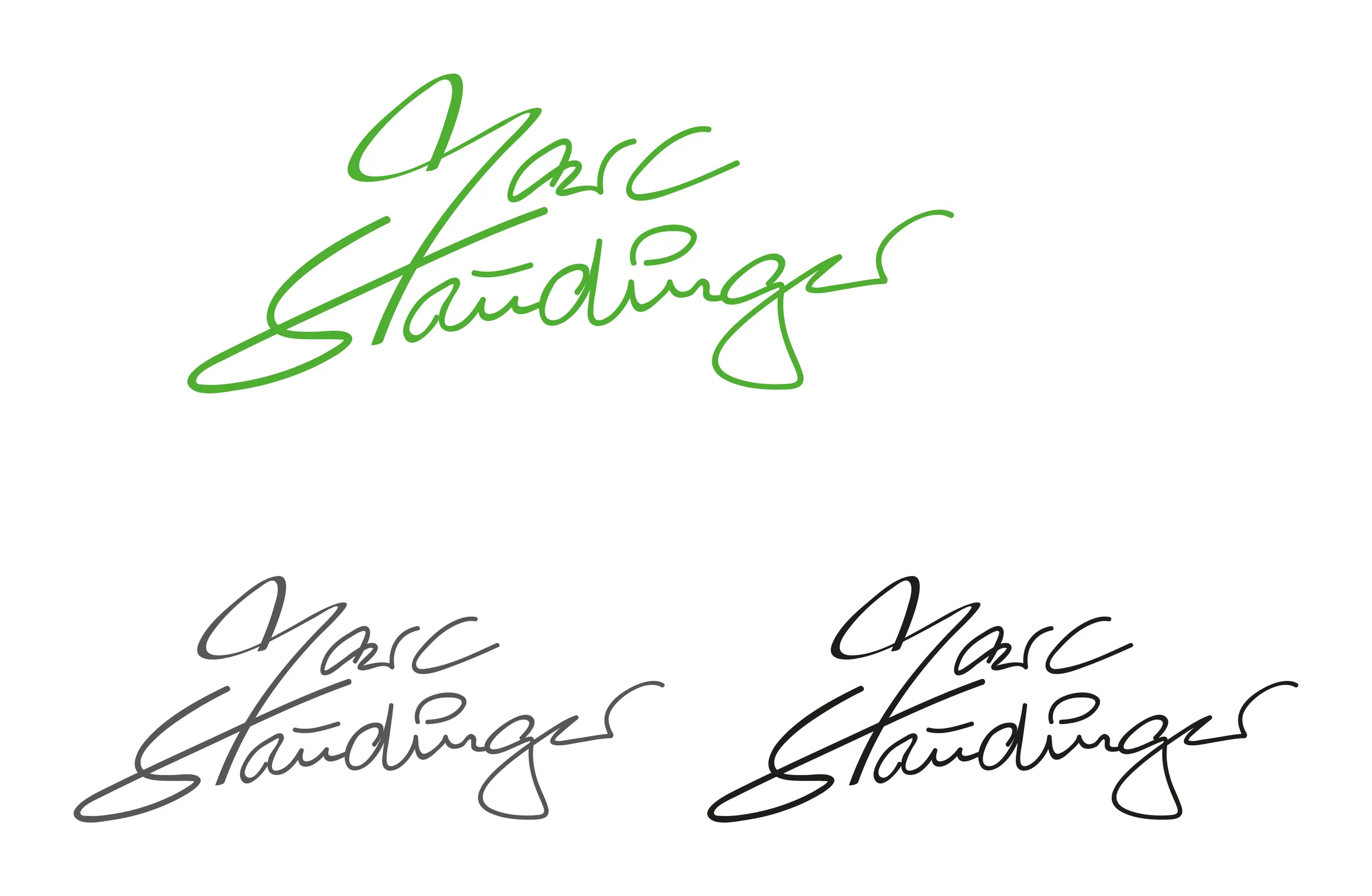
A wordmark for the presenter. It has no fixed colour, because it grew out of his signature — and a signature works in whatever tone it happens to be written in: black on a programme, white on a stage backdrop, in the organiser’s house colour on their material.
For someone who is constantly on other people’s stages and inside other people’s corporate designs, that is the more practical route. A logo with a fixed colour would have clashed with the client at every second event.
Colours
- Coco’s Black#1D1D1BBlack — print
- White#FFFFFFWhite — stage
- Sumi Ink#575756Grey — restrained
- Green Seduction#4FAE32Sample tone — an organiser's house colour
Typeface
No typeface: the lettering is his traced signature, set as a path in Illustrator and smoothed in stroke weight so it stays legible even small.