Brand & Design
Quartiersmanagement Steinen logo
A mark for an office whose job is to mediate — between the authorities, long-time residents and new arrivals.
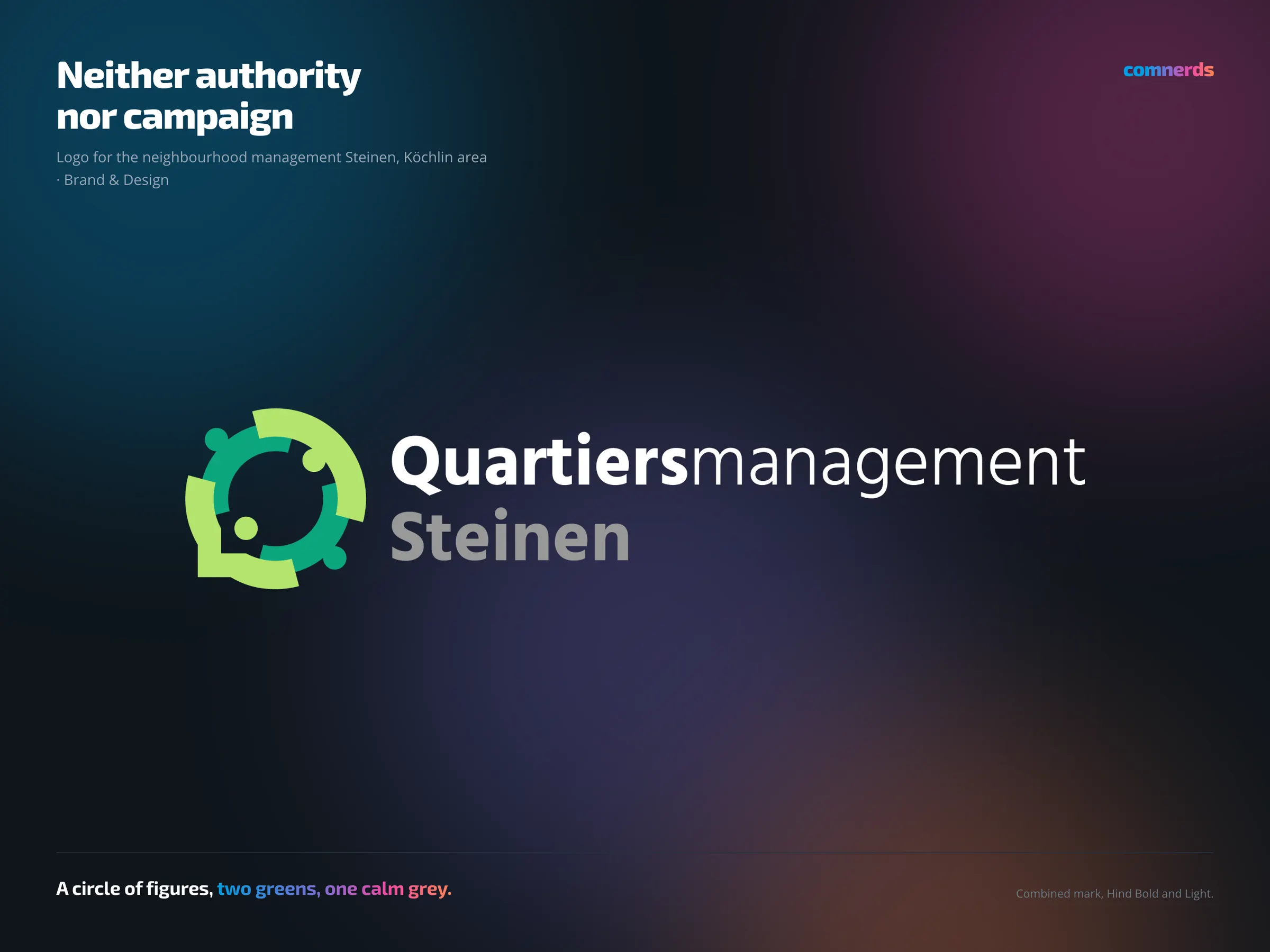
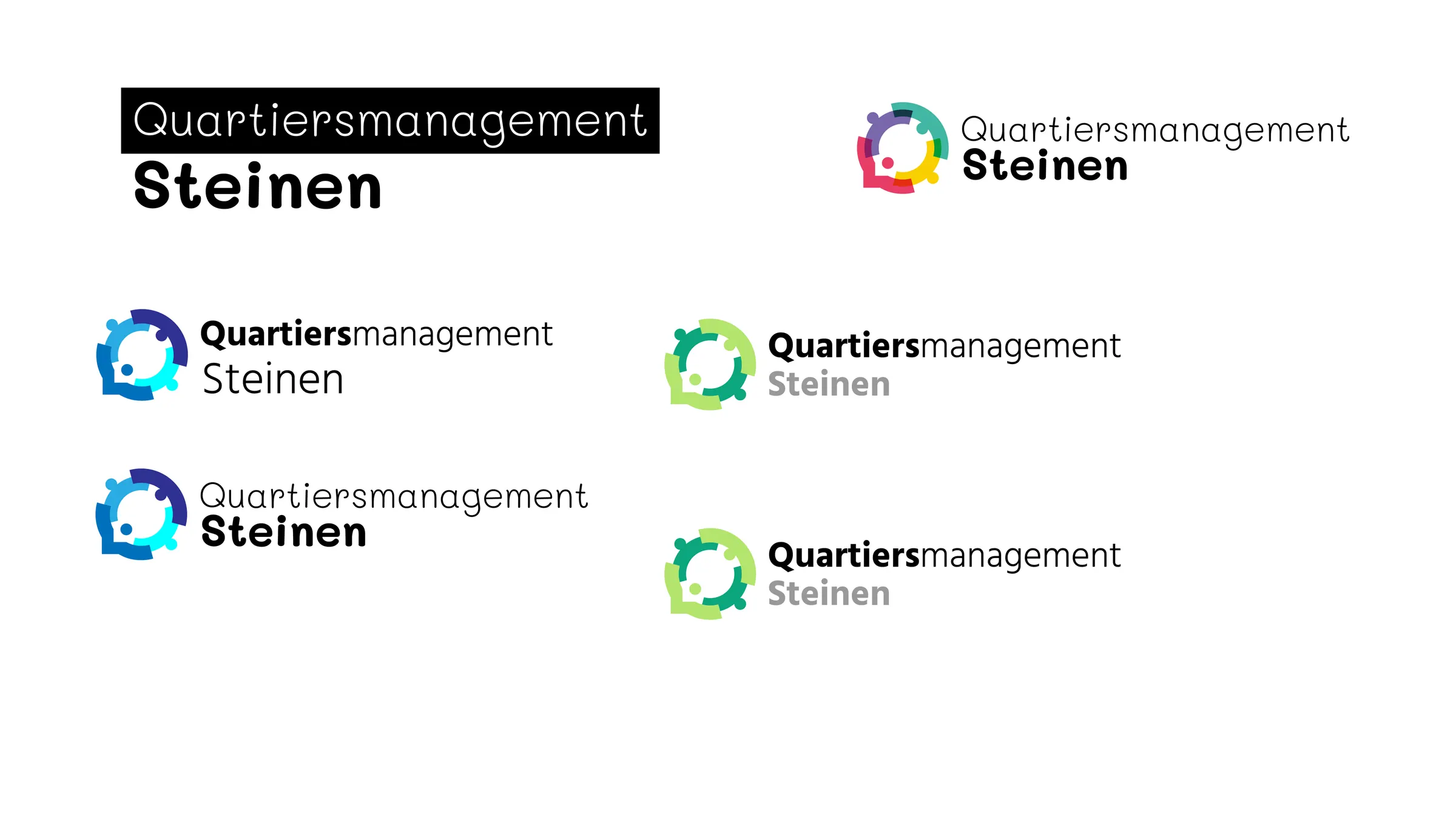
Combined word and picture mark for the neighbourhood management in the Köchlin area: a circle of stylised figures reaching out to each other, next to it the name in Hind — “Quartiers” bold, “management” light, the town name in a calm grey. The task was trickier than the size of the project suggests: a logo for a municipal mediation office must look neither like an authority — then nobody comes — nor like a campaign, or it looks like advertising for a position.
The answer was colour: two greens, a light one and a strong one, for the neighbourhood and for the gardening that is a central project there. On the way there were a black, a blue and a multicoloured version — the drafting board shows them. Friendly, but not playful.
The logo came before the website, which is also shown here.
Colours
- Last of Lettuce#B4E46ELight green — ring
- Active Green#0CA57EGreen — ring and figures
- Million Grey#999999Grey — town name
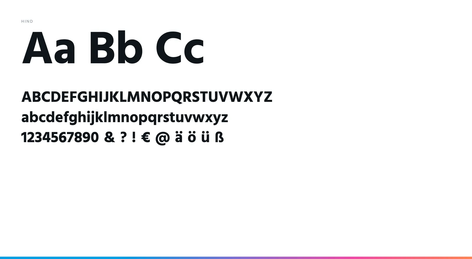
Typeface
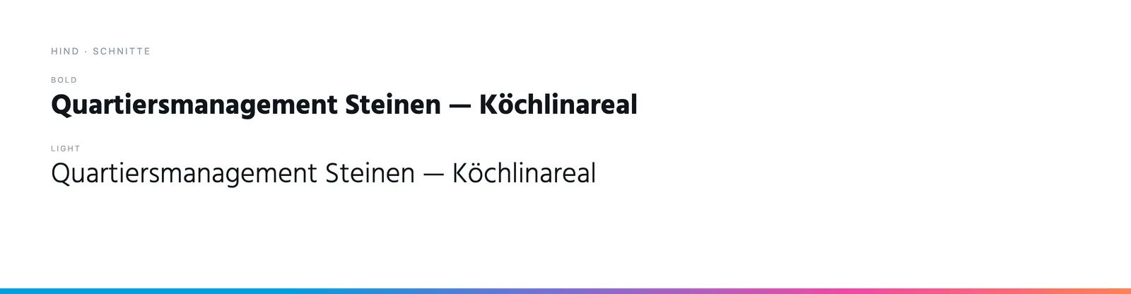
Hind in Bold and Light — the same typeface as later on the website. Bold and light within one word separate “Quartiers” and “management” without needing a hyphen.