Brand & Design
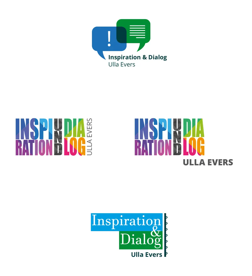
Ulla Evers logo
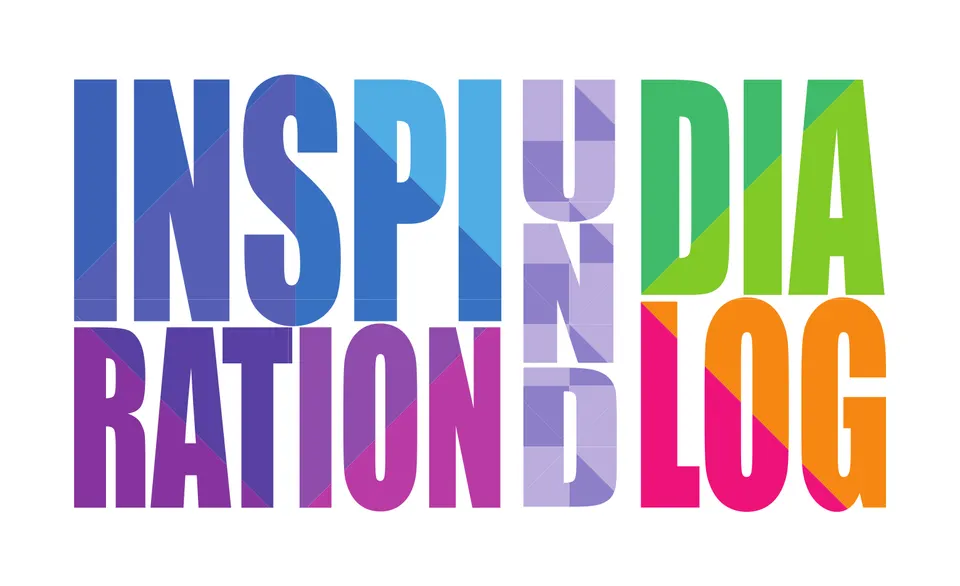
Two words that interlock — the mark does what the work does.
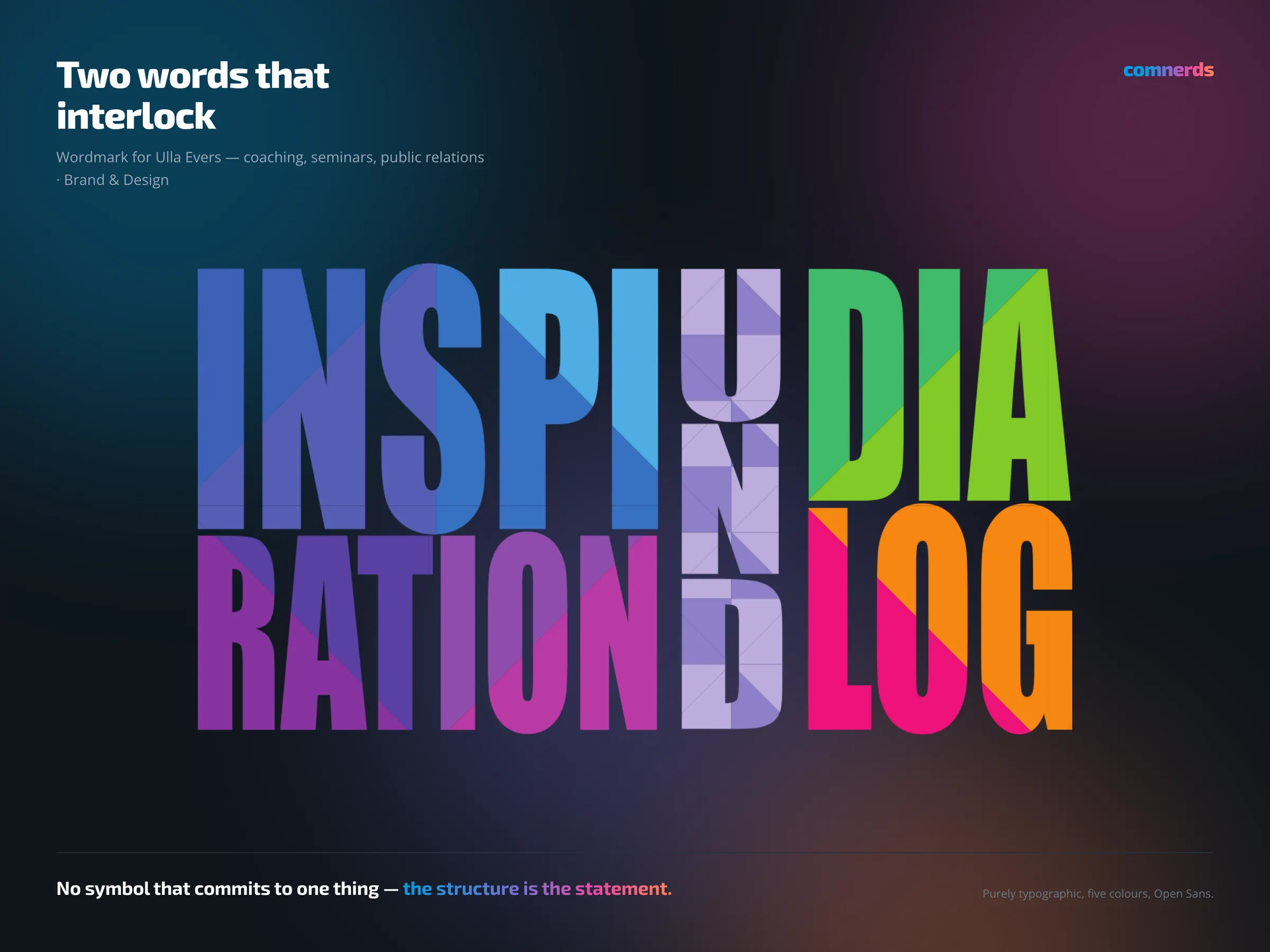
Ulla Evers works in coaching, seminars and public relations. For an offering like that a pictorial mark is almost always wrong: any symbol commits to one of the activities and shuts out the others.
So the brand is purely typographic. “INSPIRATION” and “DIALOG” stand as two blocks, with a narrow, upright “UND” pushed between them — the words interlock instead of sitting one below the other. Each block carries its own colour, from blue through violet and green to pink and orange, so that the name already reads as many-voiced at first glance.
The construction is the statement at the same time: inspiration and dialogue are not two offerings one after the other, but one that interlocks.
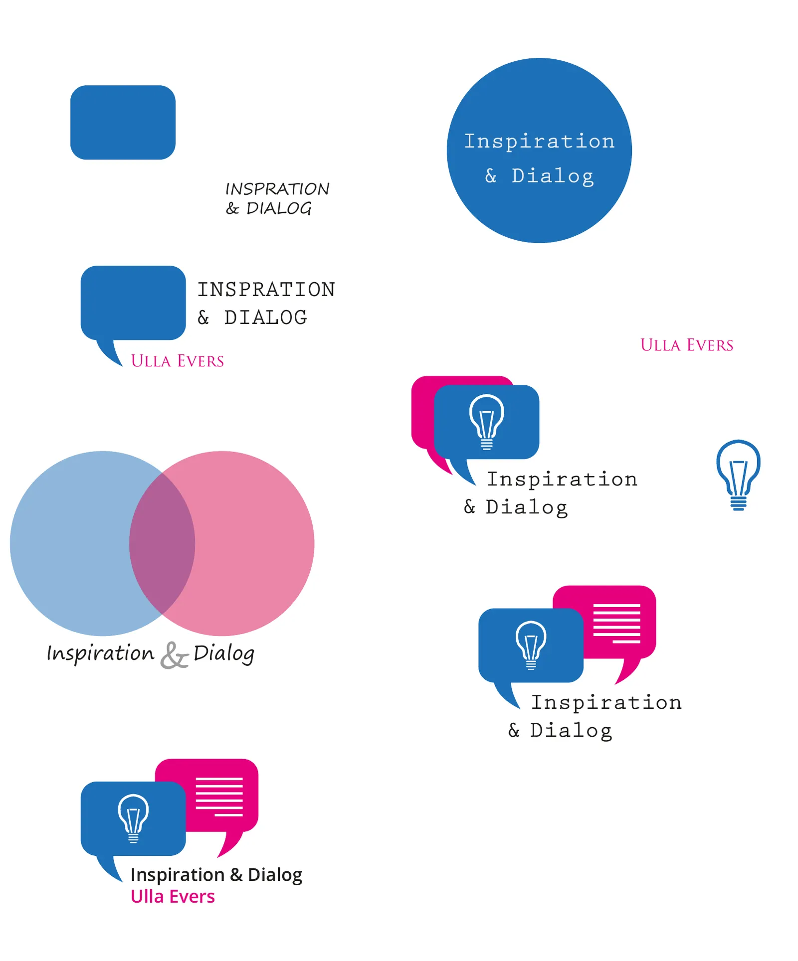
The mark was developed in several states, together with preview sheets in colour, black and white and grey — for the case where only one printing colour is available.
Colours
- Palace Blue#3871C2Blue — INSPI
- Druchii Violet#86349EViolet — RATION
- Thick Green#82C927Green — DIA
- Fatty Fuchsia#EE127BPink — LOG
- À l’Orange#F68712Orange — shadow
- Grape Illusion#BCACDDLilac — UND
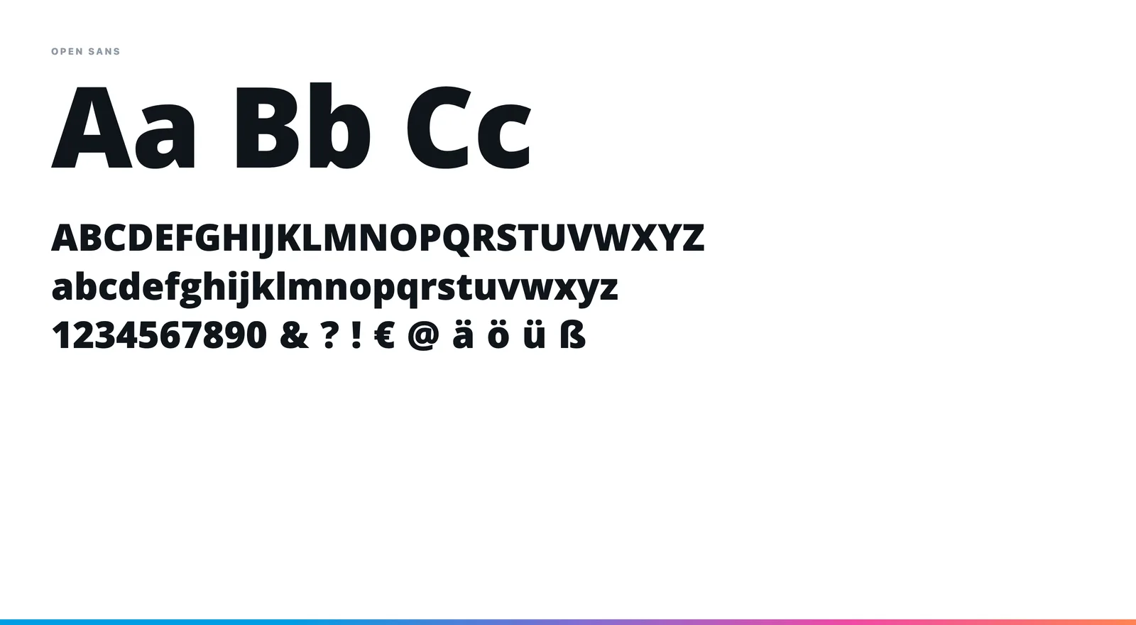
Typeface
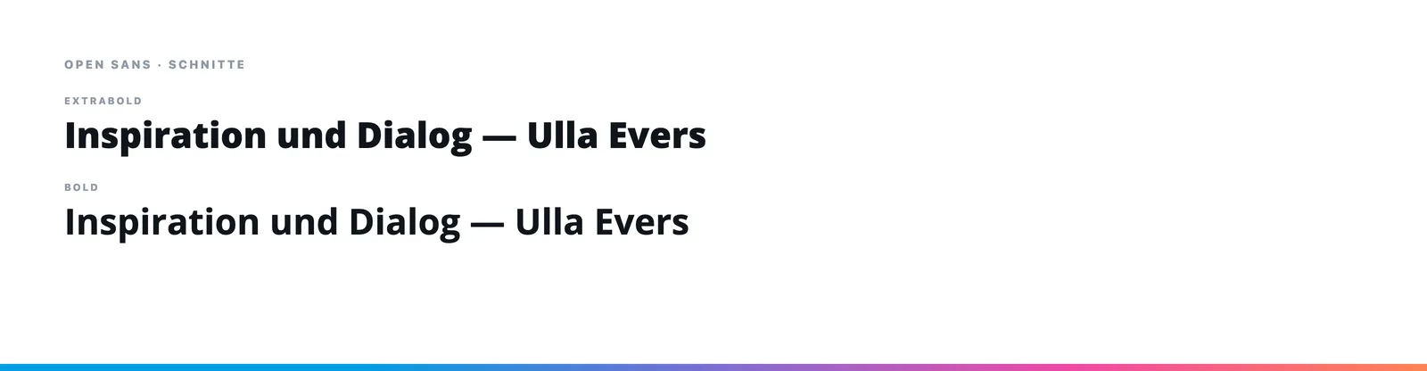
Open Sans Extrabold for the word blocks, Bold for the upright “UND”. A grotesque without quirks — colour and structure carry the mark, the typeface stays in the background.