Brand & Design
Print campaign for the St. Nicolai Foundation
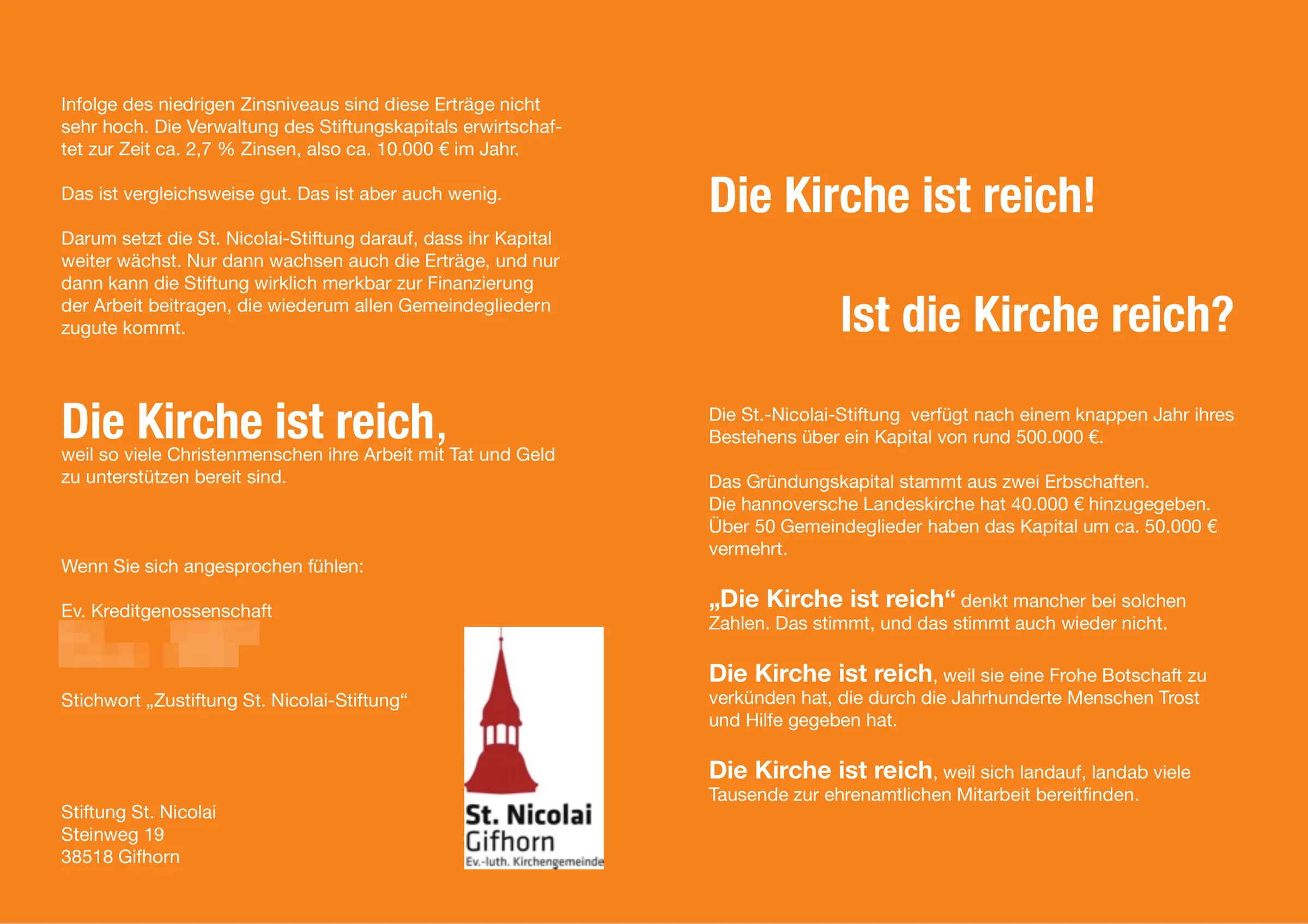
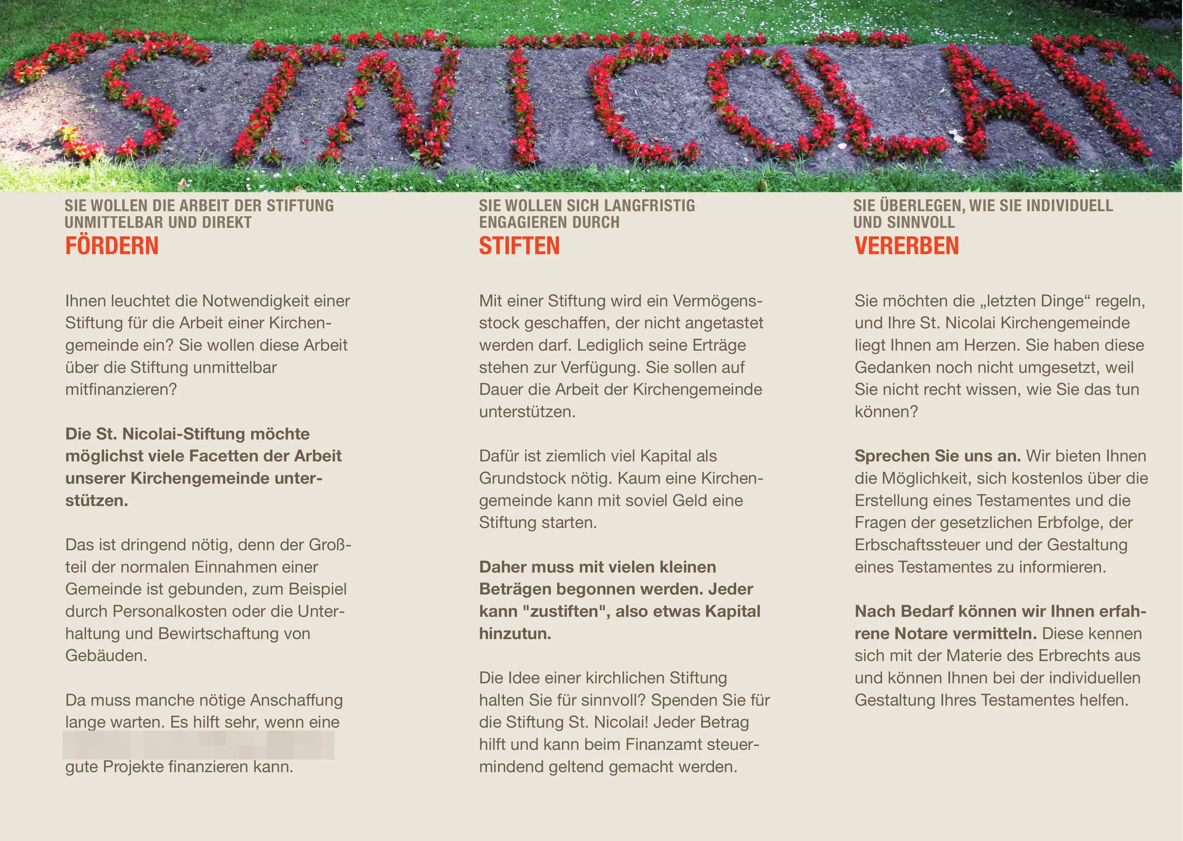
Three flyers meant to clear up a misunderstanding, one after the other.
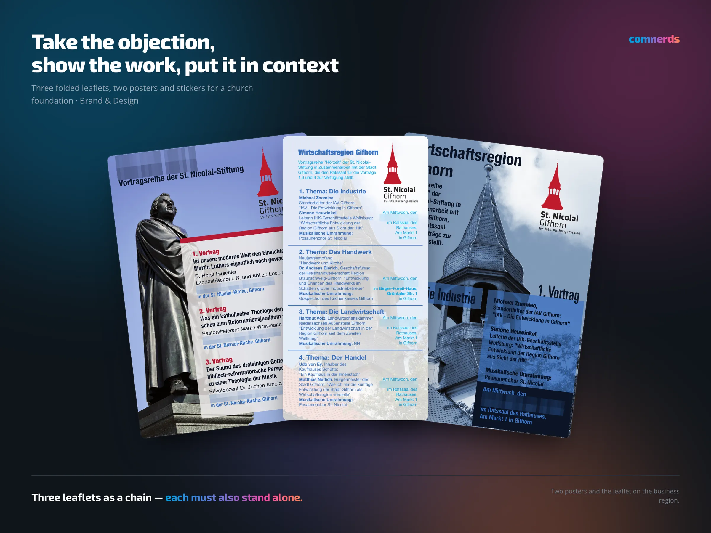
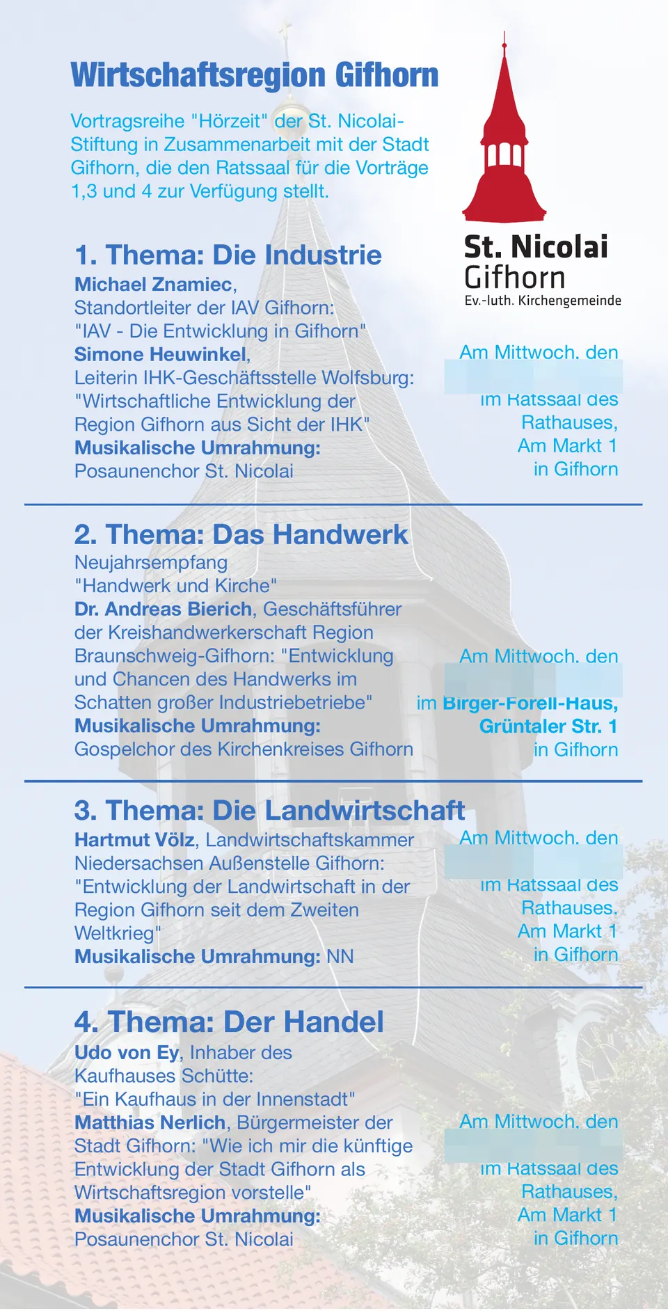
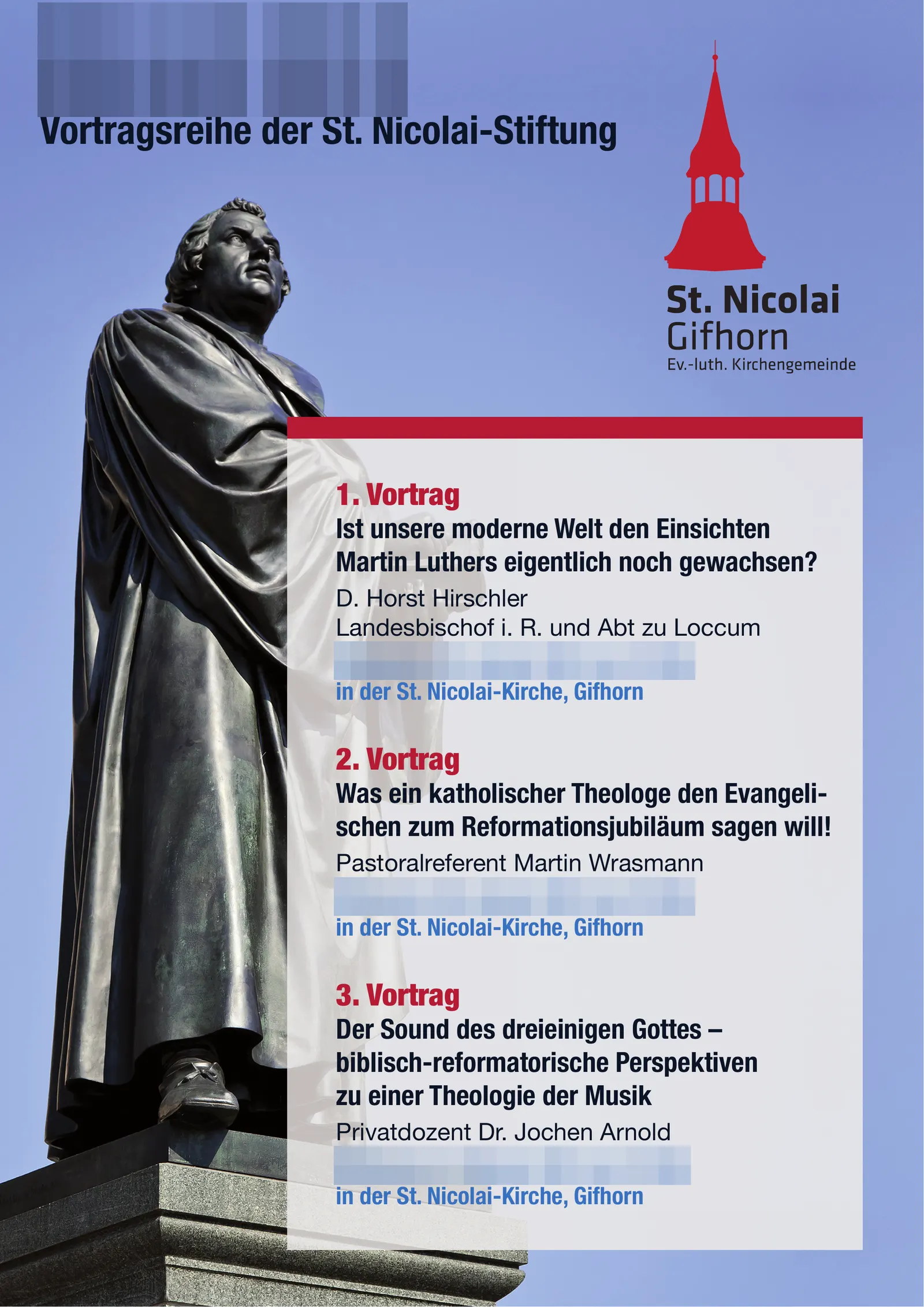
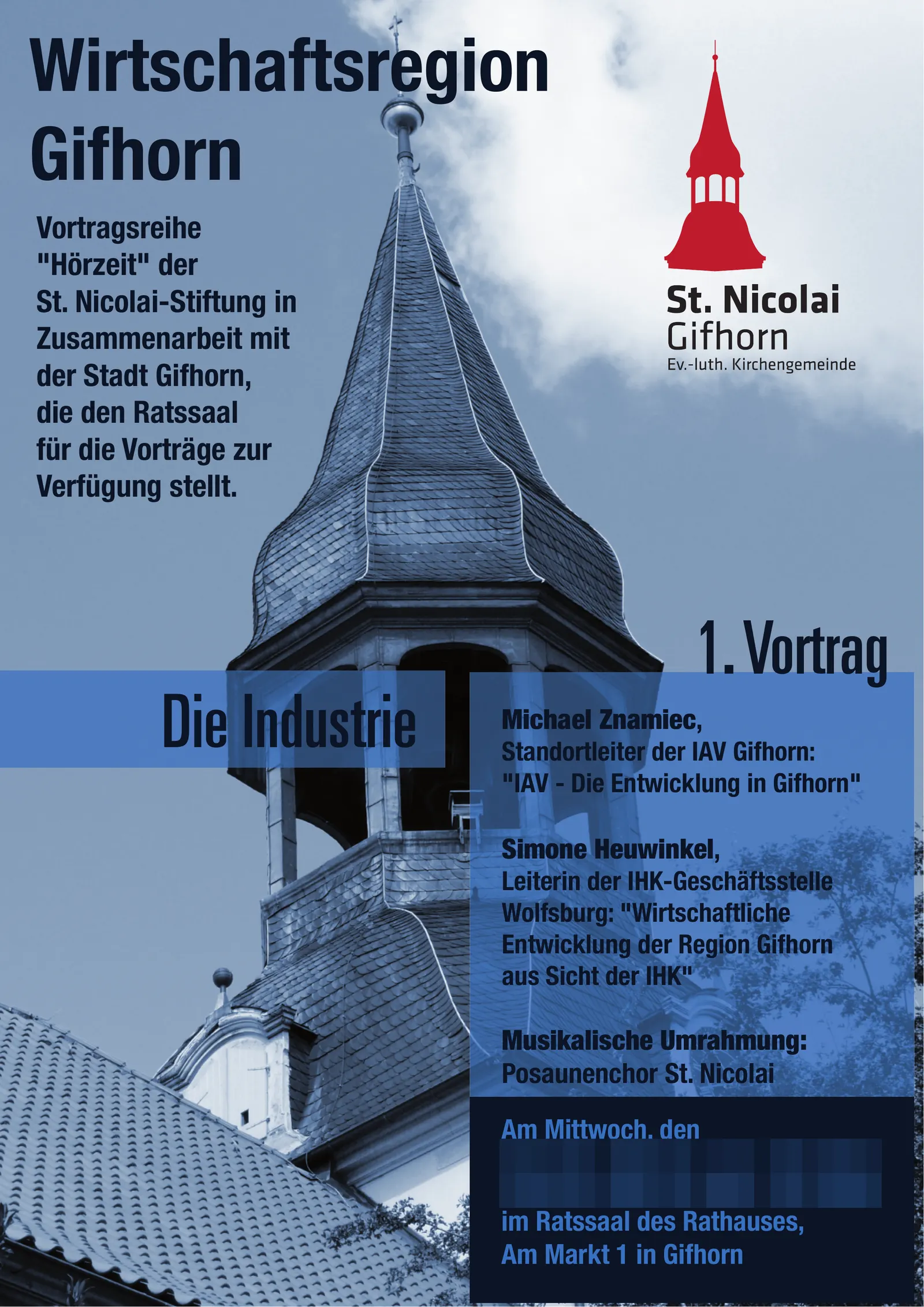
The broadest print series in my portfolio: three folded flyers, two posters and stickers for a church foundation.
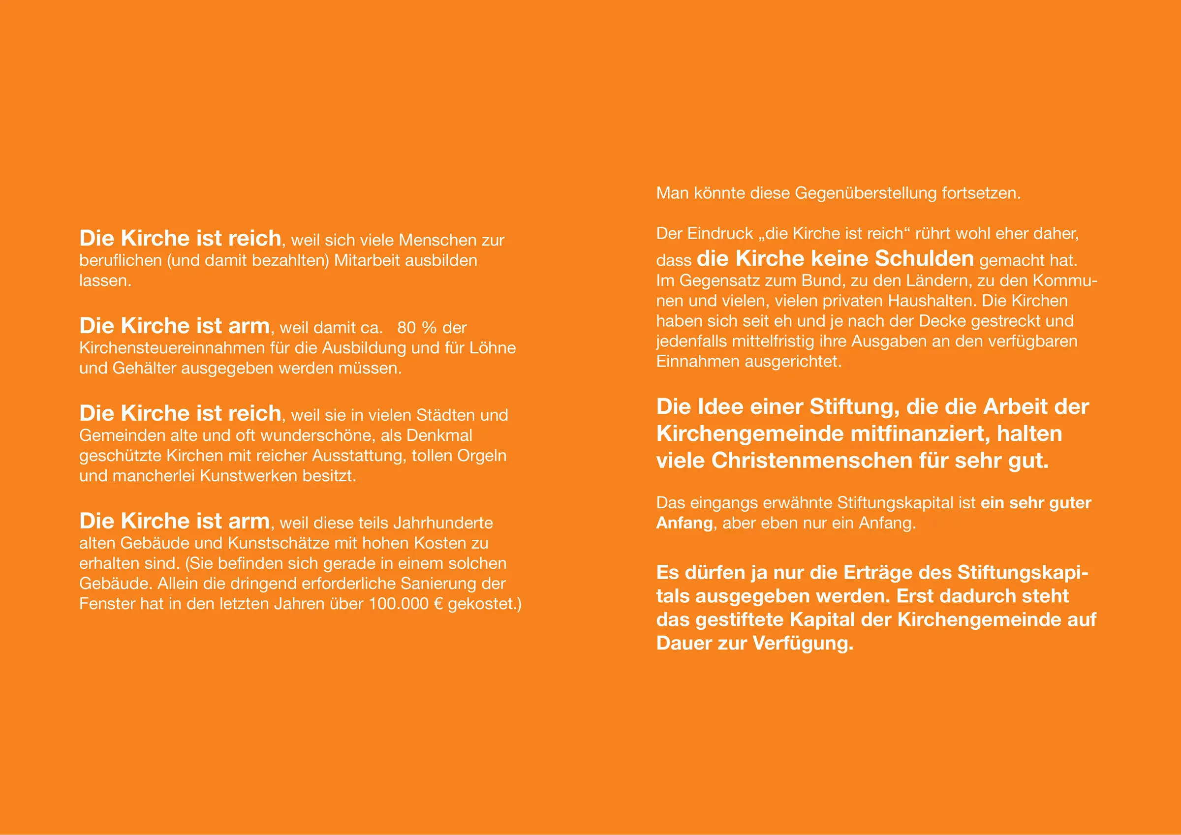
What is striking is the order of the titles. The first flyer is called “The church is rich” — as a quotation, as the sentence the foundation hears all the time. The second explains what the foundation actually does. The third places it in the context of the economic region. This is not a collection of printed pieces, it is a chain of argument: take up the objection, show the work, put the significance in context.
For the design that means: the three have to be recognisable as a series, but each also has to work on its own, because nobody guarantees that all three end up in the same hands. Plus the anniversary posters and the stickers — giveaways that keep a subject in circulation long after the flyer has been put aside.
Print production was part of the job.
Colours
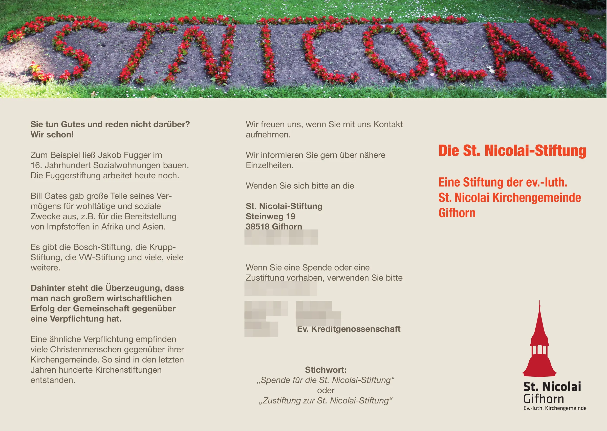
- Classic Red#C02430Steeple red — emblem
- Consumed by Fire#F6821COrange — leaflet “The church is rich”
- Screech Owl#EBE5D9Natural paper — leaflet “What the foundation does”
- Ashton Skies#7890B4Sky blue — posters
Typeface
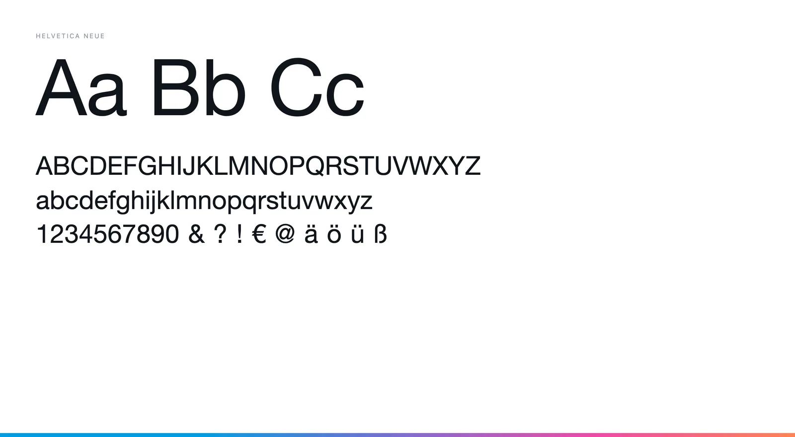
Helvetica Neue throughout — Regular and Bold in the text, Condensed Bold and Condensed Black in the poster titles. A neutral typeface for a foundation that wants to stand out by its arguments, not its typography.