Brand & Design
Print material Greenlap IT
A dealer in used technology needs paper that looks new — from the folded flyer to the sticker on the box.
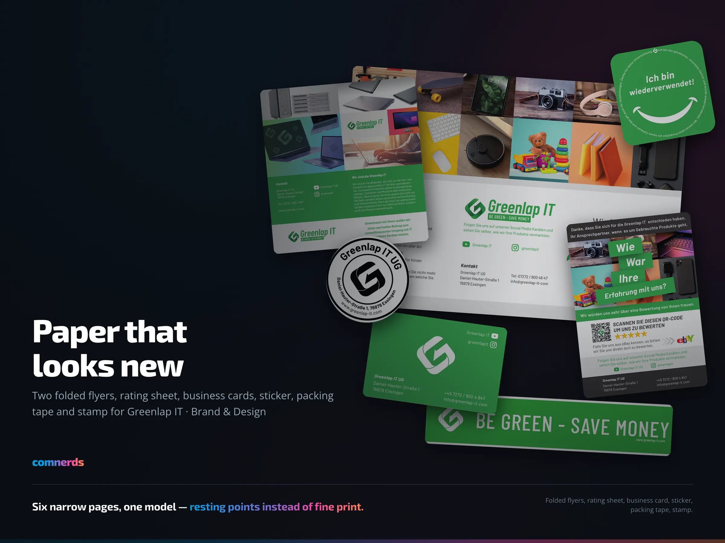
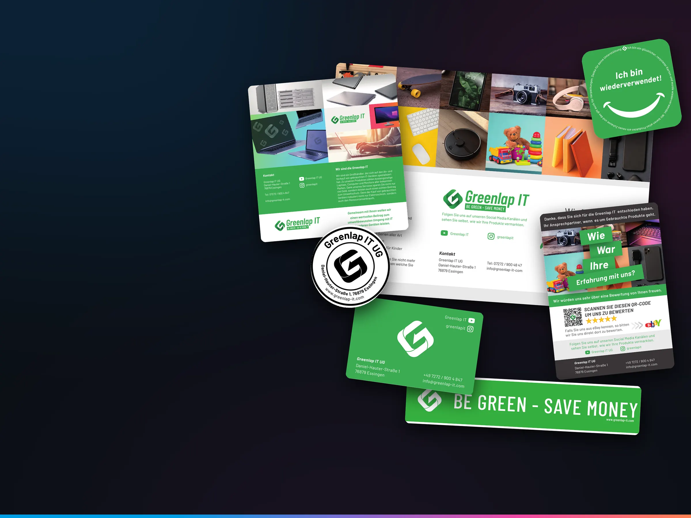
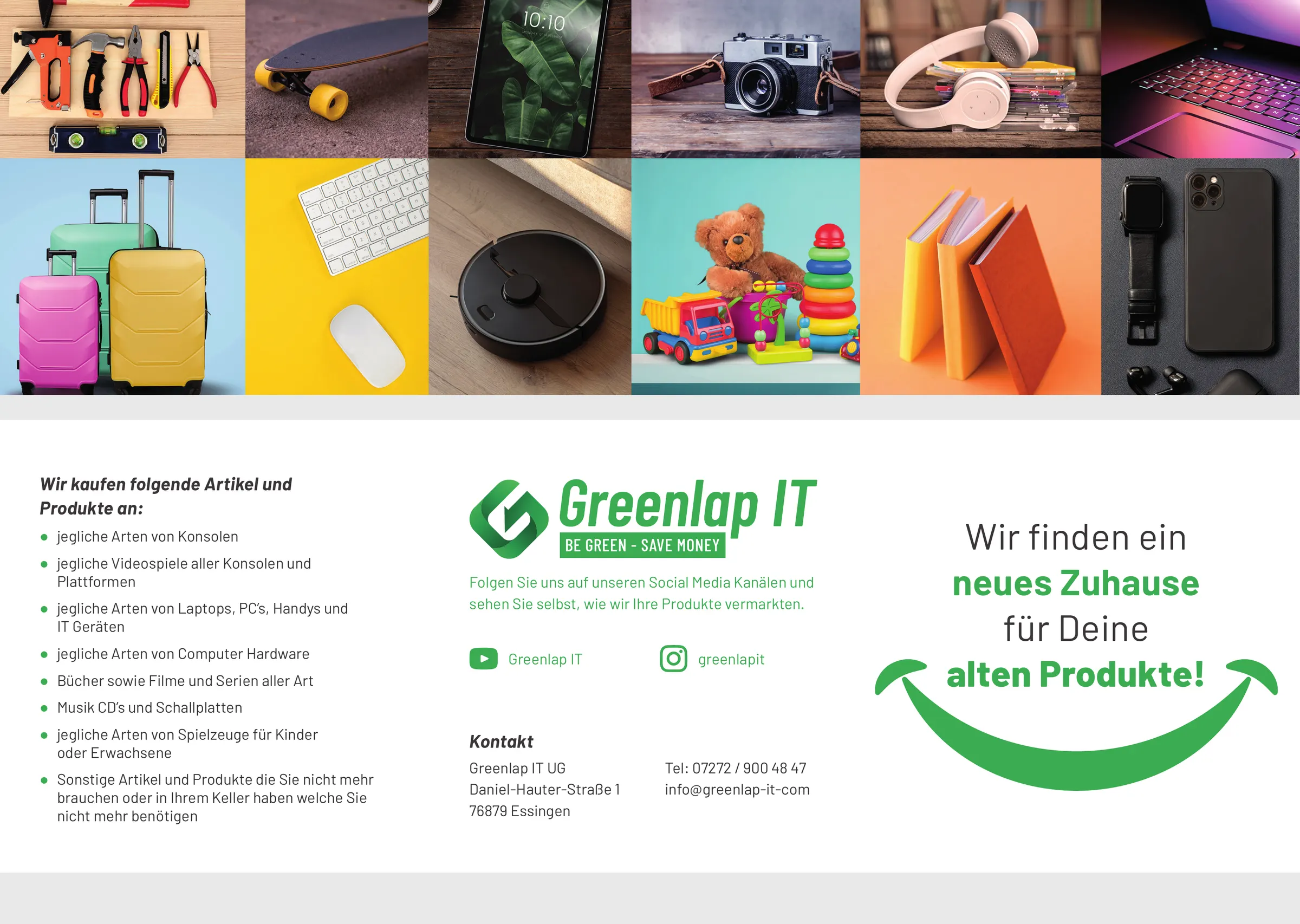
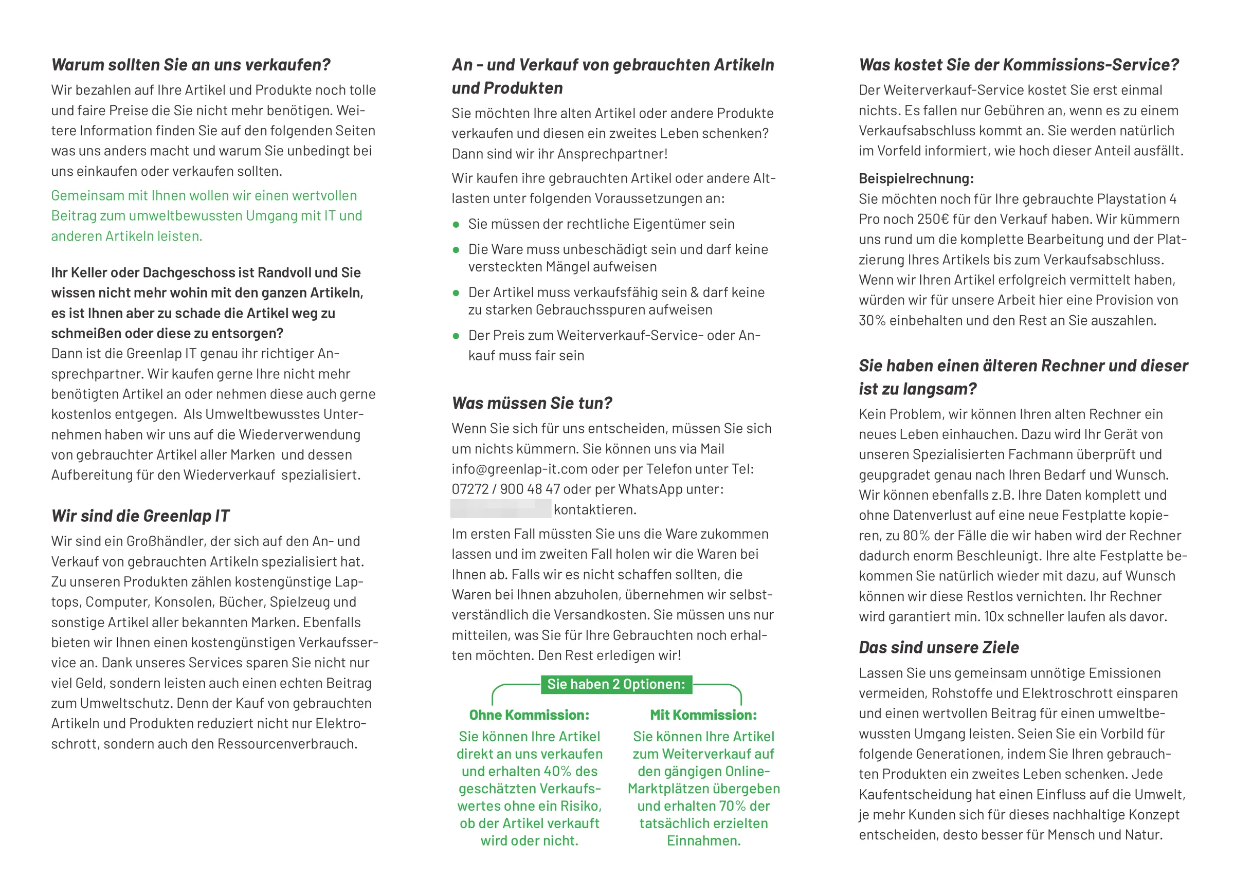
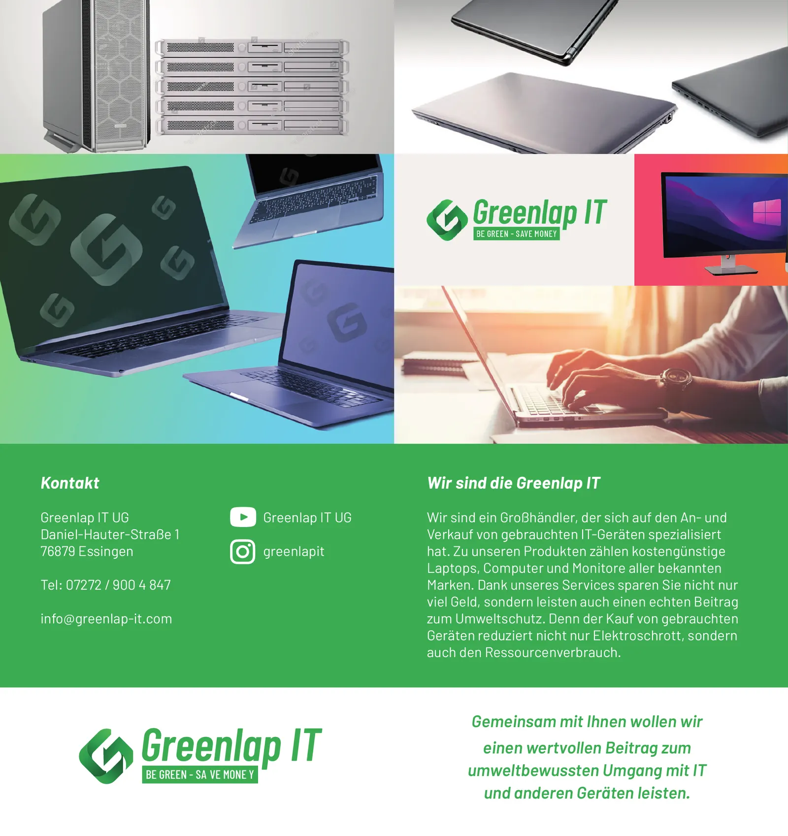
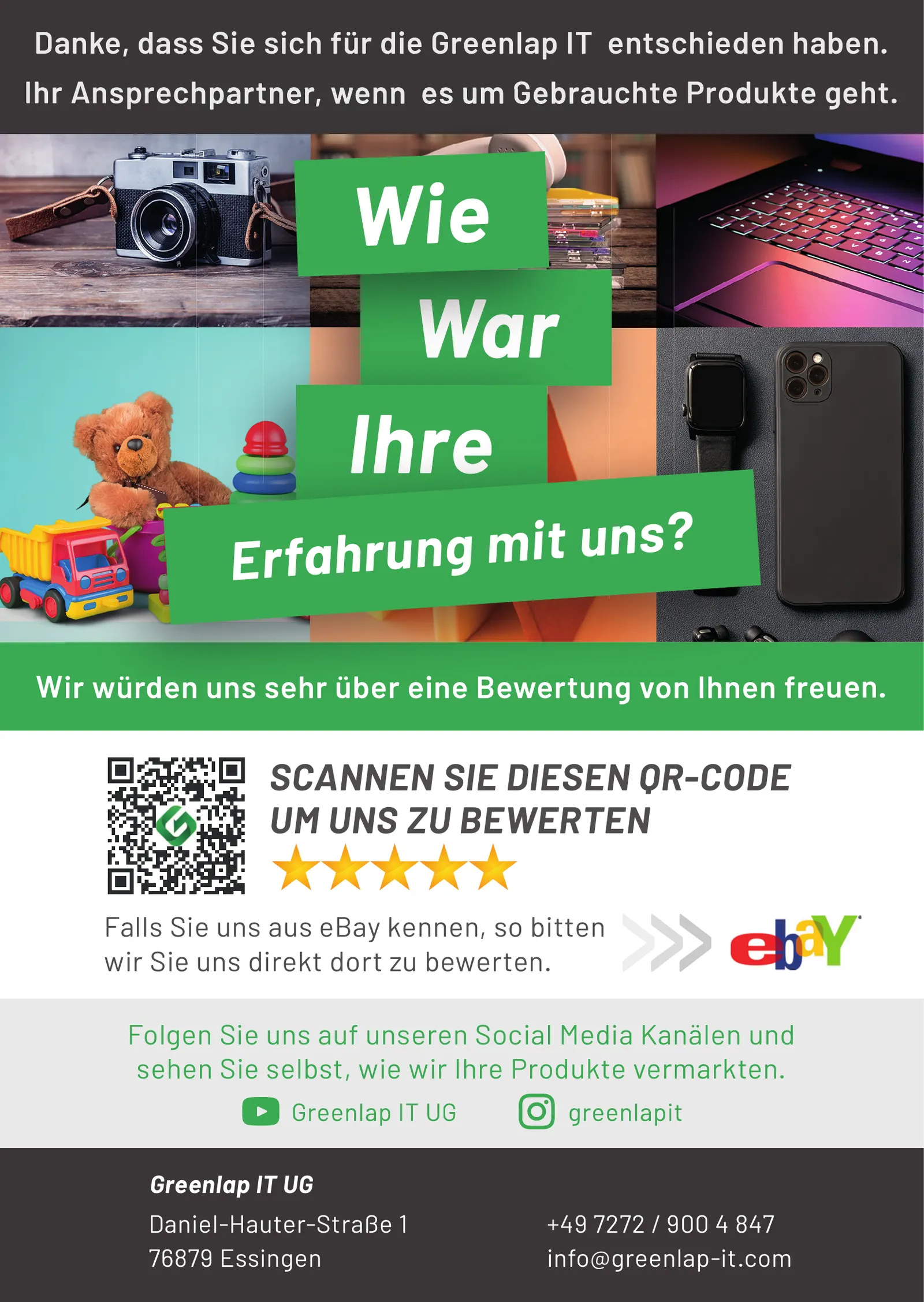
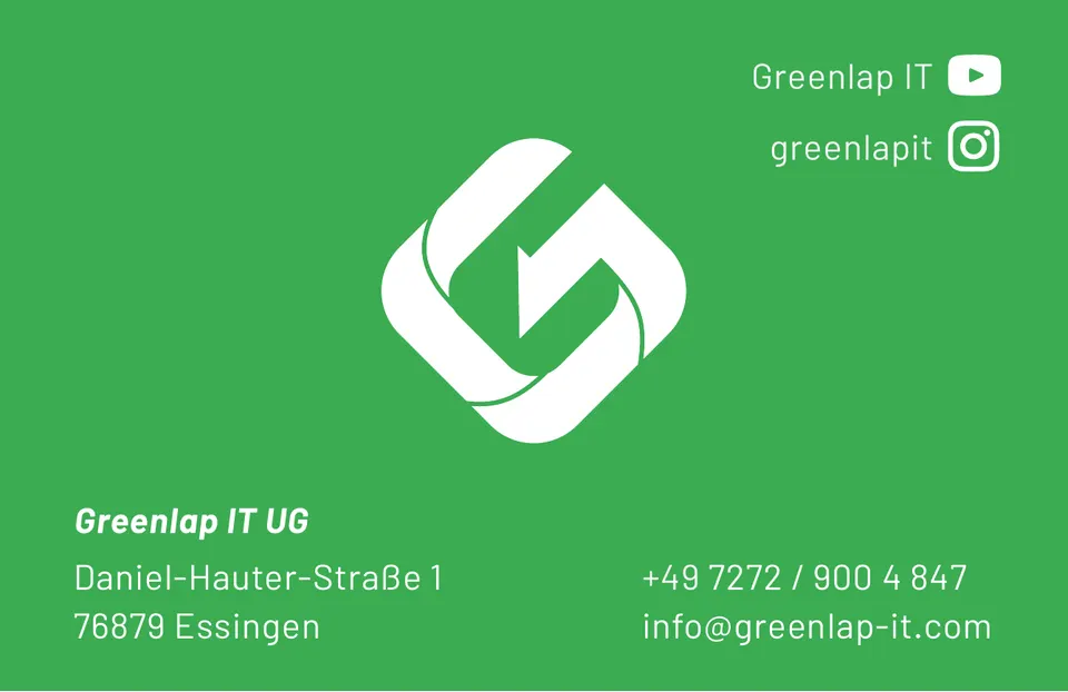
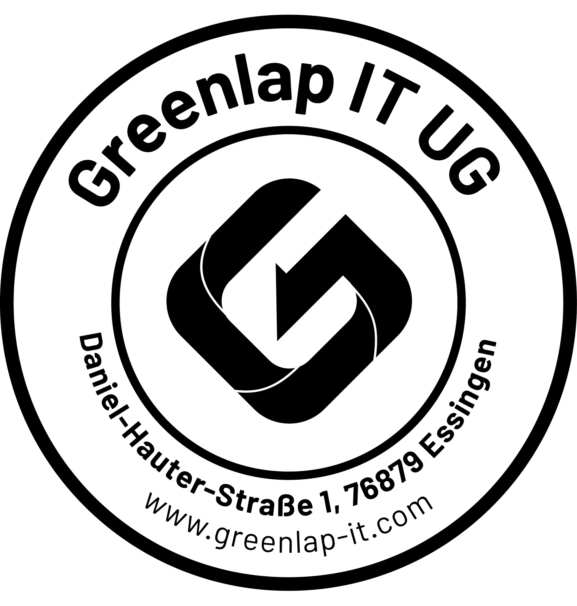
After the logo came the kit: two folded flyers — a six-page one explaining what Greenlap IT buys and how consignment sales work, and a compact four-pager for the counter —, a rating sheet that invites customers to leave a review via QR code after the purchase, business cards, a recycling sticker for the reused boxes, packing tape and a company stamp.
The flyer carries most of the work. A buy-in and consignment model needs explaining — what is accepted, what is not, who pays what — and it all has to fit on six narrow pages. Hence a clear sequence of sections, plenty of white space, green subheadings as resting points and a photo mosaic on the outside that shows the range: tools, suitcases, camera, games console.
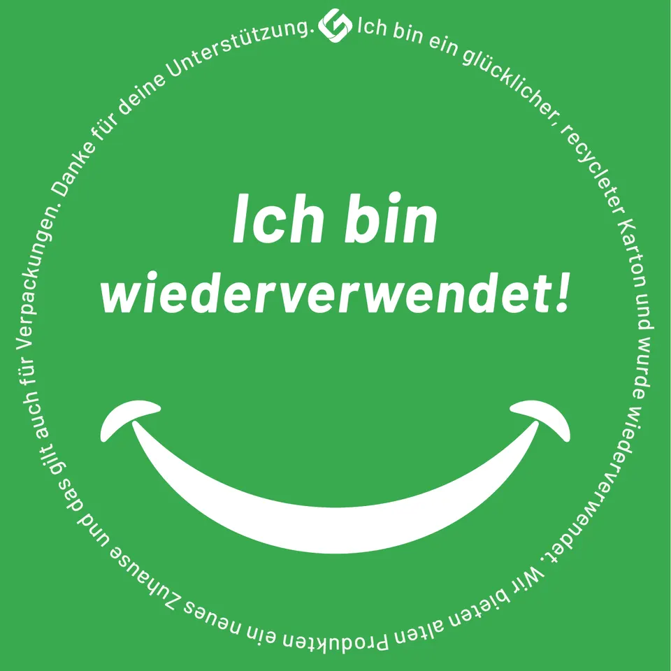
The sticker is the smallest piece and perhaps the most likeable: “I have been reused!” on a smiling box explains in one sentence why the parcel does not look new. Everything set in Barlow, the sister family of the logo typeface, so that flyer, sheet and stamp appear as one family.
Colours
- Get up and Go#2B9F4DGreen
- Charcoal Dust#595657Text
- White#FFFFFFPaper
Typeface
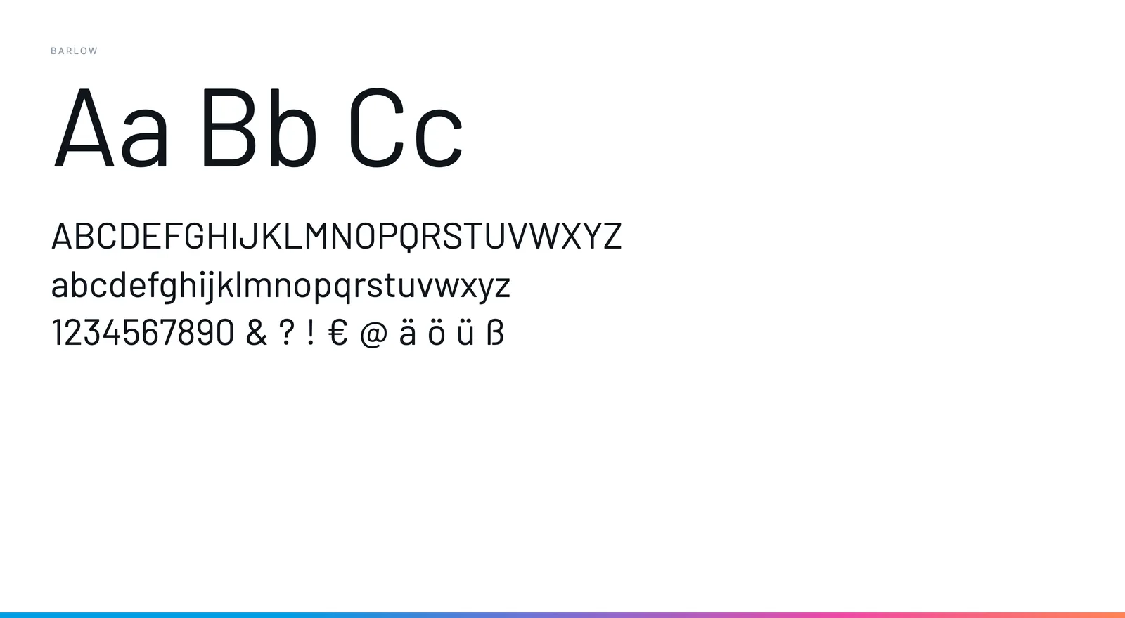
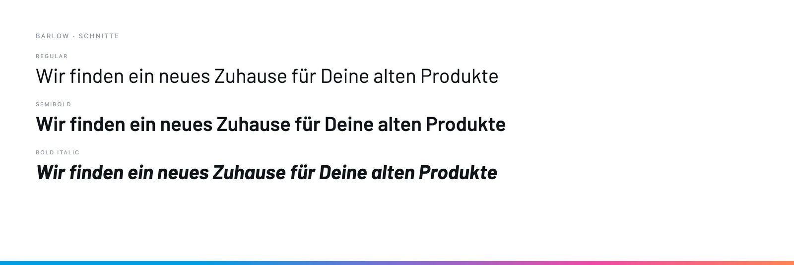
Barlow in Regular, SemiBold and Bold Italic — the wide sister of the Barlow Condensed used in the logo. In running text it stays calm; in the green subheadings it turns italic and bold so the sections can be found while skimming.