Brand & Design
Raunächte journal
A book to write in — twelve nights, twelve identically built spreads.
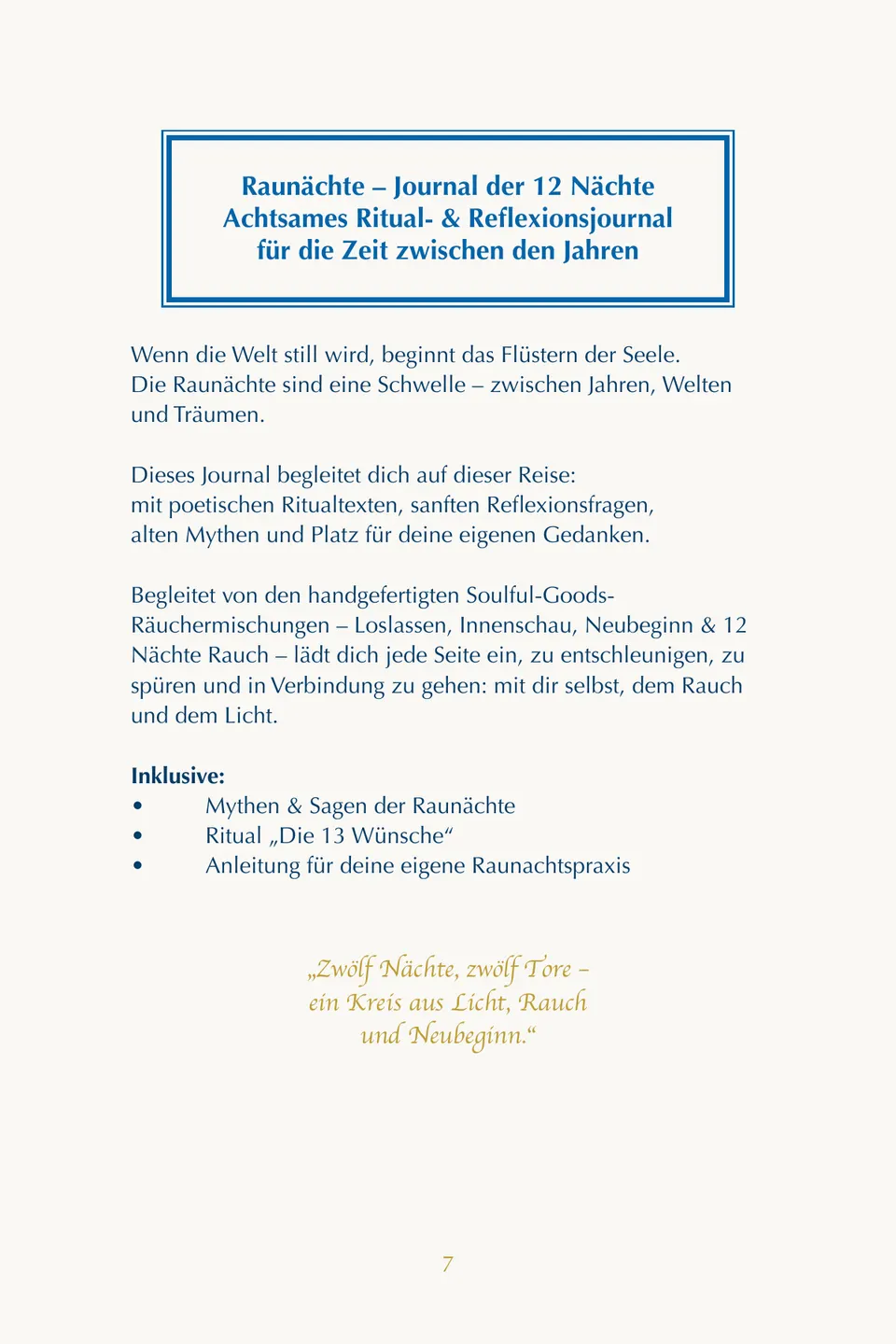
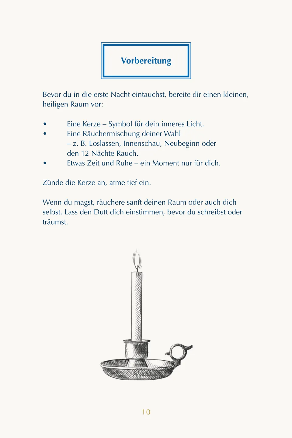
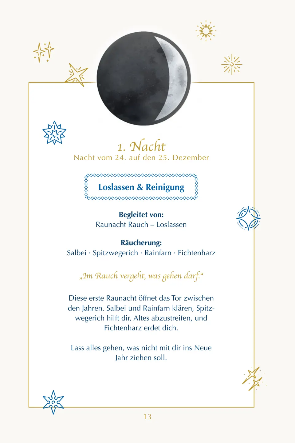
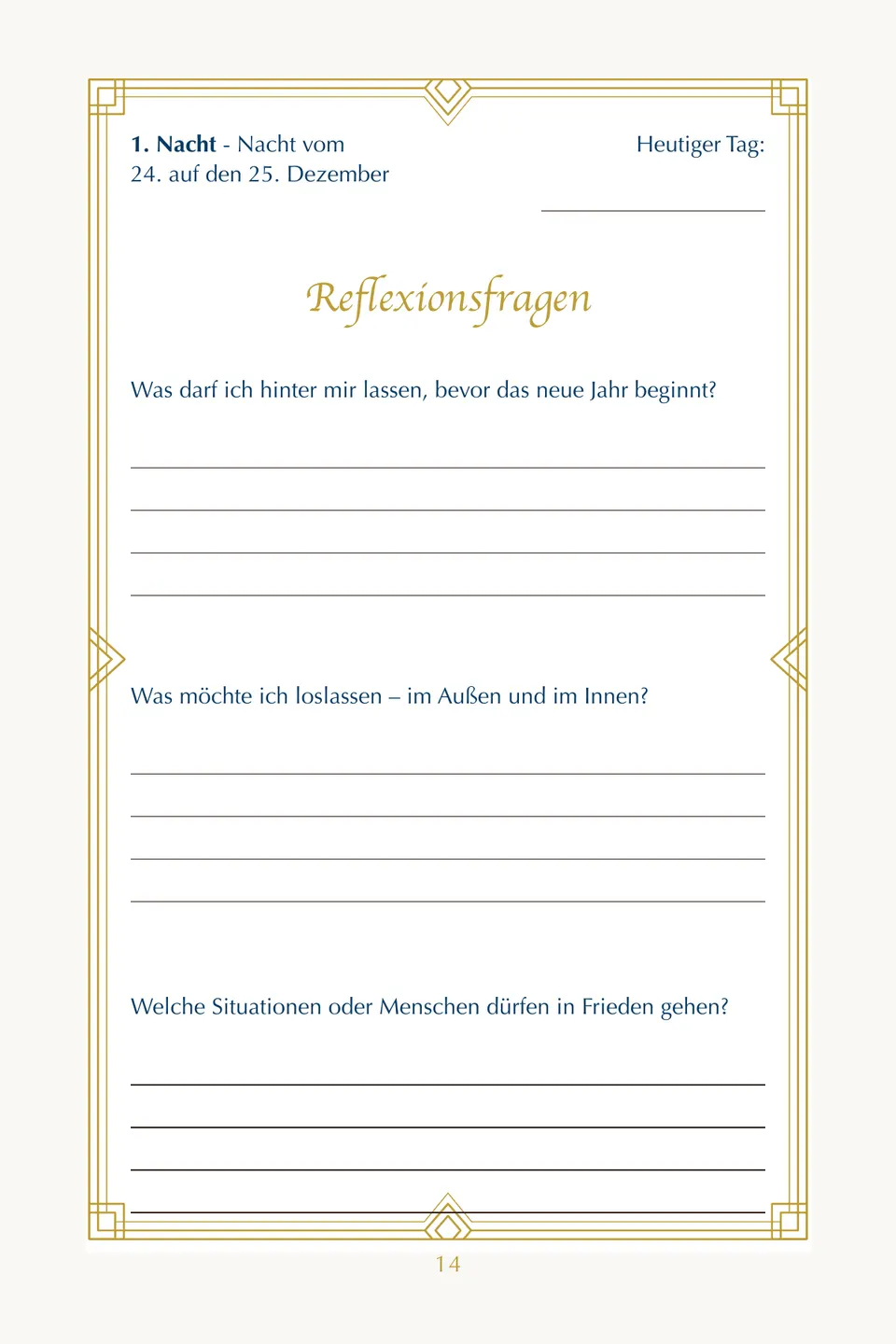
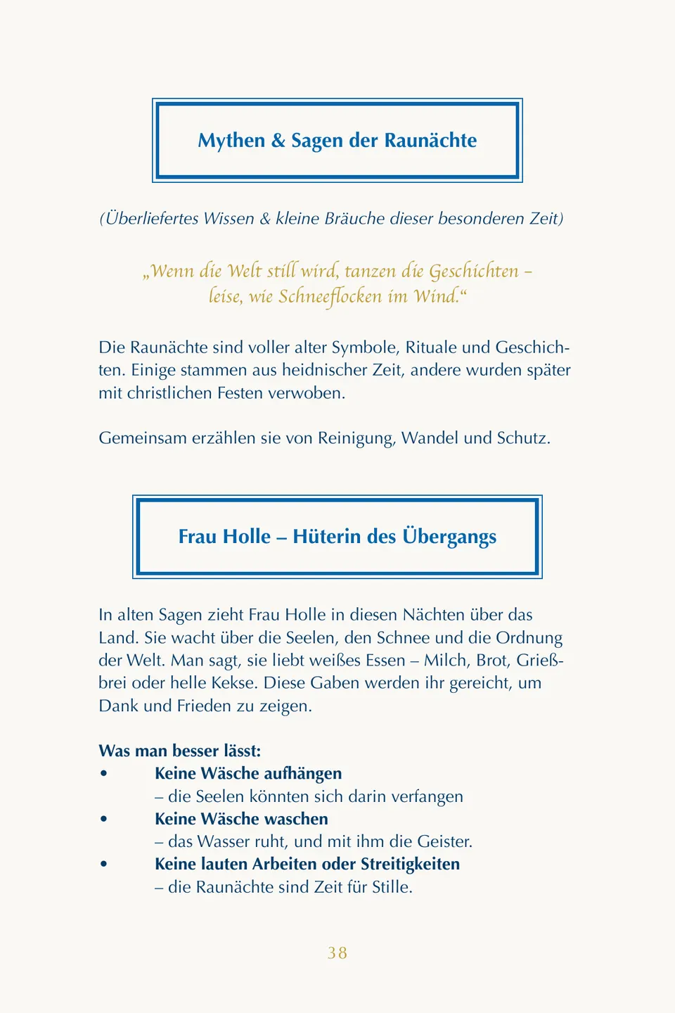
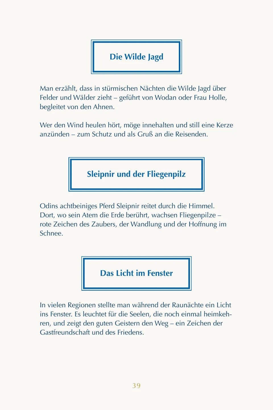
“Raunächte — Journal der 12 Nächte” accompanies the reader through the days between the years. First a book to read: origin and meaning, preparation, myths and legends. Then twelve nights, each across two pages — on the left the theme of the night with its ritual and incense suggestion, on the right the reflection questions with ruled lines to write on.
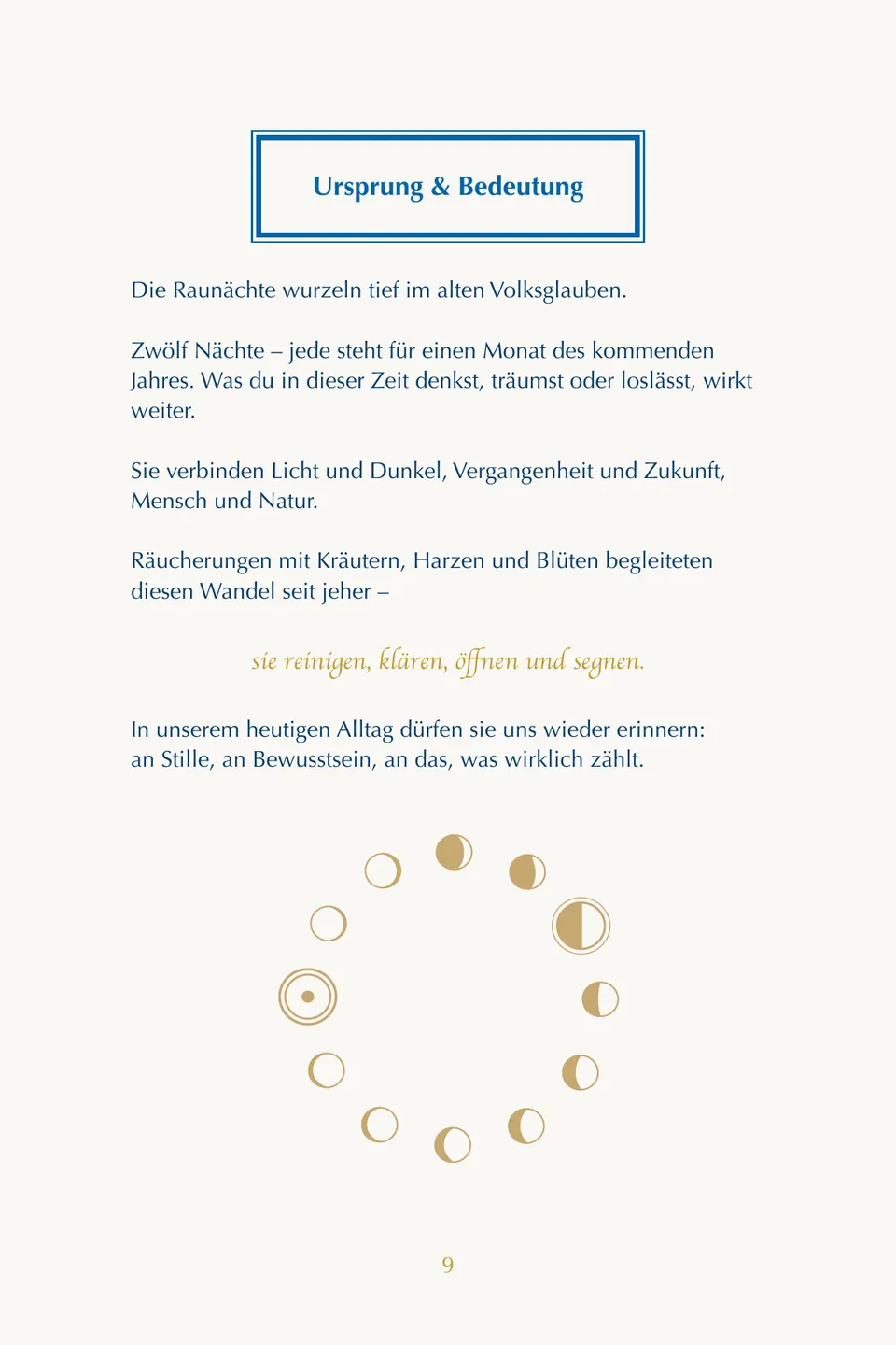
With a journal the real work lies in the white space. A page on which the design has already said everything intimidates — nobody writes on it. So these pages are built with restraint: a narrow gold frame, the moon phase of that night as a marker, a few ornaments, and plenty of room below.
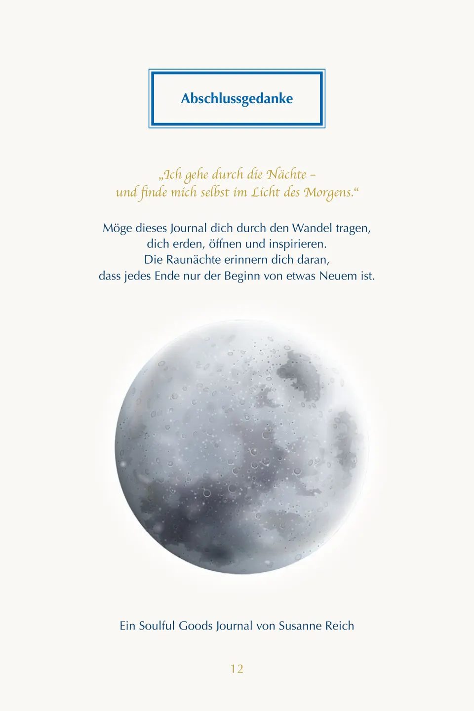
The moon phases are not decoration but navigation: whoever opens the book sees from the moon which night they are in. Twelve nights, twelve phases, always in the same place.
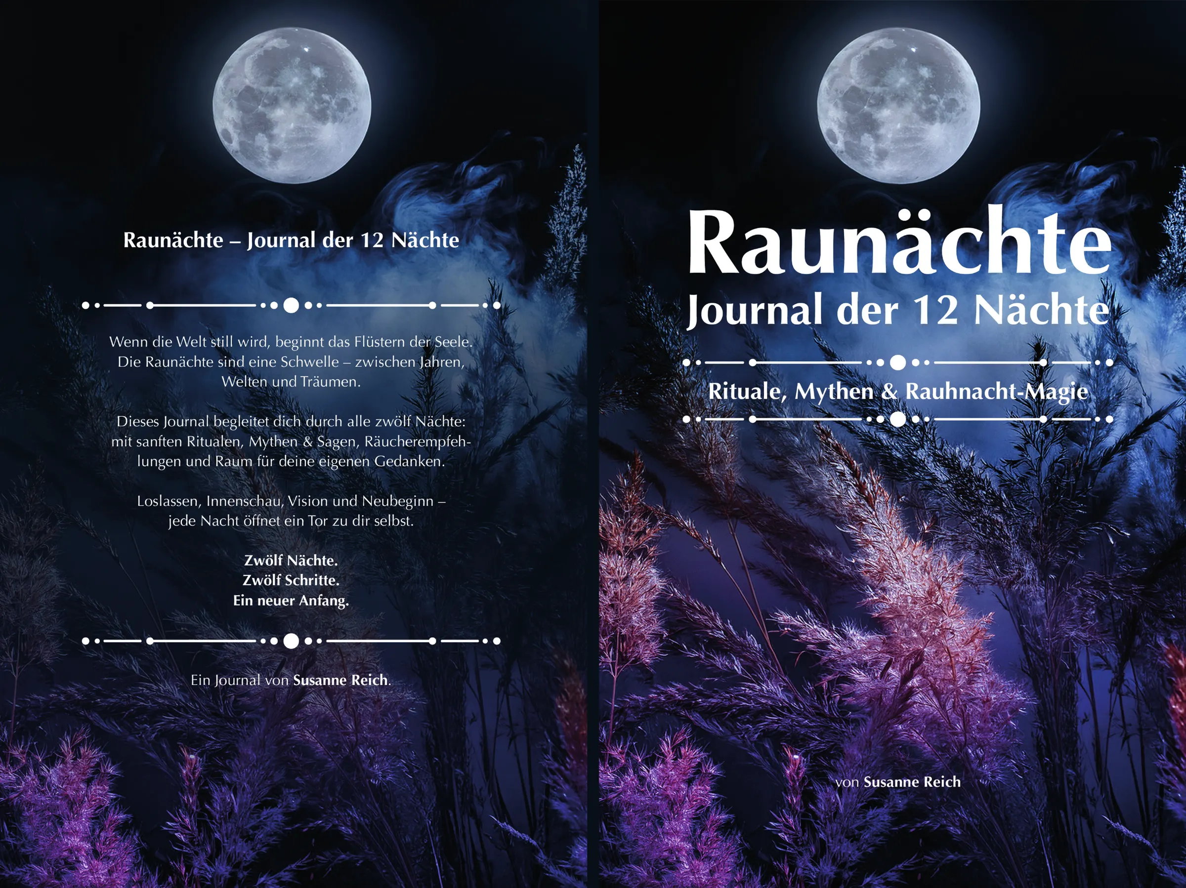
The cover is laid out as a full cover — back, spine and front in one piece, with the spine calculated from the page count. Typeset in InDesign, print-ready for Amazon KDP.
Colours
- Void#0C0C24Night sky
- Ceremonial Purple#242454Forest
- Causeway#6C7890Moonlight
Typeface
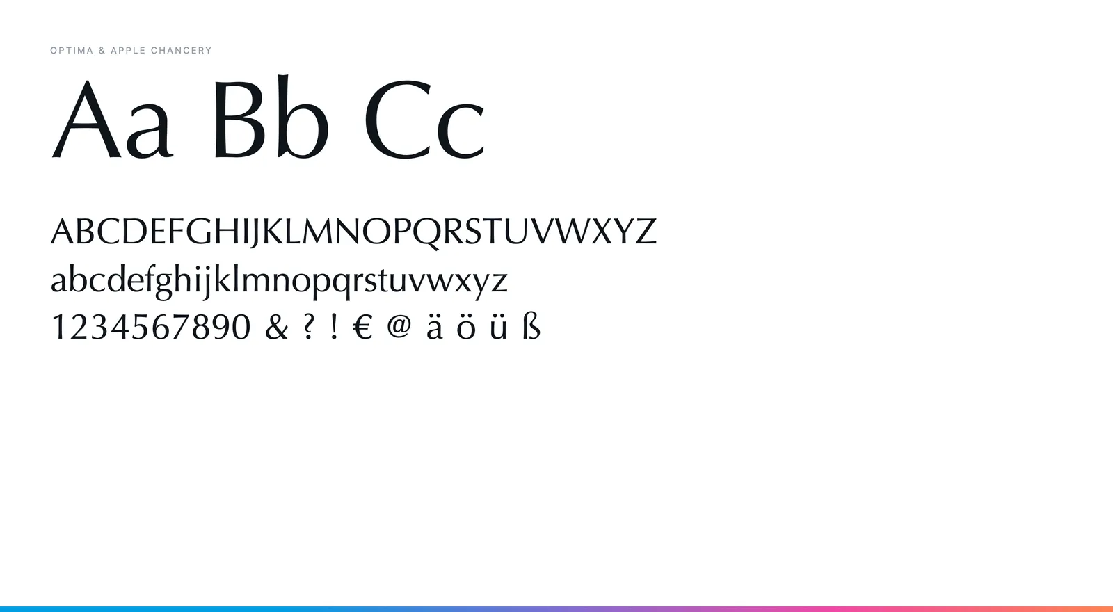
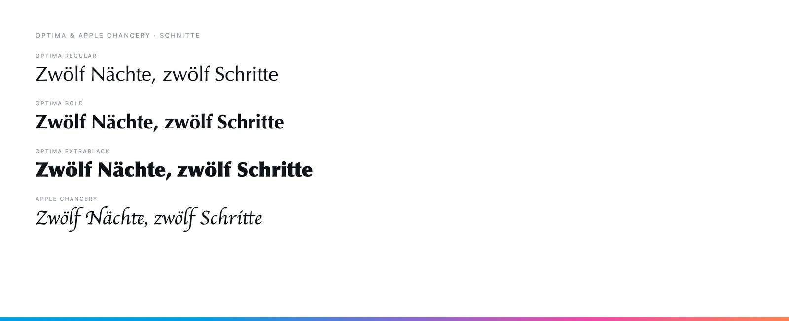
Optima in Regular, Bold and ExtraBlack, plus Apple Chancery for the quotations. Optima has no serifs and still carries the stroke modulation of a roman — it reads calmly and feels handwritten enough for a journal.