Brand & Design
Appointment pads for Praxis Tersch
A promotional item that lies on a desk for months.
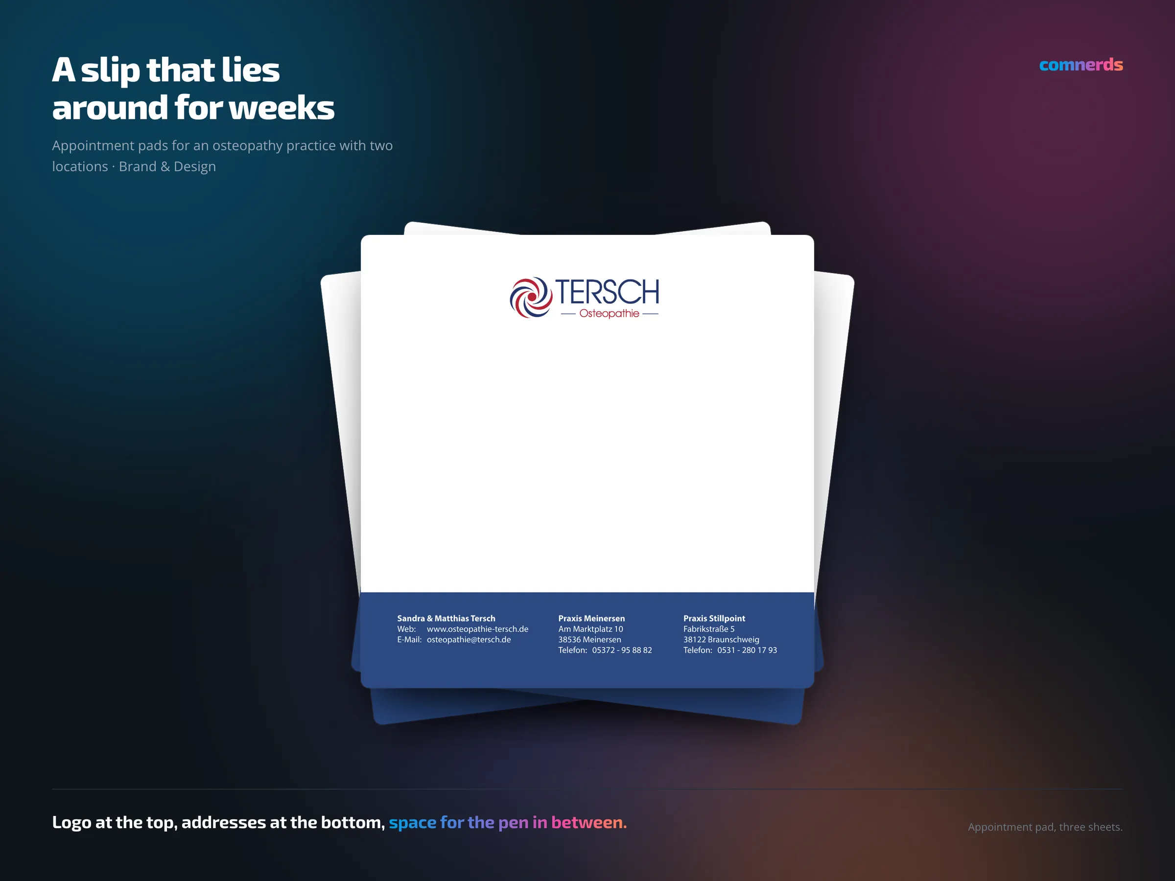
An osteopathy practice with two locations hands its patients the next appointment on a slip of paper — and that slip then hangs on the fridge or lies on the desk until the appointment has passed. That is exactly what I designed the appointment pads for, and handled them through to print.
It is an unassuming piece of print with an enviable advantage: it stays visible for weeks. So it has to be correspondingly restrained — the practice logo at the top, plenty of free space for date and time, a blue band with both addresses at the bottom. A pad that is designed too loudly does not get used, and a promotional item nobody uses does not promote.
Colours
- Coastal Surf#2B4982Practice blue — band and wordmark
- American Red#B62234Red — emblem
- White#FFFFFFWriting area
Typeface
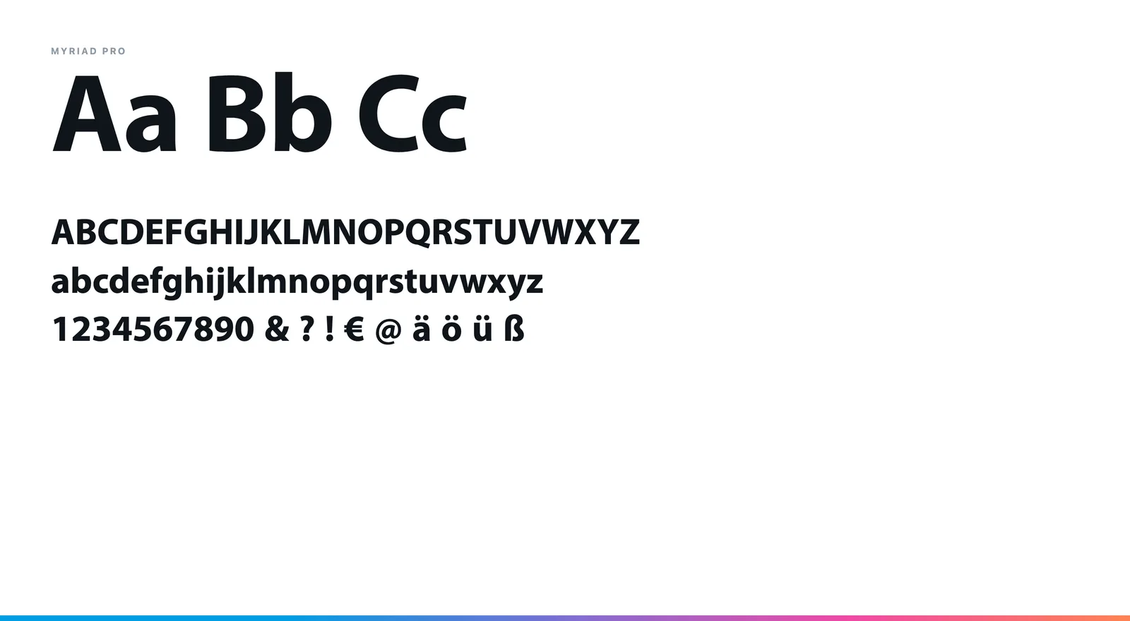
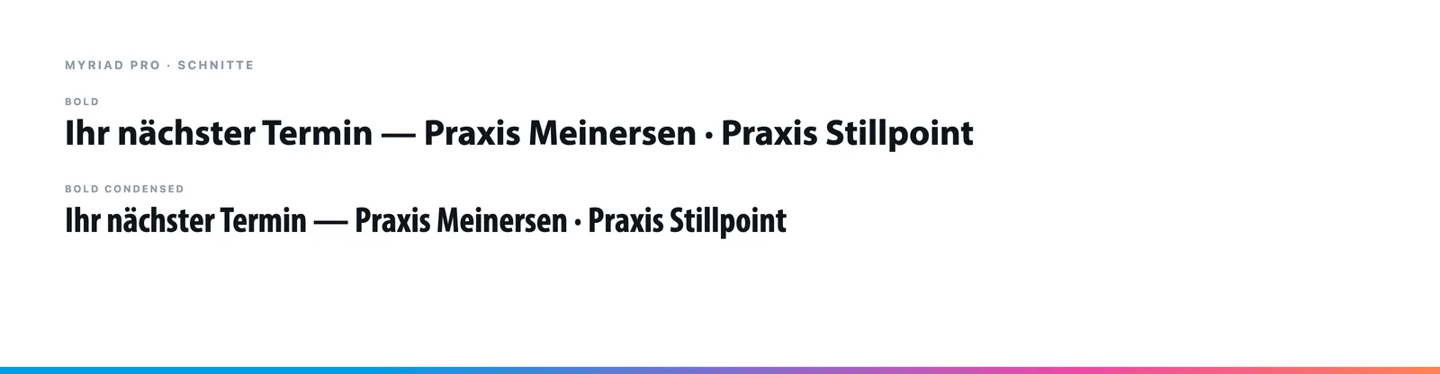
Myriad Pro in Regular and Bold — the typeface of the practice's existing stationery. The pad adopts it so that letterhead, card and appointment slip appear as one set.