Brand & Design
EFL flyer series
Advertising counselling is a contradiction — you advertise something nobody needs until they need it badly.
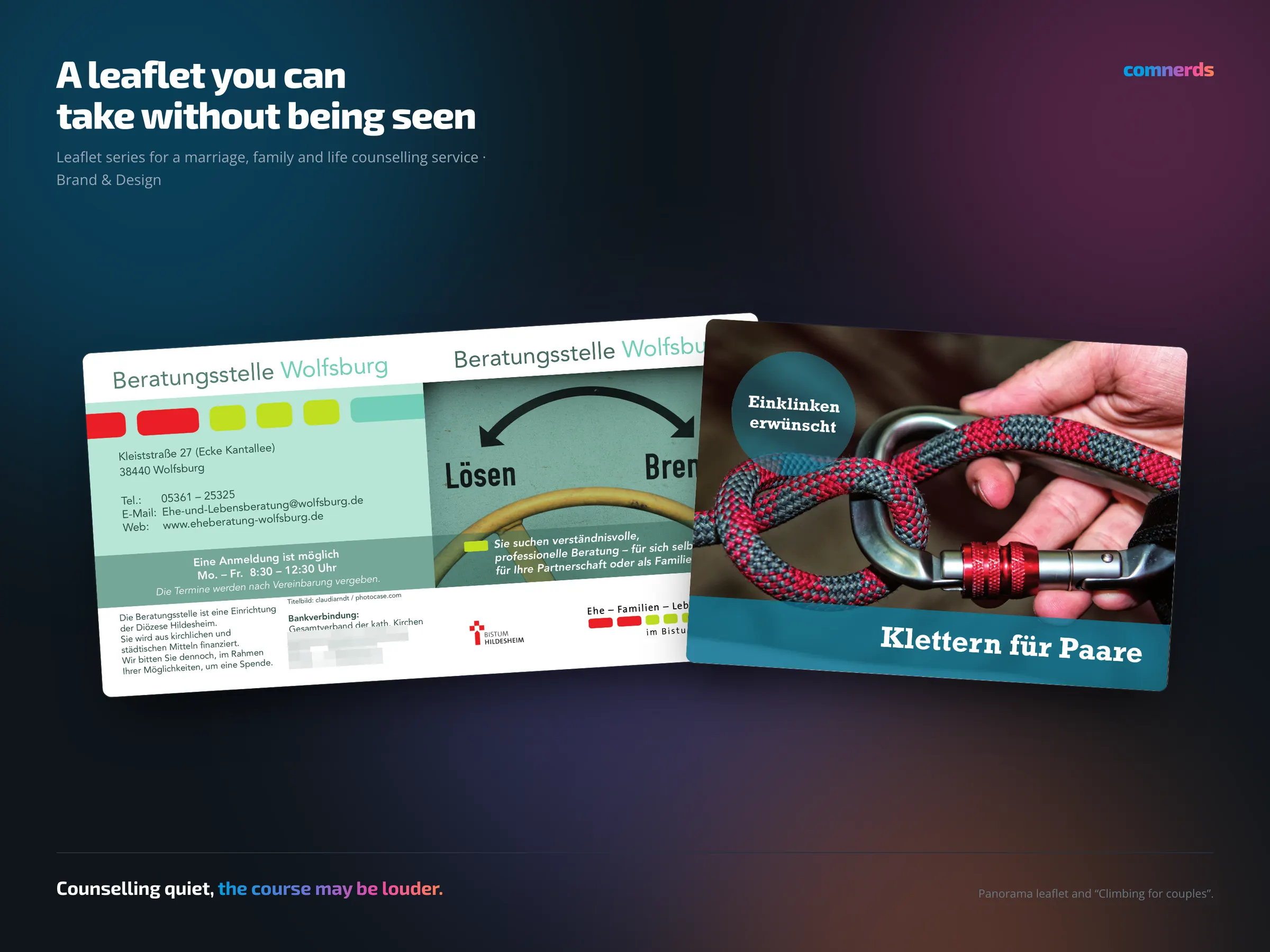
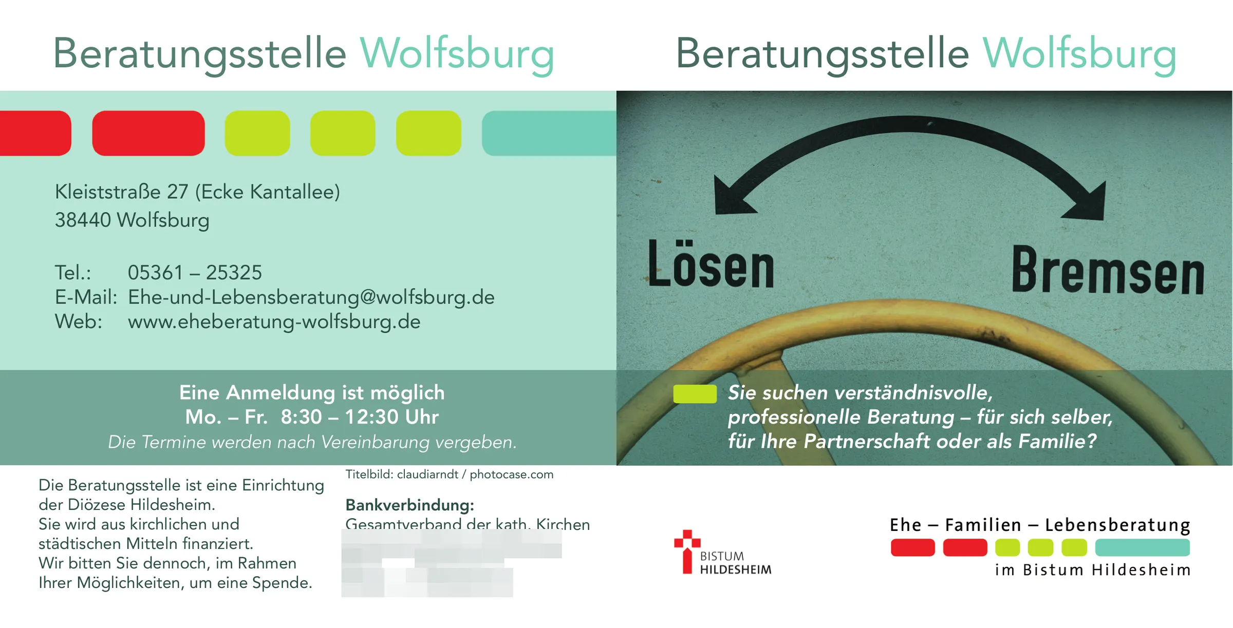
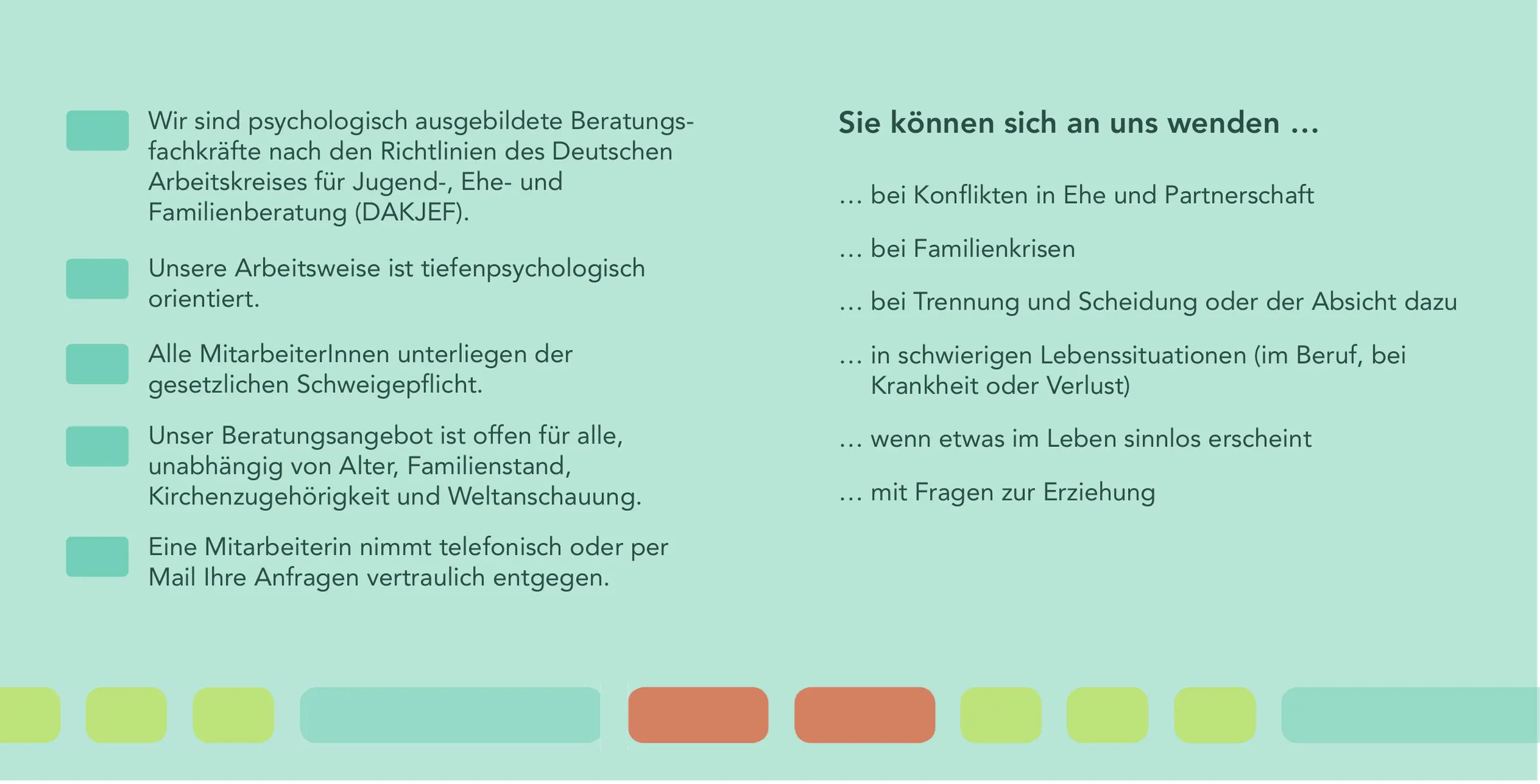
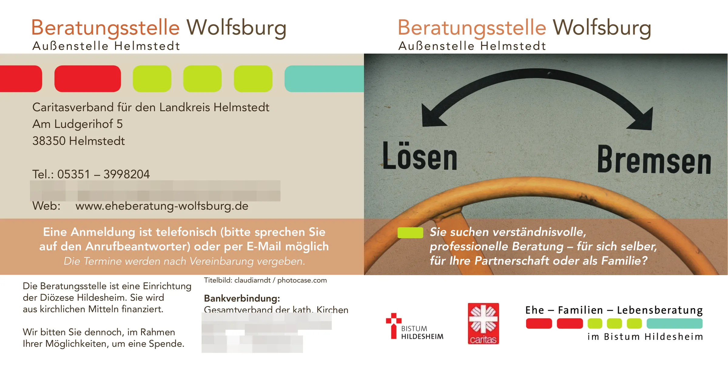
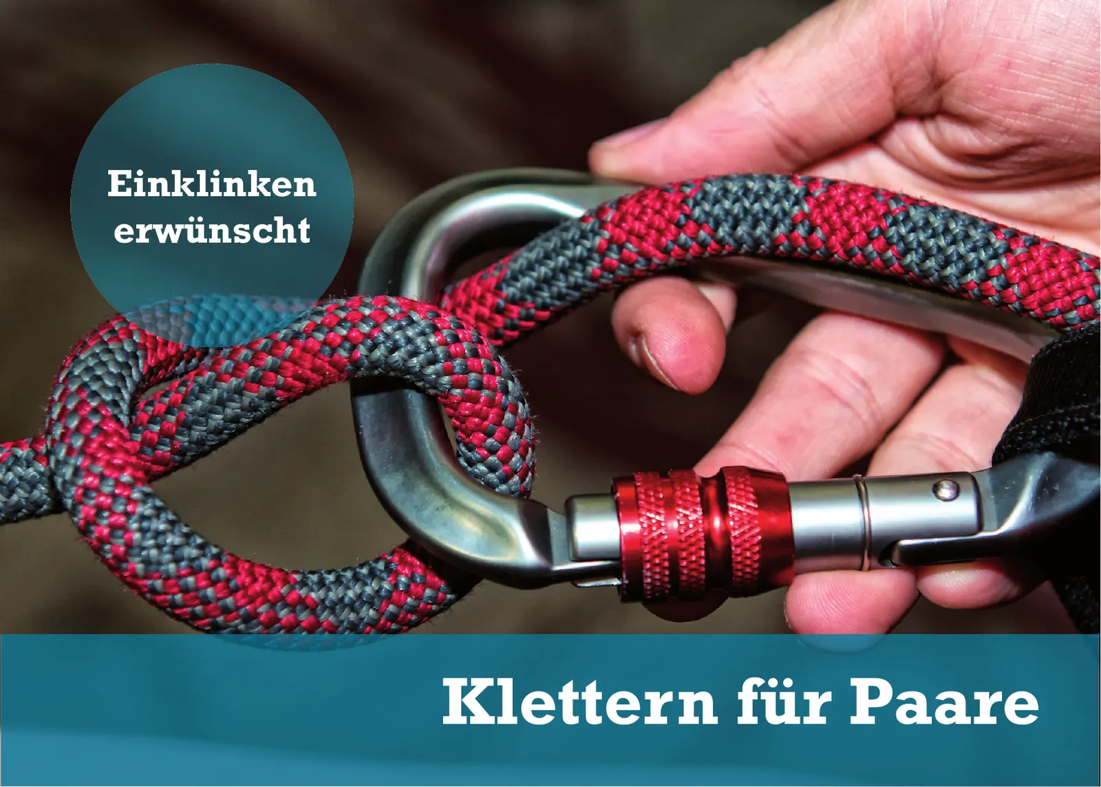
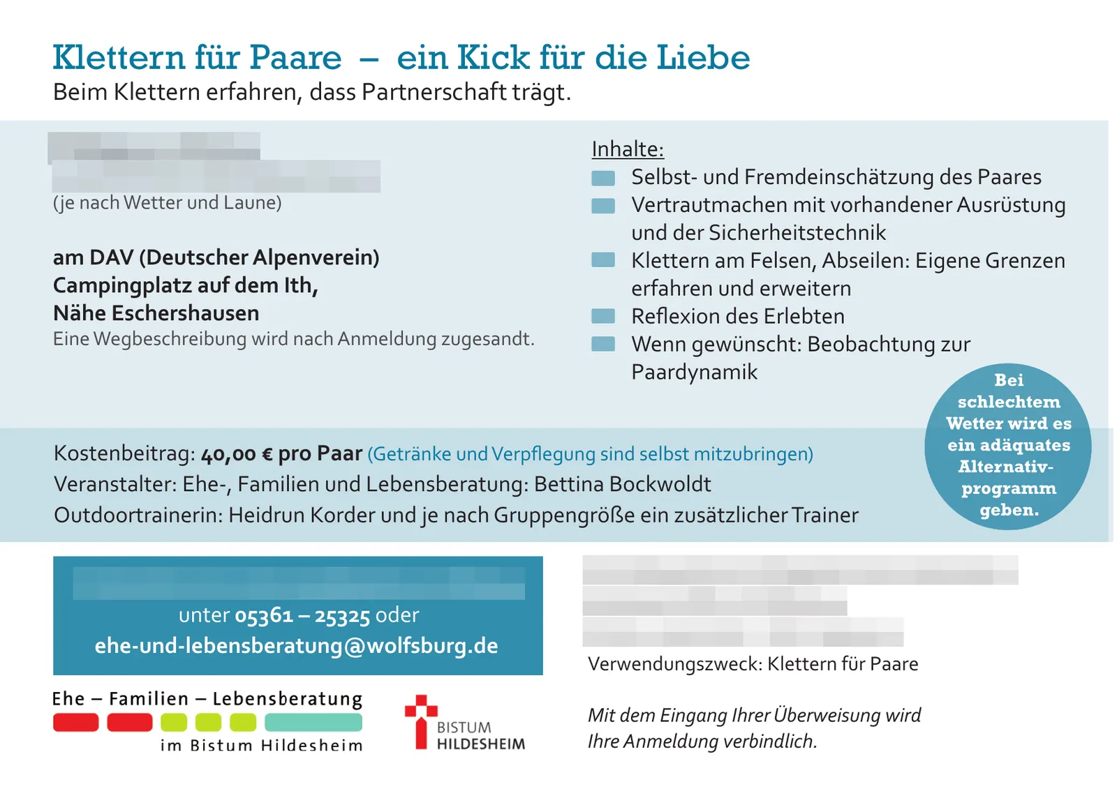
A flyer series in several formats was produced for the counselling centre: square in several versions, as a panorama fold and as a separate edition for the Helmstedt location. Plus “Climbing for couples”, a motif of its own for one of the courses.
Printed pieces like these lie in waiting rooms, parish offices and counselling centres. They are picked up by people who do not want to be seen picking up a flyer about marriage counselling. That has consequences for the design: no format that sticks out of a bag, no styling you can read from across the room, no imagery that stages distress.
“Climbing for couples”, on the other hand, was allowed to be lighter — a course is an offer, not a crisis. That difference in tone between the motifs was the real work on the series.
Colours
- Ode to Green#B8E6D7Mint — ground of the counselling leaflets
- Twining Vine#75A698Grey-green — surfaces
- Arabian Nights#196D84Petrol — Climbing for couples
- Blood Donor#EA1E25Red — Caritas mark
Typeface
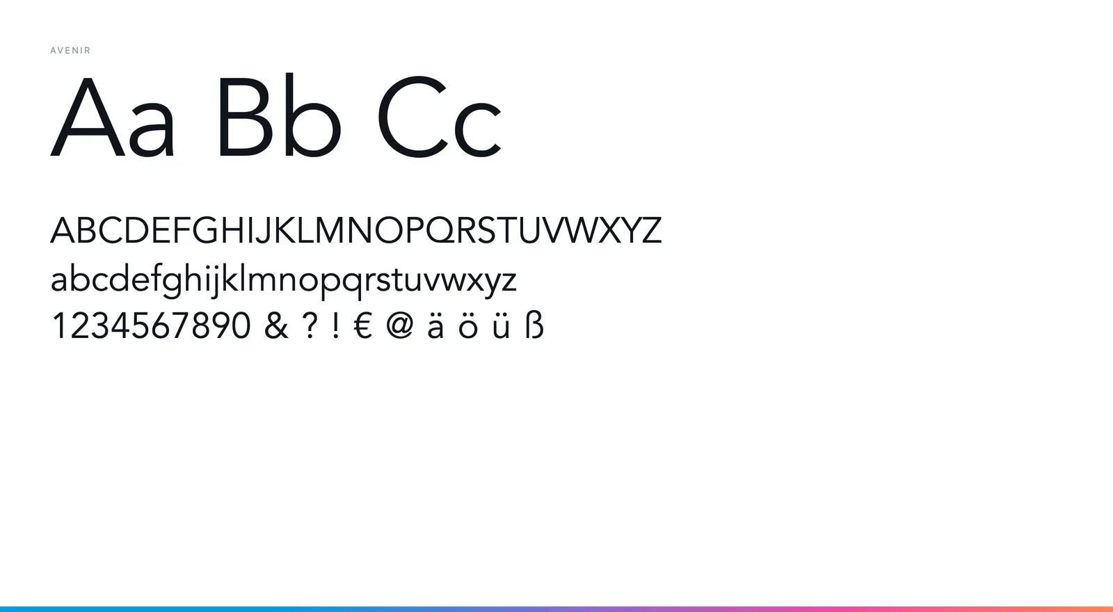
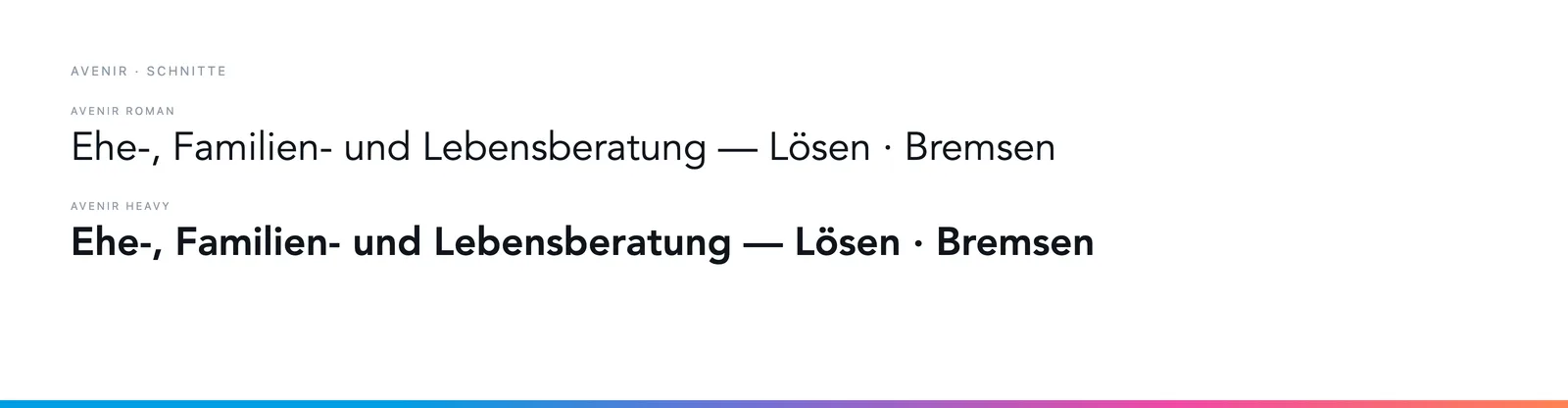
Avenir in Roman and Heavy for the counselling leaflets — matter-of-fact, without harshness. “Climbing for couples” switches to Rockwell Bold in the title and Corbel in the text: a course may appear stronger than a crisis service.