Brand & Design
Brochure: “Information for migrants”
A brochure from a public authority, read by people who are only just learning German.
The contact came through Quartiersmanagement Steinen — both municipalities lie in the district of Lörrach, and good work gets around in a region. The content came from the town; my part was typesetting and prepress.
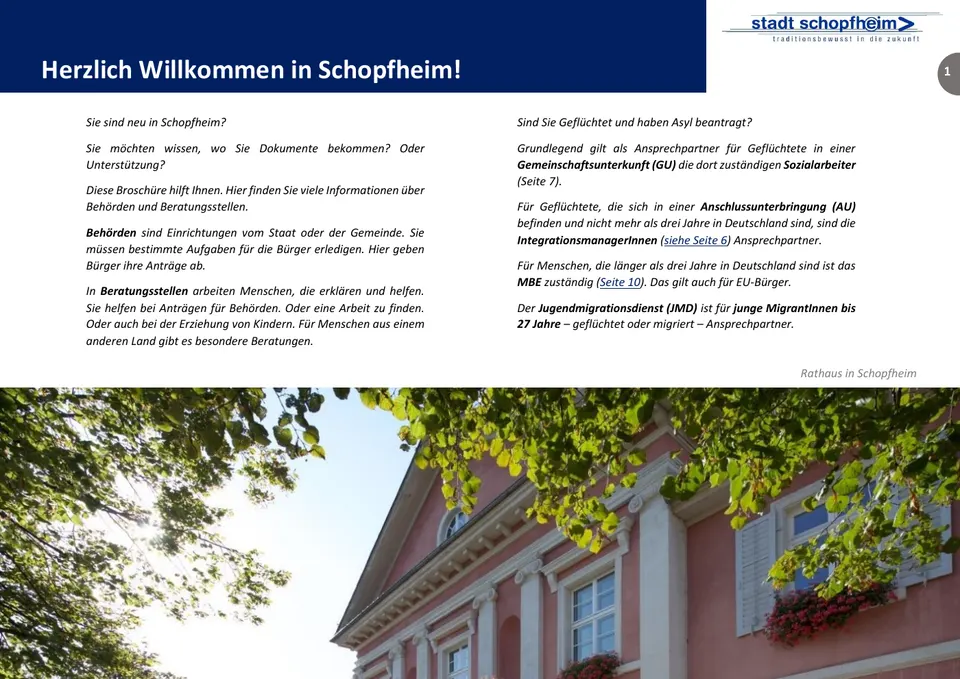
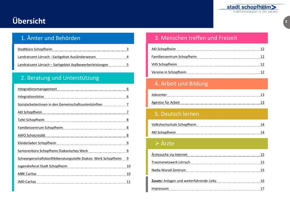
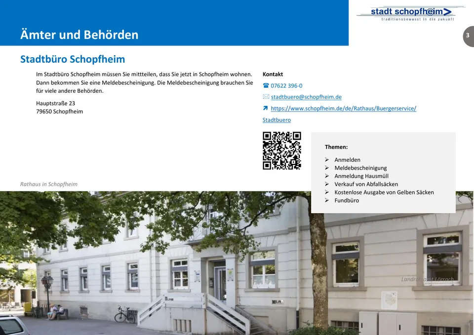
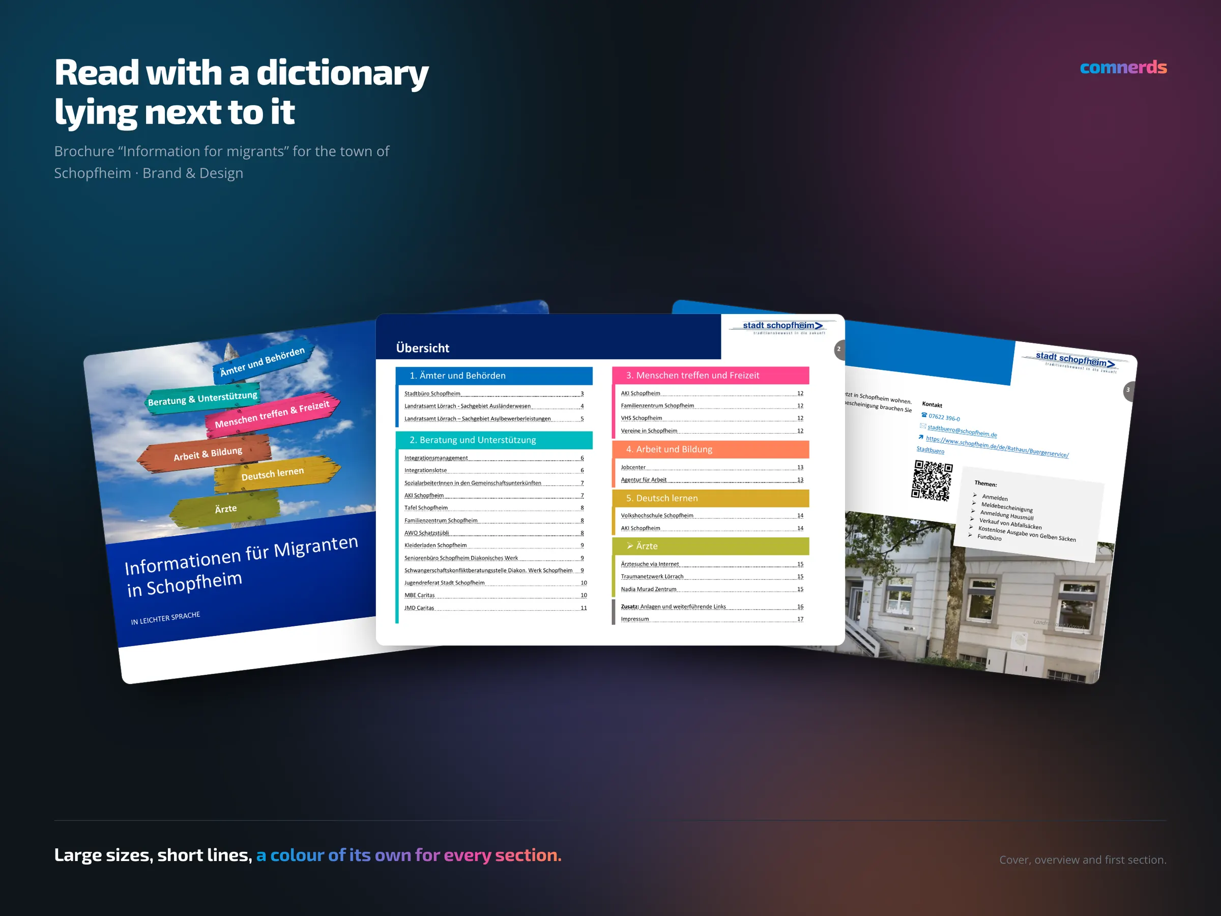
With a brochure for newly arrived residents, typography decides how useful it is. The readership reads German as a foreign language, often with a dictionary or a translation app lying next to it. That means: generous type size, short lines, unambiguous headings rather than witty ones, clear paragraph boundaries. Anyone who has to decipher sentences needs visible places to pause.
Municipalities as clients are something special. The commissioning party is not the reader, and the reader has no choice about whether they need the document — they need it. That is a responsibility you feel while typesetting.
Colours
- Deep Sapphire#002060Title and headers
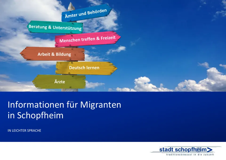
- Matt Blue#0070C0Offices & authorities
- Cyan Sky#00BBC0Advice & support
- Lower Lip#FF478DMeeting people & leisure
- Ballet Cream#FF825BWork & education
- Brassy#D7A929Learning German
- Enigma#B8B836Doctors
Typeface
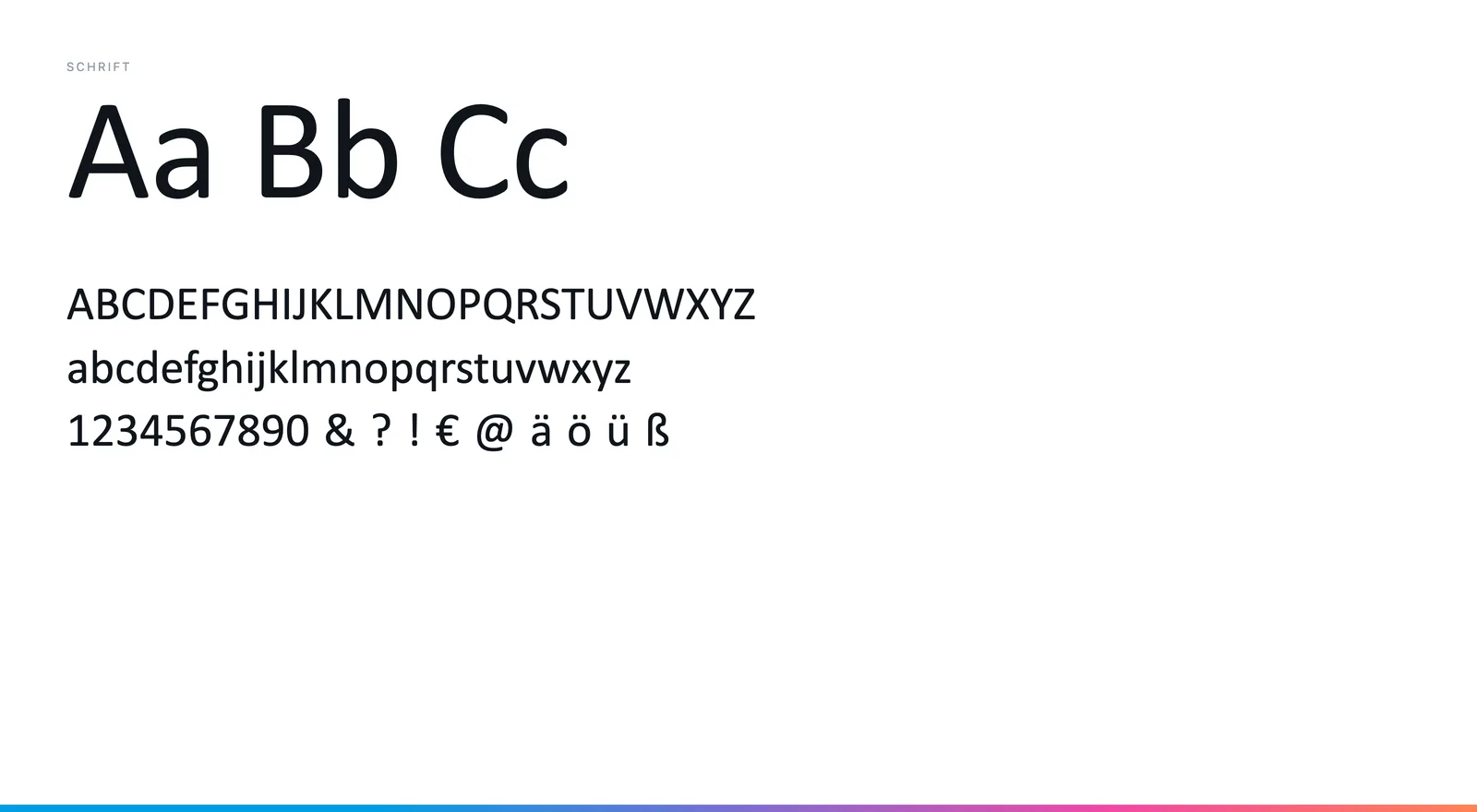
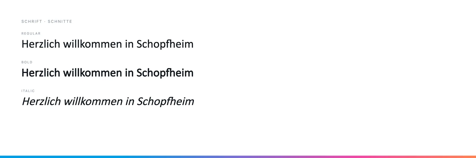
Calibri throughout, in Regular, Bold and Italic. No second typeface: the sections differ by colour, not by typography — and the colour runs from the signpost on the cover to the header of every page.